B4J Code Snippet CSS style reference guide.

Since there seems to be very little info on how views are referenced in a CSS file, I decided to create this thread so that, me as well as others, can easily find them.
Hopefully, this will become a sticky...

As we all know, B4J app are highly customizable using CSS.
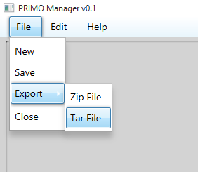
In this thread we will customize a menubar appearance, changing it from this:
upload_2015-9-12_13-17-52.png


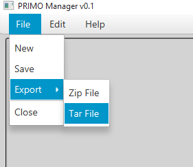
into this:

upload_2015-9-12_13-18-20.png


So, the magic happens in the CSS file, like this:

B4X:
/********************************
*    MenuBar1 styling    *
********************************/
.menu-bar
    {
    -fx-background-color: linear-gradient(#ffffff, #e8f5fc);
    }
Here we changed the MenuBar appearance itself, by referencing ".menu-bar", giving it a soft gradient; from white down to a light-bluish color

B4X:
.menu:hover, .menu:showing
    {
    -fx-background-color:
    #3c7fb1, linear-gradient(#fafdfe, #e8f5fc),linear-gradient(#eaf6fd 0%, #d9f0fc 49%, #bee6fd 50%, #a7d9f5 100%);
    -fx-background-insets: 0,1,2;
    -fx-background-radius: 3,2,1;
    -fx-effect: dropshadow( three-pass-box , rgba(0,0,0,0.6) , 5, 0.0 , 0 , 1 );
    }
Next we change the Hover and Showing states of the root menu items holder, in this case, "File";"Edit" & "help". We gave it a basecolor, layered with two gradients; added insets, rounded just a tad the corners and finished with a nice shadow effect.

B4X:
.menu     .label
    {
    -fx-text-fill: black;
    }
Since the default style (Caspian.css) changes the textcolor from black to white when hovered, we override it and force it to always be black, by changing the Label text color (.menu .label)

B4X:
.menu-item:hover, .menu-item:focused
    {
    -fx-background-color:
    #3c7fb1, linear-gradient(#fafdfe, #e8f5fc),linear-gradient(#eaf6fd 0%, #d9f0fc 49%, #bee6fd 50%, #a7d9f5 100%);
    -fx-background-insets: 0,1,2;
    -fx-background-radius: 3,2,1;
    -fx-effect: dropshadow( three-pass-box , rgba(0,0,0,0.6) , 5, 0.0 , 0 , 1 );
    }
Here we give the same style to the menu sub-items just to keep things neat.

Hopefully more examples will be added here, feel free to contribute.

Hope you enjoy.
 
Last edited:

Cableguy

Expert
Licensed User
Longtime User
Tab-Pane Default CSS

B4X:
.tab-pane
{
-fx-skin: "com.sun.javafx.scene.control.skin.TabPaneSkin";
/* -fx-tab-min-width: 4.583em;  55 */
/* -fx-tab-max-width: 4.583em; 55 */
-fx-tab-min-height: 2em; /* 24 */
-fx-tab-max-height: 2em; /* 24 */
}
.tab .tab-label
{
-fx-skin: "com.sun.javafx.scene.control.skin.LabelSkin";
-fx-background-color: transparent;   
-fx-alignment: CENTER;
-fx-text-fill: -fx-text-base-color;
}
/*
.tab *.tab-label Text {
-fx-effect: dropshadow(two-pass-box , rgba(255, 255, 255, 0.4), 1, 0.0 , 0, 1);
}*/
.tab-content-area
{
-fx-background-color: -fx-control-inner-background;
-fx-padding: 0.0em; /* 0 */
/* -fx-opacity: -fx-disabled-opacity;*/
}
.tab
{
/* This is how it is done in Button, but the -1 inset caused a white line  */
/* to appear beneath the tab, which looks bad, so it's taken out below.    */
/*    -fx-background-color: -fx-shadow-highlight-color, -fx-tab-border-color, -fx-inner-border, -fx-body-color;
-fx-background-radius: 5 5 0 0, 5 5 0 0, 4 4 0 0, 3 3 0 0;
-fx-background-insets: 0 0 -1 0, 0, 1, 2;*/
-fx-background-insets: 0, 1, 2;
-fx-background-radius: 5 5 0 0, 4 4 0 0, 3 3 0 0;
-fx-padding: 0.083333em 0.5em 0.083333em 0.5em; /* 1 6 1 6 */
/*    -fx-text-fill: -fx-text-base-color;*/
}
.tab:top
{
-fx-background-color: -fx-tab-border-color, -fx-inner-border, -fx-body-color;
}
.tab:right
{
-fx-background-color: -fx-tab-border-color, -fx-inner-border-bottomup, -fx-body-color-bottomup;
}
.tab:bottom
{
-fx-background-color: -fx-tab-border-color, -fx-inner-border-bottomup, -fx-body-color-bottomup;
}
.tab:left
{
-fx-background-color: -fx-tab-border-color, -fx-inner-border, -fx-body-color;
}
.tab:hover
{
-fx-color: -fx-hover-base;
}
.tab:selected
{
/*    -fx-background-color: white;*/
/*    -fx-background-color: -fx-tab-border-color, -fx-inner-border, -fx-body-color;
-fx-background-radius: 5 5 0 0, 4 4 0 0, 3 3 0 0;
-fx-background-insets: 0, 1 1 0 1, 2 2 0 2;*/
-fx-background-color: -fx-tab-border-color, -fx-control-inner-background;
-fx-background-insets: 0, 1 1 0 1;
-fx-background-radius: 5 5 0 0, 4 4 0 0;
}
.tab:disabled
{
-fx-opacity: -fx-disabled-opacity;
}
.tab:disabled:hover
{
-fx-color: -fx-base;
-fx-opacity: -fx-disabled-opacity;
}
.tab-pane *.tab-header-background
{
-fx-background-color: -fx-outer-border, -fx-inner-border, derive(-fx-color, -20%);
-fx-effect: innershadow(two-pass-box , rgba(0,0,0,0.6) , 4, 0.0 , 0 , 0);
}
/*.tab-pane *.tab-header-area {*/
/* I would like to use -fx-tab-border-color here, but for some reason it */
/* just isn't the correct color, even though it works in :top above */
/*    -fx-background-color: -fx-tab-border-color, lightgray;*/
/*}*/
.tab-pane:top *.tab-header-area
{
-fx-background-insets: 0, 0 0 1 0;
-fx-padding: 0.416667em 0.166667em 0.0em 0.833em; /* 5 2 0 10 */
}
.tab-pane:bottom *.tab-header-area
{
-fx-background-insets: 0, 1 0 0 0;
-fx-padding: 0 0.166667em 0.416667em 0.833em; /* 0 2 5 0 */
}
.tab-pane:left *.tab-header-area
{
-fx-background-insets: 0, 0 1 0 0;
-fx-padding: 0.833em 0.0em 0.166667em 0.416667em; /* 10 0 2 5 */
}
.tab-pane:right *.tab-header-area
{
-fx-background-insets: 0, 0 0 0 1;
-fx-padding: 0.833em 0.416667em 0.166667em 0.0em; /* 10 5 2 0 */
}
.tab-pane .headers-region
{
-fx-effect: dropshadow(two-pass-box , rgba(0,0,0,0.6) , 4, 0.0 , 0, 0);
}
/* TODO: scaling the shape seems to make it way too large */
.tab-close-button
{
-fx-background-color: -fx-mark-color;
-fx-shape: "M 0,0 H1 L 4,3 7,0 H8 V1 L 5,4 8,7 V8 H7 L 4,5 1,8 H0 V7 L 3,4 0,1 Z";
-fx-scale-shape: false;
-fx-effect: dropshadow(two-pass-box , rgba(255, 255, 255, 0.4), 1, 0.0 , 0, 1);
}
.tab-close-button:hover
{
-fx-background-color: derive(-fx-mark-color, -30%);
}
/* CONTROL BUTTONS */
.control-buttons-tab
{
-fx-background-color: -fx-tab-border-color, -fx-inner-border, -fx-body-color;
-fx-background-insets: 0, 1, 2;
-fx-background-radius: 5 5 0 0, 4 4 0 0, 3 3 0 0;
-fx-padding: 0.083333em 0.25em 0.083333em 0.25em; /* 1 3 1 3 */
}
.tab-down-button
{
-fx-background-color: transparent;
-fx-padding: 0.0em 0.416667em 0.0em 0.416667em; /* 0 5 0 5 */
}
.tab-down-button:hover
{
-fx-background-color: -fx-body-color;
-fx-color: -fx-hover-base;
}
.tab-down-button .arrow
{
-fx-background-color: -fx-mark-highlight-color, -fx-mark-color;
-fx-background-insets: 1 0 -1 0, 0;
-fx-padding: 0.238083em 0.416667em 0.238083em 0.416667em; /* 2.857 5 2.857 5 */
-fx-shape: "M 0 0 H 7 L 3.5 4 z";
}

I'm having a play with this one, and will come back with my customized version
 
Last edited:
Top