Share My Creation Pen&Paper: PWCT for Basic ABMaterial WebApps

Pen&Paper Explained.png


The intension of Pen & Paper is the creation of ABMaterial WebApps as depicted in the drawing above. This was developed as a pet project out of a personal need to create ABMaterial WebApps. So far everything has gone well with the outputs.

1. The ABMaterial Library comes out with an XML file that has vast information about the components (depicted as classed) including their properties (attributes), events and methods. Any Library viewer is able to access these too.
2. These classes are represented as property bags in Pen & Paper so that I can create any component by just changing the various attributes, whether true/false, specifying text etc. The way the components are built, initialized and added to pages/containers/modal sheets has been explained in detail in the ABMaterial Demo, where all of this started.
3&4. On creating an ABM project with Pen & Paper, two databases are created, one to store the project definition (pages and component structures i.e. propertybags) and the other a production one that the data will be stored in. These are both in SQLite. Pen & Paper has functionality to perform a DAO (Data Access Object) link for each backend table and fields you want to link a component to. This is essence creates a CRUD code base. This was inspired by the ABMCRUD generator that produces a structure of ones ABMTable and ABMModal sheet with the specific input components.
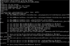
5. On Project Build, Pen & Paper produces a complete B4J application including the source code that can be compiled to generate a working version of an ABM Web Application.
6. Pen & Paper does not come bundled with ABMaterial, is not affiliated with ABMaterial and to compile any Pen & Paper project to a fully fledged working ABM Webapp, you need the ABM Libraries. It is just a helper tool to elimitate the repetitive nature of creating projects, pages, containers, modalsheets, etc, in a programming without coding technology fashion. It does NOT in anyway replace ABM or intends to replicate its functionality as it just generates B4J code for your ABM application, this being achieved by use of property bags to create your components and generate the respective source code based on your options, eliminating the need to type code and what anyone gets out is the basic stuff to make ones project work. Not everything ABM is here anyway.

As everything that has a beginning has an end. This personal enjoyment project will stop being maintained as other things will evolve. As on 31 March 2018, there is no intention to advance this any further than what it is. Thanks for B4J this project was possible.

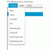
Steps in using Pen & Paper
  • Get everything related to Pen&Paper from this DropBox Link. Get executable from jar folder.
  • See videos below on usage and related articles
  • Please note that not all ABM components are covered with Pen&Paper as yet.

2018 Tutorials

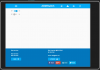
Creating a Sign In Modal Dialog with Options

Interesting Tutorials
2017-12-20

Creating a simple 'Contacts' ABMaterial WebApp - Part 1
Creating a simple 'Contacts' ABMaterial WebApp - Part 2
Creating a simple 'Contacts' ABMaterial WebApp - Part 3

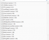
Below are some of the articles touching on code generated by Pen&Paper.

ABMaterial WebApps created with Pen&Paper

Bible.Show

CodeProject Article

Creating the Bible.Show WebApp with ABMaterial

Some YouTube Links


Pen&Paper is built using B4J and distributed with jMashProjectProfile.

NB: You will need the ABMaterial Framework to compile the generated source code.
 

Attachments

  • abmaterial.gif
    abmaterial.gif
    53.1 KB · Views: 13,343
  • MyMaterialLibraries.png
    MyMaterialLibraries.png
    16.4 KB · Views: 1,070
Last edited:

Mashiane

Expert
Licensed User
Longtime User
MyMaterial.Show: What's New

https://www.dropbox.com/sh/74t6tijshgrvi3b/AAA6Znjnp6kzl3PviBgLGucMa?dl=0https://www.dropbox.com/sh/74t6tijshgrvi3b/AAA6Znjnp6kzl3PviBgLGucMa?dl=0

1. Well a lot of things. First and foremost, there are some things that I will explain later about this tool, so to avoid any mishaps, you will get a jar from now and the mymaterial.b4j project as usual to test the functionality. Until I explain the new developments in the forum, unfortunately the source will be closed temporarily. Still, the jar file is not bundled with the ABMaterial Libraries.

2. My source code was getting bigger and some components just couldnt fit on a single screen. I didnt want to use a scrollview and I guessed one day it will take foreever to maintain the source code, so I came up with a propertyBag.

3. Therefore, besides the ABMContainer component here, the following components designers have been revampe, ABMNavigationBar, ABMGridRows, ABMContainer, ABMInput and ABMGridCells, Project and Pages designers. What does this mean? Instead of me opening up the view designer, finding the view, adding components to it and position them nicely, then generate elements, all I have to do is just type 1 single line of code then update my _render code. This will help with changes in ABMaterial components etc.

NB: This version has some incompatibilities with previous project databases. To fix that, open your project then goto Project > Upgrade, that will fix it.
To explain, maps are case sensitive and before I stored contents in map CaseInSensiTive format, that does not work with the revamped designer. So do that first or else you will see a lot of "nulls" on the generated source code.

New Project Designer: The Google Api key field has been added for the upcoming google maps designer..
 

Mashiane

Expert
Licensed User
Longtime User
The FilePicker allows you to select an image for any of the controls for easier access. As earlier discussed, for MyMaterialShow, you need to import your Images, PDF, Audio files using the Resources > Audio or PDF or Images menus. This example below is for selecting an image for a page.

ImageChooser.png


Below is a not so impressive background due to me having a switch control on the page..

mycontainer.cell653.png
 

Mashiane

Expert
Licensed User
Longtime User
MyMaterial.Show: Creating ABMTabs, ABMTabPanels/Items & ABMContainers

I forget easily, so I'm also writing this for myself. I will try and explain this with the ABMTabs example as I had postponed that for a while due to the container designer delay in MyMaterial.Show.

Fire up a new page in Page > New Page, specify the nitty gritties, etc, here is an example.

Figure 1

mytabs.png


Create a header for the page too, select the page then Components 2 > ABMNavigationBar

Figure 2

ABMNavigationBar.png


Next, lets specify the Grid definition for the page, select the page, then Components 3 > ABMGridRows, we will add 2 rows with AddRows to the page.

Figure 3


ABMGridRows.png


Note that the Parent ID here is blank, these rows will be linked to that page and not to any other component in that page. Next let's add the Columns/Cells for this row. Note our Component ID, we will need to refer to that when creating our columns as it will create the relationship between the row and the columns.

Figure 4

ABMGridCells.png


For this row identifier we will add 1 column using the AddCells12 method. Remember this spans the column 12 spaces wide. Our grid definition will basically be this..

B4X:
page.AddRows(2, True, "").AddCells12(1, "")

Now we are done creating our page, next we will add an ABMTab, its child panels and containers.
 

Mashiane

Expert
Licensed User
Longtime User
This is a continuation of post #127.

Select the page, goto Components 2 > ABMTabs

Figure 1

ABMTabs.png


Note the theme here, here is its design. This tab will be placed in Row 2 and Cell 1 of our page.

Figure 2

TabsTheme.png

Now, its time to create the panel for the tab.

Select the page, Components 2 > ABMTabsPanel

Figure 3. You will come back to this screen and link the container we will create.

ABMTabsPanel.png


Note the parent tab, a relationship has been established with that now. As the tab page container has not been created yet, that will be blank, save the tab.

Now lets create our container.

Figure 4

ABMContainer.png

The container Parent ID is the previously tab panel we created. There are different ways to initialize a container like initializeanimated and initializecollapsable, havent played with that yet, soon though.

So far we have linked the tabs, the tab, the container etc using the Parent ID properties It's time to create what will be in the container, lets pick a table.

Figure 5

ABMTable.png


If you have already created a table somewhere, you can select it go to Maintain, select copy and then paste it to the page. Dont forget the table columns. Note the parent id of this table, its the container id we just added, also ensure you have that link.

Figure 6.

ABMTableColumns.png
 
Last edited:

Mashiane

Expert
Licensed User
Longtime User
Whoohah!! a container has a grid definition!!!

Select the page, goto Components 3 > ABMGridRows, select the parent id as the name of the container you created.

Figure 1

mytabs.row656.png


This container will have 1 row and now lets define the columns. Components 3 > ABMGridCells

Figure 2

mytabs.cell657.png


Note the parent id, linking to the GridRow previously created. I think we are done. When you select the ABMTabs you created, it should look something like this on the Create Page.

B4X:
Dim tab1 As ABMTabs
tab1.Initialize(page, "tab1", "tabsgreen")
Dim tabscontainer As ABMContainer
tabscontainer.Initialize(page, "tabscontainer", "")
tabscontainer.AddRows(1, True, "").AddCells12(1, "")
tabscontainer.BuildGrid 'IMPORTANT once you loaded the complete grid AND before you start adding components
Dim ABMTable658 As ABMTable
ABMTable658.Initialize(page, "ABMTable658", True, False, True, "tbl1theme")
ABMTable658.IsBordered = True
ABMTable658.IsResponsive = True
ABMTable658.IsScrollable = False
ABMTable658.IgnoreFormattingCodes = False
ABMTable658.SetHeaders(Array As String("ID", "Open", "Last Name", "First Name"))
ABMTable658.SetHeaderThemes(Array As String("headerfooter", "headerfooter", "headerfooter", "headerfooter"))
ABMTable658.SetHeaderHeights(Array As Int(0, 48, 0, 0))
ABMTable658.SetColumnVisible(Array As Boolean(False, True, True, True))
ABMTable658.SetColumnSortable(Array As Boolean(False, False, True, True))
ABMTable658.SetColumnDataFields(Array As String("", "", "", ""))
ABMTable658.SetFooter("This footer appears at the bottom of the table", 12, "")
tabscontainer.Cell(1,1).AddComponent(ABMTable658)

tab1.AddTab("tabpanel1", "TAB 1", tabscontainer, 3, 3, 3, 12, 12, 12, True, False, "fa fa-adjust")
page.Cell(2,1).AddComponent(tab1)

Ohh, go back to the tabs panel and link its "Tab Page Container" property.

Remember

Anything without a parent id will be rendered to the page:
Anything with a parent id will be rendered to the parent id:
 

Mashiane

Expert
Licensed User
Longtime User
MyMaterial.Show: What's New

Well, bye bye Component 1, Component 2 and Component 3 menus, welcome "Component Creator"

How to use?

Select the page you want to process, expand Component Creator and select the component to add to the page. Feed in the properties you want and save then continue to the next component.

Why?

Well, I figured that soon enough I will have to search for components over and over again. This is easier and a whole lot faster. Enjoy.


Figure 1

ComponentCreator.png
 

Mashiane

Expert
Licensed User
Longtime User
MyMaterial.Show: What's New (Footers, things in footers, automatic component creation based on options, minor bug fixes etc)

At the moment, the page footer from the demo is based on two columns, I used the same approach here as I dont foresee myself doing much changes to my footers except adding SocialShare etc. So we use row 1 column 1 and row 1 column 2 anyways.

From the previous posts, each component was added a Parent ID to specify the ParentChild relationship within MyMaterial.Show. I have just added a parent called page.Footer in the dropdowns so that one can just select that parent to indicate that the component being created must reside in the footer. Of course you will indicate the RC coordinates.

This meant that I needed to do some new changes to the structure of MyMaterial.Show for some screen, here we go.

Some nice output displayed with the Ripple Emulator inside Chrome..

AutoMaticComponents.png


Looking at this screen, we have top items, a footer with some buttons and social share, the navigation bar is hidden using the constand, ...ALWAYSHIDE.

What I did... from the project definition I added a few things...

MyMaterial.png

From here the left and right footer contents was specified. This footer content is global however you can indicate whether you want a footer on each page by just checking a checkbox. I also added the definition for the icons that appear on the webpage, the apple touch icon etc.

On the page definition, there are some automatic component creation options that one can play with. When creating a page, one can

1. Indicate if the page will have a navigation bar, the title of the navigation bar, the top items that will be in that navigation bar e.g. Sign In, Sign Up, Sign Out, Back etc.
2. Indicate if the page will have a footer, whether the footer is fixed etc.

PageEnhancements.png


When you create a new page, you can check the options (explained in green above) for the automatic creation of the child components for these pages. For the ActionButton, I intend to add child buttons for crud functionality. By default, when you specify the number of rows, a grid is created for your new page. You can play around. I have noted that it's better to Fix the footer as in my desktop it just sat in the middle of the screen.


Attachments

  • AutoMaticComponents.png
    AutoMaticComponents.png
    23.1 KB · Views: 246
Last edited:

Mashiane

Expert
Licensed User
Longtime User
MyMaterial.Show: What's New: ABMButton definition

Due to buttons that can be placed in other containers e.g. footers etc, the button definition had to be updated, especially when the button is linked to an action button. From now on, you need to indicate that the button is an actionbutton button. For example below, the button btn766 will sit in the footer, as the parent id can be an action button component, I have unchecked "Parent Is Action Button" because it will be a footer for that page.

If the parent would be an action button, I would have checked that to make it a link. There is nothing else to change.

ABMButton.png
 

giannimaione

Well-Known Member
Licensed User
Longtime User
your MyMaterialShow.jar on dropbox crash ... maybe update libraries?
 

Attachments

  • Cattura.PNG
    Cattura.PNG
    24.4 KB · Views: 264
Top