The upcoming release of JDashboardUI brings powerful new chart components that will take your dashboards to the next level in clarity, interactivity, and professional design:

 JLineChart – Smooth and elegant line chart, perfect for showcasing trends and progress.


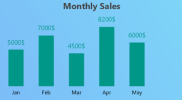
JBarChart – Modern, versatile bar chart for metrics, sales, or performance indicators.

JDonutChart – Dynamic and customizable donut chart, ideal for percentages and data breakdowns.


JMultiBarChart – Multiple bar series for easy comparison across datasets.


JMultiLineChart – Multiple line series in one chart to analyze metrics and trends side by side.


 With these new charts you can:
All charts come with smooth animations and can be added directly from the designer or via code, with ready-to-use snippets for easy integration.
 Coming very soon in the next version of JDashboardUI.
 Learn more in our official store: https://b4xapp.com/item/jdashboard-ui-library-
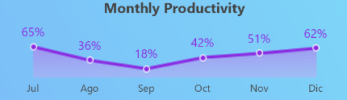
JLineChart – Smooth and elegant line chart, perfect for showcasing trends and progress.
Example:
Dim JLineChart1 As JLineChart
    JLineChart1.Initialize(Me,"JLineChart1")
    JLineChart1.AddToParent(mainform.RootPane,10,5,340,140)
    JLineChart1.TextTitle = "Monthly Productivity"
    JLineChart1.XAxisTextColor = xui.Color_DarkGray
'    JLineChart1.ShowFill = False
'    JLineChart1.ShowValues = False
    Dim arr(6) As Float
    For i = 0 To arr.Length - 1
        arr(i) = Rnd(10, 100)
    Next
    JLineChart1.Suffix = "%"
'    JLineChart1.Color = xui.Color_RGB(80, 113, 82)
    JLineChart1.TitleColor  = xui.Color_DarkGray
    JLineChart1.SetData(Array("Jul","Ago","Sep","Oct","Nov","Dic"),arr)
example:
    Private BarChart As JBarChart
        BarChart.Initialize(Me, "BarChart")
        BarChart.AddToParent(mainform.RootPane, 30, 110, 250, 200)

    '    ' Customize properties
        BarChart.setTextTitle("Monthly Sales")
        BarChart.setColor(xui.Color_ARGB(255, 0, 128, 255)) ' Blue bars
        BarChart.setShowValues(True)
        BarChart.setSuffix("$")
        BarChart.setTitleFont(xui.CreateDefaultBoldFont(16))
        BarChart.setTitleColor(xui.Color_DarkGray)
        BarChart.setXAxisTextColor(xui.Color_Black)

    '    ' Set sample data
        Dim PointsX As List = Array As String("Jan", "Feb", "Mar", "Apr", "May")
        Dim Values As List = Array As Float(5000, 7000, 4500, 8200, 6000)
        BarChart.setData(PointsX, Values)
Example:
Dim donutChart As JDonutChart
        donutChart.Initialize(Me, "donutChart")
        donutChart.AddToParent(mainform.RootPane, 10dip, 300dip, 240dip, 140dip)
        Dim values As List
        values.Initialize
        values.Add(64.2) ' Desktop
        values.Add(26.3) ' Mobile
        values.Add(9.5)  ' Tablet

        values.Add(64.2) ' Desktop
        values.Add(26.3) ' Mobile
        values.Add(9.5)  ' Tablet

        Dim labels As List
        labels.Initialize
        labels.Add("Desktop")
        labels.Add("Mobile")
        labels.Add("Tablet")

        labels.Add("Desktop")
        labels.Add("Mobile")
        labels.Add("Tablet")


        Dim colors As List
        colors.Initialize
        colors.Add(0xFF6A9FCD) ' Light blue
        colors.Add(0xFFF45559) ' Red
        colors.Add(0xFFFFA14F) ' Orange

        colors.Add(0xFF6A9FCD) ' Light blue
        colors.Add(0xFFF45559) ' Red
        colors.Add(0xFFFFA14F) ' Orange
        donutChart.SetData(values, labels, colors)
Example:
Private MultiBarChart As JMultiBarChart

            MultiBarChart.Initialize(Me, "MultiBarChart")
            MultiBarChart.AddToParent(mainform.RootPane, 40,110, 600, 300)

        '    Customize properties
            MultiBarChart.TextTitle = "Product Sales Comparison"

            MultiBarChart.ShowValues = True
            MultiBarChart.TitleFont = xui.CreateDefaultBoldFont(16)
            MultiBarChart.TitleColor = xui.Color_DarkGray
            MultiBarChart.XAxisTextColor = xui.Color_Black

            Dim PointsX As List = Array As String("Jan", "Feb", "Mar", "Apr", "May", "Jun", "Jul", "Aug", "Sep", "Oct", "Nov", "Dec")
            Dim Values1 As List
            Dim Values2 As List

            Values1.Initialize ' Initialize Values2
            For i = 0 To 11 ' Generate different random values for Values2
                Values1.Add(Rnd(8000, 19000))
            Next
            Values2.Initialize ' Initialize Values2
            For i = 0 To 11 ' Generate different random values for Values2
                Values2.Add(Rnd(5000, 8001))
            Next

            Dim ValuesMulti As List = Array(Values1, Values2)
            MultiBarChart.setData(PointsX, ValuesMulti)
Example:
    Private JMultiLineChart1 As JMultiLineChart

             JMultiLineChart1.Initialize(Me, "JMultiLineChart1")
             JMultiLineChart1.AddToParent(mainform.RootPane, 40,110, 600, 300)

         '    Customize properties
             JMultiLineChart1.TextTitle = "Product Sales Comparison"

             JMultiLineChart1.ShowValues = True
             JMultiLineChart1.TitleFont = xui.CreateDefaultBoldFont(16)
             JMultiLineChart1.TitleColor = xui.Color_DarkGray
             JMultiLineChart1.XAxisTextColor = xui.Color_Black

             Dim PointsX As List = Array As String("Jan", "Feb", "Mar", "Apr", "May", "Jun", "Jul", "Aug", "Sep", "Oct", "Nov", "Dec")
             Dim Values1 As List
             Dim Values2 As List

             Values1.Initialize ' Initialize Values2
             For i = 0 To 11 ' Generate different random values for Values2
                 Values1.Add(Rnd(8000, 19000))
             Next
             Values2.Initialize ' Initialize Values2
             For i = 0 To 11 ' Generate different random values for Values2
                 Values2.Add(Rnd(5000, 8001))
             Next

             Dim ValuesMulti As List = Array(Values1, Values2)
JMultiLineChart1.setData(PointsX, ValuesMulti)- Customize reports with flexibility and style
- Combine metrics into a single dashboard for a complete view
- Deliver modern, interactive, and professional-looking applications
All charts come with smooth animations and can be added directly from the designer or via code, with ready-to-use snippets for easy integration. Coming very soon in the next version of JDashboardUI. Learn more in our official store: https://b4xapp.com/item/jdashboard-ui-library-Attachments

Last edited:


 These are some previews of how the charts look in B4A:
 . This time, I’ve added two brand-new charts, introduced at the very last minute, to complement the previously announced ones (Line, Bar, Donut, MultiBar, MultiLine).
 JGaugeProgress
 Integration