B4J Library B4j ToggleSwitch

This is a simple start for a Toggleswitch Customview for B4j. It is deliberately not a B4X Customview as I wanted it to be styleable via CSS.
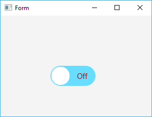
upload_2018-11-6_22-42-44.png

The animation duration is set, but you could very easily add a designer property to allow changing it in the Designer. The 3 components can be styled in the css file included in the project.

Don't forget to add the Stylesheet to an appropriate place.
 

Attachments

  • ToggleSwitch.zip
    3.4 KB · Views: 524
Last edited:

ThRuST

Well-Known Member
Licensed User
Longtime User
Well done Steve. The CSS support makes it a winner no doubt. Throw in a method so it can be accessed and put on a form.
It doesn't have to use 20+ properties just a few for the basic functionality then turn it into a library. Then I can spice it up with some CSS themes.
Here we go again :)
 

ThRuST

Well-Known Member
Licensed User
Longtime User
Something like

B4X:
ToggleSwitch.Initialize(xpos,ypos,height,width)
Log(ToggleSwitch.State)

showing 0 or 1
 

ThRuST

Well-Known Member
Licensed User
Longtime User
Can it perhaps be added to the components in the internal designer? That would be great.
 

stevel05

Expert
Licensed User
Longtime User
It is already a custom view, you can add it with the designer. You can get the selected state with the Selected method.

B4X:
Log(ToggleSwitch1.Selected)

If you want to add it in code add this sub to the class:

B4X:
Public Sub Create(Selected As Boolean, Width As Double, Height As Double)
    Dim P As Pane
    P.Initialize("Base")
    P.SetSize(Width,Height)
    Dim Lbl As Label
    Lbl.Initialize("")
    Lbl.Font = fx.DefaultFont(13)
    Lbl.Alignment = "CENTER"
  
    Dim M As Map = CreateMap("Selected":Selected)
    DesignerCreateView(P,Lbl,M)
  
End Sub

And Initialize and call the create Sub and add it to a pane in your layout :
B4X:
    ToggleSwitch2.Initialize(Me,"ToggleSwitch2")
    ToggleSwitch2.Create(True,100,40)
  
    MainForm.RootPane.AddNode(ToggleSwitch2.GetBase,10,200,ToggleSwitch2.GetBase.PrefWidth,ToggleSwitch2.GetBase.PrefHeight)

You can compile it to a library if you wish.
 

ThRuST

Well-Known Member
Licensed User
Longtime User
I made some changes to your first version. This is what my version looks like

ToggleSwitch_OFF.JPG
ToggleSwitch_On.JPG


And the source code is attached. Let me know what you think of it.
You might work on it from there :)
 

Attachments

  • ToggleSwitch v02.zip
    44.1 KB · Views: 393

ThRuST

Well-Known Member
Licensed User
Longtime User
The iphone design for the background might look good with the Glass grey design for the circle. There's many options since it supports CSS :)
 

ThRuST

Well-Known Member
Licensed User
Longtime User
I made a final change to this. You can improve it from this one, it's the best so far. I hope you agree Steve :)

off.JPG
on.JPG
 

Attachments

  • ToggleSwitch v03.zip
    44.5 KB · Views: 382

ThRuST

Well-Known Member
Licensed User
Longtime User
And here's the magic formula

/* ToggleSwitch code by Steve05 CSS by ThRuST 2018-11-07 */

.togglebutton-base
{

-fx-background-color:
#c3c4c4,
linear-gradient(#d6d6d6 50%, white 100%),
radial-gradient(center 50% -40%, radius 200%, #e6e6e6 45%, rgba(230,230,230,0) 50%);
-fx-background-radius: 30;
-fx-background-insets: 0,1,1;
-fx-text-fill: black;
-fx-effect: dropshadow( three-pass-box , rgba(0,0,0,0.6) , 3, 0.0 , 0 , 1 );
}

.togglebutton-circle
{

-fx-background-color:
#c3c4c4,
linear-gradient(#d6d6d6 50%, white 100%),
radial-gradient(center 50% -40%, radius 200%, #e6e6e6 45%, rgba(230,230,230,0) 50%);
-fx-background-radius: 30;
-fx-background-insets: 0,1,1;
-fx-text-fill: black;
-fx-effect: dropshadow( three-pass-box , rgba(0,0,0,0.6) , 3, 0.0 , 0 , 1 );
}

.togglebutton-label
{
-fx-text-fill: Black;
-fx-effect: dropshadow( one-pass-box , white , 0, 0.0 , 0 , 1 );
}

.togglebutton-label-selected
{
-fx-text-fill: Black;
-fx-effect: dropshadow( one-pass-box , white , 0, 0.0 , 0 , 1 );
}
 

stevel05

Expert
Licensed User
Longtime User
Yes, looks good.
 

ThRuST

Well-Known Member
Licensed User
Longtime User
Thanks, well done on the code. Seems like we can do magic together. Athena is a good example on that. I'll use this one since it turned out so well. I bid you a good night oh you master of allmightyness :)
 

ThRuST

Well-Known Member
Licensed User
Longtime User
Steve, one more thing, I just noticed that I had to click two times on it when it starts before it triggers. Can you please correct that. Tomorrow, now we'll sleep :)
 

stevel05

Expert
Licensed User
Longtime User
It doesn't happen for me.
 

ThRuST

Well-Known Member
Licensed User
Longtime User
Now this is interesting. When I run it in Debug mode the text "Off" flashes one time. The text dissapears very quickly just to show again. The next time I click it work like it should. When I run it in release mode it works as it should, but it moves from Off to On automatically when the application is started.
I am using JDK v9.0.4. Will try with v1.8.0 191 real quick.
 

ThRuST

Well-Known Member
Licensed User
Longtime User
Tested to change to JDK v1.8.0 191 and it behaves the same like with JDK v9.0.4. I hope this helps you find what's causing this. I use B4J v6.51.
 

ThRuST

Well-Known Member
Licensed User
Longtime User
It works as it should in Release mode when this is added

B4X:
Sub AppStart (Form1 As Form, Args() As String)
    MainForm = Form1
    MainForm.RootPane.LoadLayout("1") 'Load the layout file.
    MainForm.Stylesheets.Add(File.GetUri(File.DirAssets,"ToggleSwitch.css"))
    MainForm.Title = "ToggleSwitch by Steve05 CSS by ThRuST"
    MainForm.Show
    
    ToggleSwitch1.Selected = True 'or False
    Log("Button is in state : " & ToggleSwitch1.Selected)
End Sub

Mission completed. Over and out. Goodnight :)
 

stevel05

Expert
Licensed User
Longtime User
Now this is interesting. When I run it in Debug mode the text "Off" flashes one time. The text dissapears very quickly just to show again. The next time I click it work like it should. When I run it in release mode it works as it should, but it moves from Off to On automatically when the application is started.
I am using JDK v9.0.4. Will try with v1.8.0 191 real quick.
This is because it is set to Selected in the Designer, the default is False, so it moves to the selected state once it is loaded.
 
Last edited:

ThRuST

Well-Known Member
Licensed User
Longtime User
Hi Steve, I've updated your code to turn it into an official library that starts with v1.0. Please make the neccessary changes and attach this in the first post so everybody can see it. Take a look and let me know what you think :)

UPDATE
I made some modification to Steve's code and updated it to v1.3.
Here's the changes I've made

v1.3 changelog
v1.0 Had a type definition bug that were corrected
v1.1 Removed a log in the class and in my own sub that looked confusing
v1.2 Some fixes
v1.3 Added a new sub called MoveSpeed

Improved CSS theme
Subs ShowTextOnOff, SetText and MoveSpeed.

ShowTextOnOff
Toggles showing button text on/off
Usage ToggleSwitch1.SetTextOnOff (True/False)

example
ToggleSwitch1.ShowText = False
(In case you just want to use the button for a custom design with text somewhere else)

SetText

Sets the ToggleSwitch button text
Pass 2 arguments default text is "Off" and "On"

example
ToggleSwitch1.SetText("Offline","Online")
(Convenient if you want to override the default Off/On text)

MoveSpeed
Sets the speed of the scrolling circle (dot)

example
ToggleSwitch1.MoveSpeed(200)
(Default speed is 300. Lower values for faster movement, higher value for slower movement)
 

Attachments

  • ToggleSwitch Lib v1.3.zip
    359.6 KB · Views: 403
Last edited:

ThRuST

Well-Known Member
Licensed User
Longtime User
Ops just change the line 24 ToggleSwitch1.Selected = False ' or False into True or False and add your changes if you want, then put it up on the first post.
 
Top