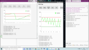
Chart analysis

peacemaker

Expert
Licensed User
Longtime User
Hi, All

If to have a chart, i mean, the data table with 2 columns, say weather temperature per hour - it would be good to have an analysis code that can check the data changing trend and return some result.
Say, "Temperature is rising during 5 hours", or "Warning: sudden freeze for -20 degrees during 5 hours !" ...

Any ready lib or code module for such analysis ?
 

hatzisn

Well-Known Member
Licensed User
Longtime User
According to my knowledge no. You will have to google for ways to calculate mathematical trends or best fits. In the university the only analysis for best fit they taught us was mean squares. Please also note that according to the number of points in chart and position of each point in graph (as it is logical - f.e. the ten first points or the ten last) this best fit line changes. I get the feeling though that this is not what you need.
 

peacemaker

Expert
Licensed User
Longtime User
I see that 5 results we can check for the given time interval:
  1. Rising trend with max Y-value
  2. Falling trend with min Y-value
  3. Wobbling around a middle Y-value
  4. Existing maximum during this period at X point with Y-value
  5. Existing minimum during this period at X point with Y-value
 
Last edited:

hatzisn

Well-Known Member
Licensed User
Longtime User
According to my knowledge no. You will have to google for ways to calculate mathematical trends or best fits. In the university the only analysis for best fit they taught us was mean squares. Please also note that according to the number of points in chart and position of each point in graph (as it is logical - f.e. the ten first points or the ten last) this best fit line changes. I get the feeling though that this is not what you need.

Lost it. I translated the Greek word "ελάχιστα" which is correctly translated as least to min and I wrote it wrong also. It is least squares.
 

peacemaker

Expert
Licensed User
Longtime User
B4X:
Dim SubIntervals_qty as int = 10   'the source period is divided into this number parts [ i] (iterable) to compare them
Dim OverallAVG as float    'average Y-value of the whole period
Dim DeltaYPercent as Int = 0.2  'allowed Y-range

  1. Rising trend with max Y-value: if AVG(Y)[i+1] >= AVG(Y)[ i]
  2. Falling trend with min Y-value: if AVG(Y)[i+1] <= AVG(Y)[ i]
  3. Wobbling around a middle Y-value: if AVG(Y)[ i] >= OverallAVG * (1-DeltaYPercent) and AVG(Y)[ i]<= OverallAVG * (1 + DeltaYPercent)
  4. Existing maximum during this period at X point with Y-value: .... need to think :)
  5. Existing minimum during this period at X point with Y-value .... need to think :)
 
Last edited:

hatzisn

Well-Known Member
Licensed User
Longtime User
Here is a video for the least squares method for calculating the best fit:


peacemaker

Expert
Licensed User
Longtime User
video for the least squares method
No, it's approximation subject, getting the similar math function of the data set.
But analysis is needed...
 

hatzisn

Well-Known Member
Licensed User
Longtime User
I am not familiar with mathematical trend analysis and I thought that this would help you. Maybe a best fit in a rolling mean (as @aeric already suggested) chart would do the job?
 
Last edited:

rabbitBUSH

Well-Known Member
Licensed User
Hunt around the meteorology part of the Web - there are many weather station installs with software and graphs that would do this. But IMHO a decent graph presentation would do the same thing. I have my own weather site and the graphs do the trick. But if you want to send a notice to users or just have a text based weather thingy - the Met guys will have something.
 

rabbitBUSH

Well-Known Member
Licensed User
What you're asking about seems to be Time Series Analysis there are books and books about that in the climate literature...
Google is your friend for that.

 
Top