Android Code Snippet Drawing Borders around Buttons and Spinners

Here is an easy way to give the appearance of a border around a button or spinner.

Quite simply you pass the name of a panel and the code adds a panel of a given color behind the view in question giving the illusion of a border.

This is the function.
B4X:
    'Draws a border around all the given Buttons, Spinners and Imageviews on a Panel
    'PanelName = Panel to process
    'Border = border width, i.e. 3dip or 1%x
    'BorderColor = color of the border.  This is actually the color of the panel that is being used
    'Exclusions = a text list of views to not process using the Tag value i.e. "btnStart,btnIgnore".  All other views will be processed
    Sub Draw_Borders(PanelName As Panel, Border As Int, BorderColor As Int, Exclusions As String)
     
          Dim matcher1 As Matcher
        
          For Each v As View In PanelName.GetAllViewsRecursive
            If v Is Spinner OR v Is Button OR v Is ImageView Then
               
                matcher1=Regex.Matcher(v.Tag,Exclusions)
                If matcher1.find = False OR Exclusions.Length = 0 Then
                    Dim pnlBack As Panel
                    pnlBack.Initialize("")
                   
                    PanelName.Addview(pnlBack, v.Left - Border, v.Top - Border, v.Width + Border*2, v.Height + Border*2)
                    pnlBack.SendToBack
                    pnlBack.Color = BorderColor
                End If   
            End If
        Next

    End Sub

Call the function with this kind of syntax
B4X:
Draw_Borders(pnlSessionStart, 2dip, Colors.White,"tbServe")

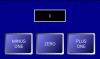
You will get something that looks like this with white borders around the spinners and buttons.
Screenshot_2014-10-27-10-37-41.png
 

Gary Milne

Active Member
Licensed User
Longtime User
No, I did not know that. I just installed 4.3 2 days ago as I was gone for a while. I will take a closer look at it. I'll always use the built in solution if I have that option.
 

Guardian17

Active Member
Licensed User
Longtime User
Thank you, Gary, for providing this method of adding a border to views. Your method allows more options -- you can use gradients on the buttons, as opposed to a gradient button which on its own does not currently allow for a border.

I've gone a step further and allowed the background panel to be a ColorDrawable, which will allow for putting a radius on the border:

B4X:
Sub Draw_Borders(PanelName As Panel, PanelColor As Int, Border As Int, BorderColor As Int, Exclusions As String)
    'Draws a border around all the given Buttons, Spinners and Imageviews on a Panel
      'PanelName = Panel to process
      'PanelColor = Color of panel inside its border
      'Border = border width, i.e. 3dip or 1%x
      'BorderColor = color of the border of the Panel.
      'Exclusions = a text list of views to not process using the Tag value i.e. "btnStart,btnIgnore".  All other views will be processed
  Dim matcher1 As Matcher
    Dim cd As ColorDrawable
    'cd.Initialize2(PanelColor as Int, CornerRadius as Int, BorderWidth as Int, BorderColor as Int)
    cd.Initialize2(PanelColor,5dip,5dip,BorderColor) '<<<<

  For Each v As View In PanelName.GetAllViewsRecursive
    'If v Is Spinner OR v Is Button OR v Is ImageView Then
    If v Is Button Then
      matcher1=Regex.Matcher(v.Tag,Exclusions)
      If matcher1.find = False OR Exclusions.Length = 0 Then
        Dim pnlBack As Panel
        pnlBack.Initialize("")
        PanelName.Addview(pnlBack, v.Left - Border, v.Top - Border, v.Width + Border*2, v.Height + Border*2)
                pnlBack.SendToBack
        'pnlBack.Color = BorderColor
        pnlBack.Background = cd
      End If
    End If
  Next
End Sub

I've uploaded a sample app, TestBorder.zip, that shows how this works. And this is how the buttons appear in that app:

upload_2015-4-5_8-4-43.png


Note that I added a "PanelColor" to the argument list. And since I've married the ColorDrawable.initialize2 in this code, if you were to change the call to your Sub from

B4X:
    Draw_Borders(Panel1, Colors.Yellow, 5dip, Colors.Yellow, "")

to be:

B4X:
    Draw_Borders(Panel1, Colors.Blue, 10dip, Colors.Yellow, "")


this is the result for the buttons, having two colors for the border:

upload_2015-4-5_8-24-59.png


I then went an additional step further and made the background panel a GradientDrawable (see TestGradientColorBorder.zip):

B4X:
Sub Draw_Borders(PanelName As Panel, Border As Int, BorderColor As Int, Exclusions As String)
    'Draws a border around all the given Buttons, Spinners and Imageviews on a Panel
      'PanelName = Panel to process
      'Border = border width, i.e. 3dip or 1%x
      'BorderColor = color of the border of the Panel.
      'Exclusions = a text list of views to not process using the Tag value i.e. "btnStart,btnIgnore".  All other views will be processed
  Dim matcher1 As Matcher
  Dim gd As GradientDrawable
  Dim clrs(2) As Int
  clrs(0) = BorderColor
  clrs(1) = Colors.RGB(50,50,50)
  gd.Initialize("BR_TL",clrs)
  gd.CornerRadius = Border

  For Each v As View In PanelName.GetAllViewsRecursive
    'If v Is Spinner OR v Is Button OR v Is ImageView Then
    If v Is Button Then
      matcher1=Regex.Matcher(v.Tag,Exclusions)
      If matcher1.find = False OR Exclusions.Length = 0 Then
        Dim pnlBack As Panel
        pnlBack.Initialize("")
        PanelName.Addview(pnlBack, v.Left - Border, v.Top - Border, v.Width + Border*2, v.Height + Border*2)
                pnlBack.SendToBack
        'pnlBack.Color = BorderColor
        pnlBack.Background = gd
      End If
    End If
  Next
End Sub


This removes my added "PanelColor" from the argument list since it's not used for the gradient background.
I really like this version because it makes the border look more like a 3D bevel, and makes the button itself appear like it's much more in the foreground:

upload_2015-4-5_8-44-10.png


Hope you find this useful
 

Attachments

  • TestBorder.zip
    13 KB · Views: 370
  • upload_2015-4-5_8-9-19.png
    upload_2015-4-5_8-9-19.png
    30.6 KB · Views: 348
  • TestGradientColorBorder.zip
    13.1 KB · Views: 374
Last edited:

Guardian17

Active Member
Licensed User
Longtime User
Hmmmm... Something that I don't have an answer for ...

If the buttons have different sizes (I changed the sizes of the buttons in Layout1), the following can happen:

upload_2015-4-5_11-58-37.png


Does anyone understand why this happens and what would fix it?
 

Guardian17

Active Member
Licensed User
Longtime User
Ah, silly old me ... the GradientDrawable has to be determined inside the For Loop for EACH view:

B4X:
Sub Draw_Borders(PanelName As Panel, Border As Int, BorderColor As Int, Exclusions As String)
    'Draws a border around all the given Buttons, Spinners and Imageviews on a Panel
      'PanelName = Panel to process
      'Border = border width, i.e. 3dip or 1%x
      'BorderColor = color of the border of the Panel.
      'Exclusions = a text list of views to not process using the Tag value i.e. "btnStart,btnIgnore".  All other views will be processed
    Dim matcher1 As Matcher

  For Each v As View In PanelName.GetAllViewsRecursive
    'If v Is Spinner OR v Is Button OR v Is ImageView Then
    If v Is Button Then
      matcher1=Regex.Matcher(v.Tag,Exclusions)
      If matcher1.find = False OR Exclusions.Length = 0 Then
        Dim pnlBack As Panel
        pnlBack.Initialize("")
        PanelName.Addview(pnlBack, v.Left - Border, v.Top - Border, v.Width + Border*2, v.Height + Border*2)
                pnlBack.SendToBack
        'pnlBack.Color = BorderColor
        Dim gd As GradientDrawable
        Dim clrs(2) As Int
        clrs(0) = BorderColor
        clrs(1) = Colors.RGB(50,50,50)
        gd.Initialize("BR_TL",clrs)
        gd.CornerRadius = Border
        pnlBack.Background = gd
      End If
    End If
  Next
End Sub

Now we get:

upload_2015-4-5_12-13-19.png


Although I'm not quite sure why the ZERO button did not have a very large panel behind it before making this correction.
 
Last edited:

Gary Milne

Active Member
Licensed User
Longtime User
Nice add Guardian17, thanks for sharing. I will try that out. I think B4A is a great RAD tool but it's hard to get a really polished looking app. I think this is quite a simple solution that is very helpful in achieving that.
 

Beja

Expert
Licensed User
Longtime User
Gary and Guardian17, thanks for sharing this important additions..
@Guardian17: Sorry I didn't try this, but may I ask about the light source of the border? Is the current implementation built-in or can be changed like in any gradient property?
because now it is coming from bottom-right instead of top-left.. The panel light source is ok and it is coming from the top-left.
 

Gary Milne

Active Member
Licensed User
Longtime User
Gary and Guardian17, thanks for sharing this important additions..
@Guardian17: Sorry I didn't try this, but may I ask about the light source of the border? Is the current implementation built-in or can be changed like in any gradient property?
because now it is coming from bottom-right instead of top-left.. The panel light source is ok and it is coming from the top-left.

The "light source" is controlled by the direction of the gradient.
gd.Initialize("BR_TL",clrs)
In this case it is BR_TL, or bottom right to top left.
 

Beja

Expert
Licensed User
Longtime User
Thanks Gary for the clarification..
The Windows standards is Top-Left.. but it's not important if the inside button was the same, but the button followed Windows, so now we have two sources of the light.
 

Guardian17

Active Member
Licensed User
Longtime User
Thanks for answering for me, Gary.

Yes, the light source is as Gary says, and that can be changed to any of the eight possible directional gradients.

Also, the gradients of the faces of the buttons are handled currently in the Designer Layout, and for that, I reverse the gradient between pressed and enabled to also give the buttons a "shadowed press" visual effect.

And the "brightness" of the lit bezel works best when you specify a bright color for BorderColor. Darker BorderColors will not be as vibrant.

Glad you all like these effects, and thanks again Gary for the initial post.
 
Last edited:

Guardian17

Active Member
Licensed User
Longtime User
The Windows standards is Top-Left.. but it's not important if the inside button was the same, but the button followed Windows, so now we have two sources of the light.
I don't see this as being two sources of light. If you take the source of light as ONLY TOP-LEFT, then this makes the button face a curved face with the light hitting the top left, and the border is then an angled bevel "into the screen", and as such, the "bottom right" of the bevel receives more light than the "top left" due to the bevel angle.

The application of the reverse gradients on the button face between "enabled" and "pressed" makes the button itself act like a "rubberized button", in that when you press the rubber face, it gets pressed in enough to cause the bottom right to receive more light.
 
Top