Immerse yourself in an exciting journey through time with the Billboard Hot 100 music charts from 1951 to the present day.
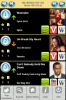
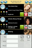
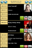
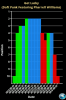
You can view weekly and yearly charts (first 10 tracks) and statistics with summary and details, search by title, artist or album, link to Wikipedia informations, Vevo or YouTube videos, listen to Spotify music.
A charming way to remember the songs and artists that have accompanied your life and awaken emotions and memories.
N.B.: You can use this application offline, but you will need an internet connection for artists images and audio/video contents. Use of the above mentioned linked external applications is optional and is subject to the respective terms of use.
Free Version : https://play.google.com/store/apps/details?id=tecware.mtmhot100free
A new Online Version that retrieves data from a MySQL DB Server is here :
http://www.amazon.com/gp/mas/dl/android?p=tecware.mtmhot100online
Attachments
Last edited: