Advice on colors

jschuchert

Active Member
Licensed User
Longtime User
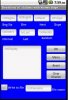
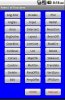
There are no right or wrong answers for this one and I know it is very subjective but I want to jazz up my application a bit. I think it is pretty boring with a solid color background and default colors for the buttons. It is a commercial app with lots of numbers and maybe the user couldn't care less but if it is pleasing to the eye, it might attract more attention.

There are 30 activities, each of which have multiple views, including edittexts, buttons and a few checkboxes. I saw some results of what Klaus did with gradient colors and they made quite a difference so that's the direction I want to go. Here is the advice I need:

1. Use same gradient or solid background for all activities or mix it up a little?
2. Which colors seem to conservatively blend the best?
3. Use same color for buttons throughout or mix them in same activity?
4. Save space by eliminating labels where possible and using 'hint' text with compatible color instead?
5. Will most devices essentially show the same colors as designed? (My tablet is very close with the emulator).
6. Advice/opinion for anything I might have overlooked or considered will be appreciated.

Even though the app is completed and "out there", this is something I think I still need to do. I know it will take a lot of time so if any of you have some short cut tips for me, please offer them. I sincerely value the opinions of everyone on this forum. You have saved my bacon countless times. Thank you.

Jim
 

klaus

Expert
Licensed User
Longtime User
Hi Jim,

I will give you my feeling.

1. I would change the background color for different activies, but trying to have same or similar colors for similar functions or purposes.
2. Everybody has its own color preferences. For me, it depends also on, what kind of program it is. For a game, bright colors would be better, for other programs I prefer dark colors.
3. I try to have a same color for same or similar functions throughout the whole program.
4. I wouldn't do it, because you only see the hint text when the EditText is empty. If you show a certain number of variables for editing and the views have already values in there, the user doesn't know what variable is on what place.
5. I don't know.

The user interfaces I made in Windows and also with B4PPC were always buttons with a self explainig image, no text, but a tooltip explaining more precicely the buttons function. The advantage was that you could have many buttons in a relatively small space.
With the finger driven devices, buttons must have a bigger size, so with numerus buttons on a page they consume much space.
Unfortunately B4A doesn't have the touch event for buttons (yet?) which is necessary to create tooltips as I want them. Touch down shows the tooltip, touch up removes the tooltip and the function is executed only if the the cursor is inside the button area. This way it is possible to touch the button to see what its function is, move the cursor (finger) outsides the button and release it without executing the function. As soon as B4A will have the touch event for buttons I will go back doing it that way.

Of course, this is just one opinion.

Best regards.
 
Upvote 0

Merlot2309

Active Member
Licensed User
Longtime User
Hello Jim,

I go along with Klaus´ ideas and want to add that, in case it´s not a game,
I would keep it stylish; not to many colors.
It also depends on the users. Is it a specific group?

If you give some screenshots it's much easier to give ideas.

Greets,
Helen.
 
Upvote 0

jschuchert

Active Member
Licensed User
Longtime User
A typical screen shot is attached.

So far as 'hint' vs labels...there will only be 1 entry per edittext.

Klaus and Helen, thank you so much for your advice.

Jim
 

Attachments

  • grades.jpg
    grades.jpg
    28.6 KB · Views: 240
Upvote 0

jschuchert

Active Member
Licensed User
Longtime User
This is the main view where a particular routine is selected. May have to leave this alone since there is not a lot of extra room. I have noticed that using drawable colors and gradients increases the button size.

Jim
 

Attachments

  • menu.jpg
    menu.jpg
    36.5 KB · Views: 240
Upvote 0

Merlot2309

Active Member
Licensed User
Longtime User
Hi Jim,

I think it´s looking good and functionality is the most important issue in your app.

The department peanuts:
- A darker blue background
- If there are groups in the routine screen you could add lines or border groups.

Also would put the labels above the edit fields (the first screenshot), because that is the most common.

I also would like to ask you if it´s important to know the value of the routine boxes. No harm is done when a wrong value is entered?

Someone once made a calculator for fuel (I think it was in B4PPC) without labels for the values, so it was not clear if the value was gallons or liters.
Only remember this because there was an airplane crash (a long, long time ago) because they mixed up these values.
Do I sound dramatic seeing height and slope in your app?

Success,

Helen.
 
Upvote 0

jschuchert

Active Member
Licensed User
Longtime User
Klaus, thank you for checking the button sizes. Reducing the height from 40 to 35 will allow the gradient colors.

Helen,
The dark blue sounds good. I used the grouping concept with my desktop version and somewhat with the b4ppc version. I will look at possibly using panels for the groups. Not familiar with how to make the borders you mentioned.

I have always looked for labels beneath the item but perhaps I should consider the other alternative. Incidentally, I am still kicking around the 'hint' text/color idea. I did some of this with b4ppc when I just didn't have any room left for labels. However, I had to include code and another button to restore the hint. It looks like with b4a the hints return automatically. I would like some more feedback about this concept before I do anything.

My users are/will be surveyors and engineers who are familiar with the units of measurement used so I don't think further clarification will be necessary. I doubt anyone would enter inches vs feet and it doesn't matter with metric except in the calculation of the area, which I have allowed for. In addition, I have included a 'distance multiplier' for a user to adjust to the units they are more familiar with. The instruction manual (text version within the app) details each routine specifically. I remember the instance with the fuel calculations problem you cited.

I don't have a 'height' entry but the 'slope' is the amount of rise or fall from horizontal per 100 feet expressed in percentage.

Again, thank both of you for your input. Unfortunately, the buck stops with me so now I must decide and go to work.

Jim
 
Upvote 0

hdtvirl

Active Member
Licensed User
Longtime User
Change the properties of a button created with the Designer.

Hello, this might seem like a stupid question but I am going to ask it anyway.

I am writing an application which has a panel with 31 buttons on it, and depending on a user selection I want to change the background gradient colours (the same two colours for each button) for all the buttons on the Panel. I have setup the button with a gradient (gradientDrawable) background with a TOP_BOTTOM. Their initial setting is black and white as default but I want to chage these as the users makes a selection.

The question is is it possible to get at all the methods of a button created using the designer programatically ?.

If so would it be possible to give some example.

Thanking you in advance.

BOB.:sign0104:
 
Upvote 0

Harris

Expert
Licensed User
Longtime User
These attachments (and zip file) show examples of a business app where clarity is essential. Large buttons (few buttons), simple text, appropriate colors (debatable), smooth gradiants, use of images, nice scroll and list views.

Some labels have a gradiant and rounded background frame to group columns. Panels group button controls.

These forms work great on tablets with large screen res (800x480 and up). This was developed on a 1024x600. Show me how to get this to fit a phone...???

Background images of the activity panels were cropped from pictures taken in Wells Gray Park, BC. One is of a gravel beach on Azure Lake (Rainbow Falls) - makes a nice mottled gray look. Another is the waters surface with mountain evergreen trees reflection. Be creative - its fun as well as productive - just like all of B4A.
 

Attachments

  • Define (Medium).jpg
    Define (Medium).jpg
    59.5 KB · Views: 201
Upvote 0
Top