The visual designer includes two features that help you target devices with different screen sizes and scales: layout variants and designer scripts.
A single layout file can include multiple variants. At runtime the best match variant, based on the device screen size and scale, is used. The variants differ in the views location and size.
Note that views position and size is scaled automatically based on the device scale (dots per inch).
For example you can add one variant for a portrait phone and one for a landscape phone. When the orientation changes the layout will be set based on the current device values.
You can also add script code to a specific variant.
When you press on the Create variant button you will see the following dialog:
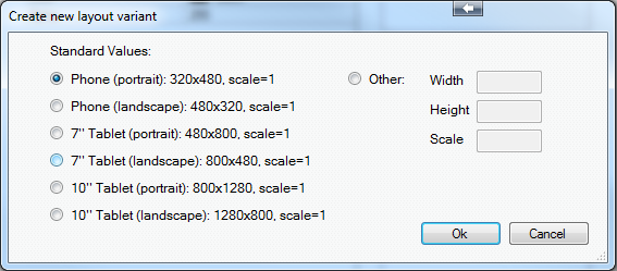
These are the recommended variants. In most cases it is not recommended to add other variants, especially not to add variants with scale different than 1.
For example the Samsung Galaxy Nexus screen data is: 720x1184, scale=2 (320 dpi). While this may look completely different than the default phone which is: 320x480, scale=1 (160 dpi), if you calculate the normalized values of the Galaxy Nexus, its layout actually matches: 360x592, scale=1 (160 dpi). This means that it is slightly wider and longer than the default phone size. It should be easier to handle these differences in the designer script.
The abstract designer is a useful tool to quickly test your layout and script. Note that unlike the compiled program, the abstract designer and the wysiwyg designer will always show the current chosen variant which can be different than the best match variant.
A single layout file can include multiple variants. At runtime the best match variant, based on the device screen size and scale, is used. The variants differ in the views location and size.
Note that views position and size is scaled automatically based on the device scale (dots per inch).
For example you can add one variant for a portrait phone and one for a landscape phone. When the orientation changes the layout will be set based on the current device values.
You can also add script code to a specific variant.
When you press on the Create variant button you will see the following dialog:
These are the recommended variants. In most cases it is not recommended to add other variants, especially not to add variants with scale different than 1.
For example the Samsung Galaxy Nexus screen data is: 720x1184, scale=2 (320 dpi). While this may look completely different than the default phone which is: 320x480, scale=1 (160 dpi), if you calculate the normalized values of the Galaxy Nexus, its layout actually matches: 360x592, scale=1 (160 dpi). This means that it is slightly wider and longer than the default phone size. It should be easier to handle these differences in the designer script.
The abstract designer is a useful tool to quickly test your layout and script. Note that unlike the compiled program, the abstract designer and the wysiwyg designer will always show the current chosen variant which can be different than the best match variant.