Android Question MPAndroidCharts - Spurious horizontal lines

AlpVir

Well-Known Member
Licensed User
Longtime User
I started using the library MPAndroidCharts in question but in the example (post # 7)
https://www.b4x.com/android/forum/t...st-library-v1-18-in-post-1.58017/#post-366818
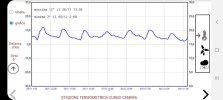
but the final result of the graph in the upper left shows some spurious horizontal lines. How are they born and above all how to avoid them appearing ?

Righe doppie.jpg
 

Johan Schoeman

Expert
Licensed User
Longtime User
Upvote 0

AlpVir

Well-Known Member
Licensed User
Longtime User
The red lines are spurious. The Y spacing must be 40 pixels and due to the spurious lines there is confusion (sometimes it is not 40 pixels)
I use Android 11, targetSdkVersion=29 or 30, screen 2400x1080 pixels, library 1.18
Righe doppie.jpg
 
Upvote 0

AlpVir

Well-Known Member
Licensed User
Longtime User
I'm sorry but there are no instructions (in the sense that they do not exist, they are not provided in the library)
B4X:
mlc1.HorizontalGridColorLeft = Colors.Cyan
mlc1.HorizontalGridColorRight = Colors.Transparent
I am using the mpChartLib vers. 1.18. Is it really the most recent?
I enclose another example
Righe doppie 2.jpg
 
Upvote 0

AlpVir

Well-Known Member
Licensed User
Longtime User
Maybe I haven't made myself clear.
In post # 1 I reported the result (a part of a screenshot, as it appears on my smartphone) of the example of which I have provided the link also in post # 1.
In post # 3 I highlighted in red the horizontal lines that MUST NOT APPEAR (they generate confusion and are in any case an error)
In post # 5 I reported another example with horizontal lines that I call "spurious", useless, that create confusion.
The library is very interesting, very good for the rest and I would like to use it.
But I don't know how to remedy the defect reported here.
The suggestion to use multilinechart does not seem valid to me because I am interested in viewing ONLY ONE GRAPH. Also the reference to the color (mlc1.HorizontalGridColorLeft = Colors.Cyan) makes me suspect that my problem has not been understood (I have indicated the spurious lines in red).
Can you help me simply by correcting the example cited ?
Thank you in advance.
 
Upvote 0

Johan Schoeman

Expert
Licensed User
Longtime User
Maybe I haven't made myself clear.
In post # 1 I reported the result (a part of a screenshot, as it appears on my smartphone) of the example of which I have provided the link also in post # 1.
In post # 3 I highlighted in red the horizontal lines that MUST NOT APPEAR (they generate confusion and are in any case an error)
In post # 5 I reported another example with horizontal lines that I call "spurious", useless, that create confusion.
The library is very interesting, very good for the rest and I would like to use it.
But I don't know how to remedy the defect reported here.
The suggestion to use multilinechart does not seem valid to me because I am interested in viewing ONLY ONE GRAPH. Also the reference to the color (mlc1.HorizontalGridColorLeft = Colors.Cyan) makes me suspect that my problem has not been understood (I have indicated the spurious lines in red).
Can you help me simply by correcting the example cited ?
Thank you in advance.
add this to your code:
B4X:
    mlc1.YaxisMinVal = -1.2
    mlc1.YaxisMaxVal = 1.2

....else it will autoscale the left and right axis independantly.

As a side note - you can also show only one graph when using multi linechart.

The graph below is however from the single line chart part of the library i.e the one that you are using.

4.png
 
Last edited:
Upvote 0

Mahares

Expert
Licensed User
Longtime User
Solution suggestion. Thanks !
IF you are looking for another route, xChart is xplatform and extremely powerful. Or , you may post your data and code and allow members to help you. I am surprised klaus didn't jump on this yet. I am sure you already took a look at the library thread.
 
Upvote 0

klaus

Expert
Licensed User
Longtime User
I am surprised klaus didn't jump on this yet.
I did not jump into this because the question was about an existing library.
And 'promotion' made by a user has, in my opinion, a better impact than promotion made by the author.
 
Upvote 0

AlpVir

Well-Known Member
Licensed User
Longtime User
It has nothing to do with the title of this place but I hope to have further help in reference to what is turning out to be a great bookshop.
On the X axis I have some kind of values 1637971200000, 1637974800000, 1637978400000 1637982000000, etc.
They are clearly ticks and I would prefer them to be displayed in the usual form "04/12/2021 07:00" or similar.
It's possible ?
Similarly on the Y axis I have some type values 27.0, 26.0, 30.0, etc.
Would it be possible to view them without the decimal place (27, 26, 30, etc) ?
If one or both of these issues could not be possible I would suggest to the author of this library to implement this possibility in the future.
Thanks again in advance.
[EDIT]
I solved the problem on the X axis with a simple DateTime.DateFormat = "dd / MM H: mm" statement. However (see example) the dates and times are a bit "messy".
 

Attachments

  • perb4a.jpg
    perb4a.jpg
    44 KB · Views: 117
Last edited:
Upvote 0
Top