Android Question mpChartLib

Cenny

Active Member
Licensed User
Longtime User
Hi,

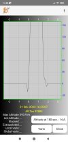
When feeding altimeter data into an app using mpChartLib it gives this graph 274853126_386781039945237_5757681009341568731_n.jpg
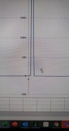
However when I import the data into a csv file it yields 274378014_643006840316747_8379147511068118479_n.jpg
As you can see there is a difference at the bottom.
Anyone an idea what might cause the negative spikes in the mpChartLib graph?

Cenny
 

klaus

Expert
Licensed User
Longtime User
Looking at the tow images it seems that in the first one the points are joint with cubic splines and in the secondone with straight lines.
Meaning cubic lines through the data points, removing the 'knees' in the line ?
This might be a property of the chart.

Example:
Blue: points joined with straight lines.
Red: points joint with cubic splines.
This happen when there are big and steep changes.
1646140917055.png
 
Upvote 0

Johan Schoeman

Expert
Licensed User
Longtime User
@klaus is probably correct. See if you have these two lines in your code

B4X:
mlc1.DrawCubicGraph = True
mlc1.CubicIntensity = 0.xx

Set DrawCubicGraph to false and/or set the intensity to 0.0.

If it is not the case then upload a small sample project and I will see if there might be anything else that might cause it.
 
Upvote 0

Cenny

Active Member
Licensed User
Longtime User
Looking at the tow images it seems that in the first one the points are joint with cubic splines and in the secondone with straight lines.
Meaning cubic lines through the data points, removing the 'knees' in the line ?
This might be a property of the chart.

Example:
Blue: points joined with straight lines.
Red: points joint with cubic splines.
This happen when there are big and steep changes.
View attachment 126226
Thanks for your help.
Looking at the tow images it seems that in the first one the points are joint with cubic splines and in the secondone with straight lines.
Meaning cubic lines through the data points, removing the 'knees' in the line ?
This might be a property of the chart.

Example:
Blue: points joined with straight lines.
Red: points joint with cubic splines.
This happen when there are big and steep changes.
View attachment 126226
thanks Klaus
 
Upvote 0

Cenny

Active Member
Licensed User
Longtime User
@klaus is probably correct. See if you have these two lines in your code

B4X:
mlc1.DrawCubicGraph = True
mlc1.CubicIntensity = 0.xx

Set DrawCubicGraph to false and/or set the intensity to 0.0.

If it is not the case then upload a small sample project and I will see if there might be anything else that might cause it.
Thanks for your help.
i was not aware of these
Looking at the tow images it seems that in the first one the points are joint with cubic splines and in the secondone with straight lines.
Meaning cubic lines through the data points, removing the 'knees' in the line ?
This might be a property of the chart.

Example:
Blue: points joined with straight lines.
Red: points joint with cubic splines.
This happen when there are big and steep changes.
View attachment 126226
 
Upvote 0

Cenny

Active Member
Licensed User
Longtime User
Looking at the tow images it seems that in the first one the points are joint with cubic splines and in the secondone with straight lines.
Meaning cubic lines through the data points, removing the 'knees' in the line ?
This might be a property of the chart.

Example:
Blue: points joined with straight lines.
Red: points joint with cubic splines.
This happen when there are big and steep changes.
View attachment 126226
Thanks for your help.
 
Upvote 0

Cenny

Active Member
Licensed User
Longtime User
@klaus is probably correct. See if you have these two lines in your code

B4X:
mlc1.DrawCubicGraph = True
mlc1.CubicIntensity = 0.xx

Set DrawCubicGraph to false and/or set the intensity to 0.0.

If it is not the case then upload a small sample project and I will see if there might be anything else that might cause it.
Problem solved when I follow your suggestions.
Once again thanks for the help
 
Upvote 0
Top