B4J Tutorial Simple Layout Designer (SLD) B4J application.

Simple Layout Designer (SLD) B4J application.

Check out message #31 for the latest update!

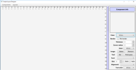
In this tutorial you can learn how to create a layout using the Simple Layout Designer application.
1676784923949.png
diagram04.png

1676785021436.png
1676785093561.png
diagram01.png


You can place labels and panes on the main pane using the components menu.

Each component can be moved to another position. When you hover over the edge or corner of the component (blue edge) then you can click and drag that edge or corner to resize the component.

The order of creating the components is important because the last created component can be placed on top of another component. Labels and panes can be placed on top of a pane or another label.

You can attach labels to a selected pane by clicking on the menu item “Attach” and detach them from the pane when you don’t need the attachment any more. Components can be removed.

The layouts can be saved or loaded. The file extension is *.sld. The content is a plain JSON text (a list of maps) and can be edited outside of the application.

To select a component you just click on it. In the Component info panel you can see and change the property settings for that component.

The main pane or another selected pane can be printed. When you use a PDF printer application then you can select the paper format (A4, A3 or A2) and the orientation (portrait or landscape). When you print on a A2 paper in portrait you get 4 A4 pages! (see the sld_doc example).

The project zip-file is attached.

When you first run the application the documentation file and its images are copied to the layoutfiles and imagefiles folders from the project folder usually under C:/Users/yourname/AppData/Roaming/simple_layout_designer/.
Replace “yourname” with your actual user name.

If you load the sld_doc.sld file in the application you will see that the images do not appear yet. Click on each label, look at the image file name in the component info panel, click on the image select button and select the correct image. After all the modifications are done then you can save the layout file and replace the old sld_doc.sld file. The next time you start the application the documentation should be complete.

Now you have a tool to be creative with layouts. If you think of any improvements that need to be made, just let me know or share your additions. It would be nice if we could work together on this application to make it even better!

And of course you can find an example on how to use the layouts you create in the attached file. Unzip the sld_load_example.zip file to test it out.

Happy coding!
 

Attachments

  • sld00.png
    sld00.png
    26.5 KB · Views: 1,050
  • simple_layout_designer.zip
    270.5 KB · Views: 269
  • sld_load_example.zip
    115.4 KB · Views: 238
Last edited:

PaulMeuris

Active Member
Licensed User
This update contains a new component: button. In the designer it is just a label with an ID of "Button".
In the component info panel some things have changed.
You can now select 2 gradient colors from a named list and specify if the (linear) gradient appears horizontally or vertically.
On top of the component info panel a CustomListView appears when you click on the Select button from the gradient.
Once you set the gradient colors for a component you can't use the plain color setting anymore.
You can however set the 2 gradient colors to the same named color.
This version also contains a bug fix. When a component that is attached is dragged, there is no longer a flickering (the dragging and resizing of the children are disabled.
Some screenshots:
attached3.png


attached4.png


attached5.png
This button is made with a gray pane in the background and a label attached to the pane. The pane is 2 pixels wider and 2 pixel higher.
If you find any bugs, will you let me know?
You can find the source code in the attached zip-file.
Note: you get a free bonus: check out the "colornames.json" file in the assets.
Happy coding!
 

Attachments

  • simple_layout_designer_v6.zip
    287.3 KB · Views: 93

PaulMeuris

Active Member
Licensed User
After a week of testing and programming it is time for a new update of this tool.
1676108513716.png

The documentation ("sld_documentation.sld") has been updated and is copied the first time you start the application. As before you still have to reconnect the images. This time however you can click on each pane in the treeview and see which image you have to select (Background - Image - Select). The documentation showcases the ability of the application to produce a similar result as a publishing application.
You can find the source code in the attached zip-file.
The images used in the defaults components are copied to the imagefiles folder.
I have added a canvas drawing for a vertical line and renamed the menu items HLine (horizontal line) and VLine (vertical line). This will allow you to make a hierarchy design.
The defaults components have been used in the border_panel_example. Check it out to see how these components can be used.
In the next message i will provide some printing instructions.
Happy coding!
 

Attachments

  • simple_layout_designer_v7.zip
    123.1 KB · Views: 89
  • border_panel_example.zip
    3.9 KB · Views: 92

PaulMeuris

Active Member
Licensed User

Printing instructions using the Simple Layout Designer application.​

If you choose the print menu item then you can print the layout as it is present in the main pane.
A format setting of A4 will print the upper left region from the main pane. This region is limited to the ruler values of 12 horizontally and 17.5 vertically.
A format setting of A3 will print the upper region limited to 17.5 vertically.
A format setting of A2 will print the entire main pane region limited to 35.5 vertically.
If you print in landscape mode then these values change.
When a pane is current or active (by clicking on it directly or in the treeview pane) then this pane and all of its attached children will be printed.
Click in the component info panel Text pane on the Print pane button.
The pane will temporarily be shifted to the upper left corner (0,0) so that it comes in the A4 standard portrait range. You don’t have to change the settings then.
The standard dialog for choosing a printer will appear. In it you can choose a printer or a PDF printer application which allows you to save the printing to a PDF-file.
You can then use a PDF merge tool (for instance the Portable app PDFTKBuilderPortable) to assemble all the individual pages into a single PDF-file.
 

PaulMeuris

Active Member
Licensed User
Diagrams, diagrams, diagrams, ...
A finer grid, additional canvas drawing components, filling setting for drawings...
With this version you can make cool looking diagrams:
diagram01.png
diagram02.png

diagram03.png

diagram04.png

You can find the source code in the attached zip-file.
Happy coding!
 

Attachments

  • simple_layout_designer_v8.zip
    124.4 KB · Views: 106

PaulMeuris

Active Member
Licensed User
In this update you can use shortcut keys to cut, copy, paste and duplicate components.
There are also shortcuts for the layouts menu entries. Be careful with the CTRL+N !
shortcuts.png

These are the new menu's:
new_menus.png

The user manual has been updated and is now available in the Help menu. The version from the assets is copied every time you start the application.
You don't need to attach the images any more.
The shortcuts CTRL+X, CTRL+C and CTRL+V are standard keystrokes you can use to be more productive.
You might not be able to copy components from old layout files.
You can find the source code in the attached zip-file.
Happy coding!
 

Attachments

  • simple_layout_designer_v9.zip
    140.5 KB · Views: 94

PaulMeuris

Active Member
Licensed User
A few more shortcuts: CTRL + arrow keys (UP,DOWN,LEFT,RIGHT) that you can use in this minor update.
1676884678416.png
1676884712893.png
1676884749640.png

Thank you @xulihang for your code snippet about moving rotated panes and labels.
With the up and down arrow keys in combination with the CTRL key you can flip a component vertically (see example above).
CTRL+arrow key left allows you to rotate a component counter-clockwise by 5 degrees each time. With CTRL+arrow key right you can rotate the component clockwise by 5 degrees each time.
I think this addition can be very useful in your new design projects.
The source code is in the attached zip-file.
Happy coding!
P.S.: any suggestions for new features in this application are always welcome!
 

Attachments

  • simple_layout_designer_v10.zip
    141.2 KB · Views: 84

PaulMeuris

Active Member
Licensed User
This next update is a "cosmetic" update...
The component info panel has changed a little. When the application starts it has the component panel and the treeview panel expanded. The other panels are collapsed. So when you load a layout file and click on a component the treeview will display the component list. The structure of this list depends on the relations between the components. It will show the parents, children and grandchildren if there are any.
1677317890246.png
1677317935310.png
1677317953855.png

When you click on a component ID in the treeview panel then that component becomes the current and active component. You can verify this in the newly added statusbar.
1677318044189.png

This fixed information is not in the component panel any more.
When you click with the right mouse button on an ID in the treeview panel than the children of that component are collapsed. Right clicking on the first pane will collapse all its children and grandchildren. Click with the left mouse button on a remaining ID to expand all the children and grandchildren.
Clicking on an ID in the treeview also shows a yellow border in the main pane around that component. This way you can locate the component. You can also use the CTRL+I (info) keystrokes to show the yellow border around the active component. The border should disappear after maximum 2 seconds.
1677318181431.png

You can find the source code in the attached zip-file.
Happy coding!
 

Attachments

  • simple_layout_designer_v11.zip
    148.9 KB · Views: 86

AnandGupta

Expert
Licensed User
Longtime User
This next update is a "cosmetic" update...
The component info panel has changed a little. When the application starts it has the component panel and the treeview panel expanded. The other panels are collapsed. So when you load a layout file and click on a component the treeview will display the component list. The structure of this list depends on the relations between the components. It will show the parents, children and grandchildren if there are any.
View attachment 139731 View attachment 139732 View attachment 139733
When you click on a component ID in the treeview panel then that component becomes the current and active component. You can verify this in the newly added statusbar.
View attachment 139734
This fixed information is not in the component panel any more.
When you click with the right mouse button on an ID in the treeview panel than the children of that component are collapsed. Right clicking on the first pane will collapse all its children and grandchildren. Click with the left mouse button on a remaining ID to expand all the children and grandchildren.
Clicking on an ID in the treeview also shows a yellow border in the main pane around that component. This way you can locate the component. You can also use the CTRL+I (info) keystrokes to show the yellow border around the active component. The border should disappear after maximum 2 seconds.
View attachment 139735
You can find the source code in the attached zip-file.
Happy coding!

I like the graded color of your statusbar 👍
 

PaulMeuris

Active Member
Licensed User
In this (maybe final) update you can see that the defaults menu has disappeared.
The component info panel has a new panel for the defaults components.
sld16.png
defaults.png

You can click on an item in the list to use that component.
When you make a new component of your own then you can type in a name and click the Add button to save that component to the newly added default files folder.
You can right click on an item to remove it from the list. The default components that come with the application however will be copied every time you start the application.
The user manual has been updated.
You can find the source code in the attached zip-file.
There will be no more updates unless you ask for it and describe what you would like to be added.
Happy coding!
 

Attachments

  • simple_layout_designer_v12.zip
    272.2 KB · Views: 125

Xfood

Expert
Licensed User
just to give an idea, just divide the page into various main sessions, report header, report body, report footer, and use the data management controls, a bit like this example, by now you should be close, and I think it would be very useful to all B4X members

1677755722672.png
 

PaulMeuris

Active Member
Licensed User
Thank you @Xfood for the support and the new idea. I will give it some thought.
The 2 examples i already provided give you some idea of what you can do with the *.sld files.
 

PaulMeuris

Active Member
Licensed User
With a little bit of coding you can go a long way...
Here's an example of how to use a .sld layout file to produce a simple list (report?).
report_example.png

This is the layout with some font and background settings.
And with this application the result looks like this:
report_example_1.png

The data can come from any source. In this case it's a CSV-file. I copied the records a few times to make the list longer.
The output is a html string in a webview. The html string contains some inline CSS settings for the alignment of the text, the width of the column, the font family, the font-weight and the gradients. These settings come from the sld-layout file.
You can find the source code in the attached zip file to study.
The complexity of the report depends on the data structures that are being used.
Happy coding!
 

Attachments

  • testenvironment20.zip
    4.7 KB · Views: 106

Xfood

Expert
Licensed User
With a little bit of coding you can go a long way...
Here's an example of how to use a .sld layout file to produce a simple list (report?).
View attachment 139888
This is the layout with some font and background settings.
And with this application the result looks like this:
View attachment 139889
The data can come from any source. In this case it's a CSV-file. I copied the records a few times to make the list longer.
The output is a html string in a webview. The html string contains some inline CSS settings for the alignment of the text, the width of the column, the font family, the font-weight and the gradients. These settings come from the sld-layout file.
You can find the source code in the attached zip file to study.
The complexity of the report depends on the data structures that are being used.
Happy coding!
congratulations, fantastic, as a preview, to send it to print, do you need to generate a pdf?
 
Top