This is a plugin replacement for the standard spinner styled as the spinner in Android 4. I redesigned an app using the Android 4 spinner and then hated it running on earlier versions with the old style spinner, so I created this.
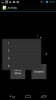
I've added several additional functions to the normal Spinner. You can change more of the appearance, List Border color, List Border width, List width, List height (within certain constraints), Item Heights etc.
I've also added an option to allow a touch on the button when the list is displayed, to return the button value as if it were selected from the list - ButtonTouchSelect, something I needed used with manual ordering of a list.
The background icon is drawn in code, so you can change it add a different graphic or change the colors as you please, or you can just use the defaults.
The Pressed and Focused colors in the state list drawable are taken from the Hololight Theme if it's available, if not the defaults are used. If for some reason neither are available, the Class will create it's own.
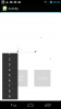
This is a custom view class, which you can also add manually to your code. The example shows both and includes a standard spinner for comparison.
I've tested it on various devices and API levels, please let me know if you find any problems.
The code is included so you can poke about and change anything you don't like. If you make improvements, please repost.
This is new software, and is quite complex in places. Please test thoroughly in any apps you plan to use it in.
SLSpinner
Author: Steve Laming
Version: 0.9
Version 0.9 attached with example. You can compile the module to a library if you prefer.
Added pre3.2 for those without the latest javaobject
I've added several additional functions to the normal Spinner. You can change more of the appearance, List Border color, List Border width, List width, List height (within certain constraints), Item Heights etc.
I've also added an option to allow a touch on the button when the list is displayed, to return the button value as if it were selected from the list - ButtonTouchSelect, something I needed used with manual ordering of a list.
The background icon is drawn in code, so you can change it add a different graphic or change the colors as you please, or you can just use the defaults.
The Pressed and Focused colors in the state list drawable are taken from the Hololight Theme if it's available, if not the defaults are used. If for some reason neither are available, the Class will create it's own.
This is a custom view class, which you can also add manually to your code. The example shows both and includes a standard spinner for comparison.
I've tested it on various devices and API levels, please let me know if you find any problems.
The code is included so you can poke about and change anything you don't like. If you make improvements, please repost.
This is new software, and is quite complex in places. Please test thoroughly in any apps you plan to use it in.
SLSpinner
Author: Steve Laming
Version: 0.9
- Methods:
- Add(Item As String) As String
Add an item to the spinner
AddAll(List As List) As String
Add all items from a List of Strings to the spinner
Background As Object
Get or Set the background for the visible Button. Can be one of: BitmapDrawable, ColorDrawable, GradientDrawable or StateListDrawable
Returns a drawable of the type that was initially or subsequently set
BringToFront As String
Changes the Z order of this view and brings it to the front.
ButtonTouchSelect As boolean
Gets or sets whether a touch on the button passes the currently selected item as a selection
Default is False
Clear As String
Clear all items from the Spinner
Color(Color As int) As String - [Write Only]
Sets the background of the Button to be a ColorDrawable with the given color.
DropDownTextColor As int
Get or set the DropDownTextColor
Enabled As boolean
Enable / Disable the spinner
GetItem(Index As int) As String
Get Item at index from the list
Gravity As int
Gets or sets the Gravity for the displayed Button and drop down List
Height As int
'Gets or sets the height of the displayed View
IndexOf(Value As String) As int
Returns the index of Value in the Spinner or -1 if not found
Initialize(TargetModule As Object, EventName As String) As String
Initializes the object.
Required for both designer and code setup.
Provides callback {EventName}_ItemClick(Position As Int,Value As Object)
Invalidate As String
Invalidates the view, forcing it to redraw itself.
IsInitialized As boolean
Returns True if the View has been initialized. For a manually added Spinner, setup must have also been called
ItemHeight As int
Gets or sets the ItemHeight. Default height is 48Dip
Left As int
Gets or sets the view's left position.
ListBorderColor(Color As int) As String - [Write Only]
Sets the List Border Color . Default = Colors.ARGB(120,35,35,35) and gives a shadow effect
ListBorderSize(Size As int) As String - [Write Only]
Set the List Border Size. Default = 5Dip Set to '0' to hide the border
ListColor(Color As int) As String - [Write Only]
Sets the background of the List to be a ColorDrawable with the given color.
ListHeight As int
Gets or sets the lists height excluding any border
Seting this will be ignored if it would make the height of the list go off the screen, so that the list can scroll fully.
ListWidth As int
Gets or sets the lists width excluding any border
RemoveAt(Index As int) As String
Removes the item at the specified index.
RemoveView As String
Removes this view from its parent.
RequestFocus As boolean
Tries To set the focus To this View.
Returns True If the focus was set.
SelectedIndex As int
Gets or sets the index of the selected item. Returns -1 if no item is selected.
SelectedItem As String - [Read Only]
Returns the value of the selected item. Returns an empty string if no item is selected.
SendToBack As String
Changes the Z order of this view and sends it to the back.
SetBackgroundImage(Image As Bitmap) As String
Set the Spinner Buttons background image
SetLayout(Left As int, Top As int, Width As int, Height As int) As String
Changes the view position and size.
Setup(Act As Activity, Pnl As Panel, Left As int, Top As int, Width As int, Height As int) As String
Use when setting up the CustomView manually. Pass an initialized panel to add the Spinner to or Null to add to the Activity
Size As int - [Read Only]
Returns the number of items in the list.
Tag As Object
Gets or sets the Tag value. This is a place holder which can used to store additional data.
TextColor As int
Gets or sets the Buttons text color.
TextSize As float
Get or sets the text size. Default for a customview is 14, default for a Spinner is 16
ToggleList As String
Show / Hide the drop down list
Top As int
Gets or sets the view's top position.
TypeFace As Typeface
Get or set the Typeface used by the spinner
Visible As boolean
Gets or sets the spinners Visibility
Width As int
Gets or sets the view's width. If you have set listwidth, setting this will only effect the Button width
Depends on:
javaobject, reflection
- Add(Item As String) As String
Version 0.9 attached with example. You can compile the module to a library if you prefer.
Added pre3.2 for those without the latest javaobject
Attachments
Last edited: