Ola
I had had some challenges with my charts for a while, though the other potent charts I found.
So my dashboard based page, as much as awesome as it looked, when many x-axis items were loaded, the legends got cut off. So today I spent some time exploring billboard and wrapping it up for ABM. Here are my explorations, 12 chart types with animations. The most important issue has been ease of implementation, speed and presentation and responsiveness.
NB: Please note that all data points passed to billboard cannot be null. So if reading records directly from the database, any of the Y values should NOT BE NULL.
1. Horizontal Chart
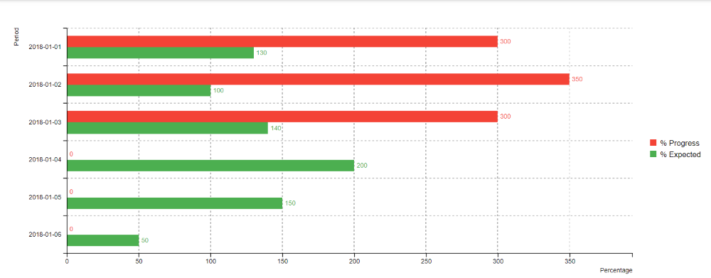
You can turn the grid on and off, turn the legends on or off, and the x and y labels on and off. You can show the label values / hide them. Also zoom functionality is available and these can be exported to png too.
2. Area and Area-spline
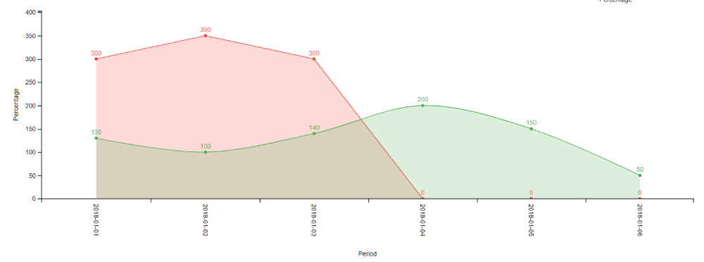
Besides being able to set the height of the x-axis, the angle of the x axis is an added nicety.
3. Bar Chart
By default, one creates a bar chart and is able to set it up or change series as they want.
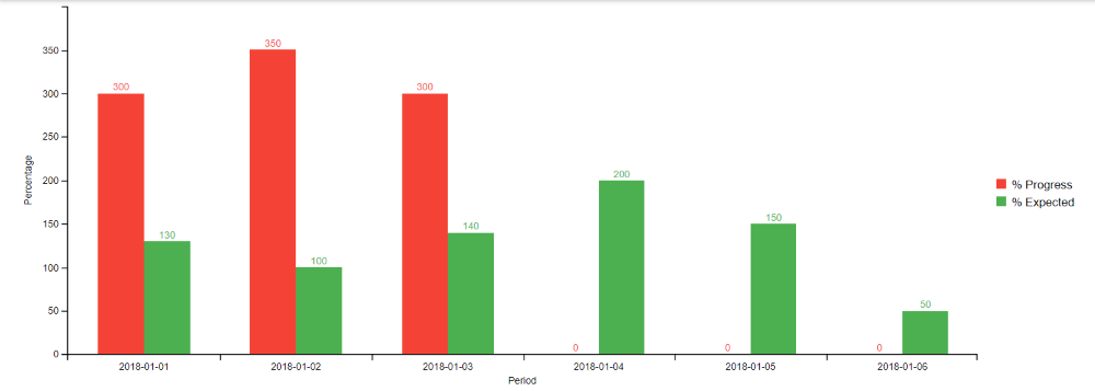
4. Stacked Bar Chart
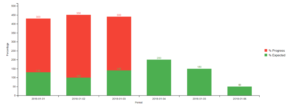
5. Combination Chart (this was shown above with an area chart, this one is bar + spline)
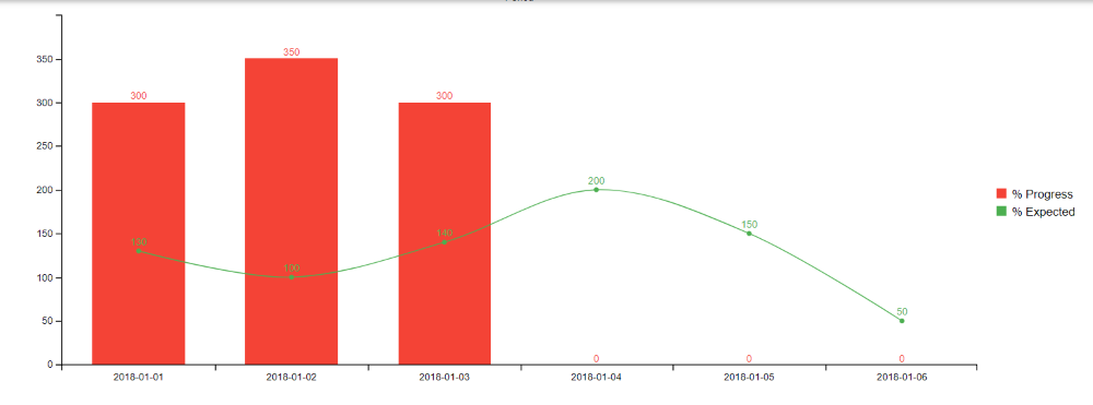
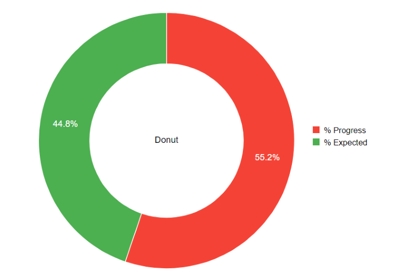
6. Donut
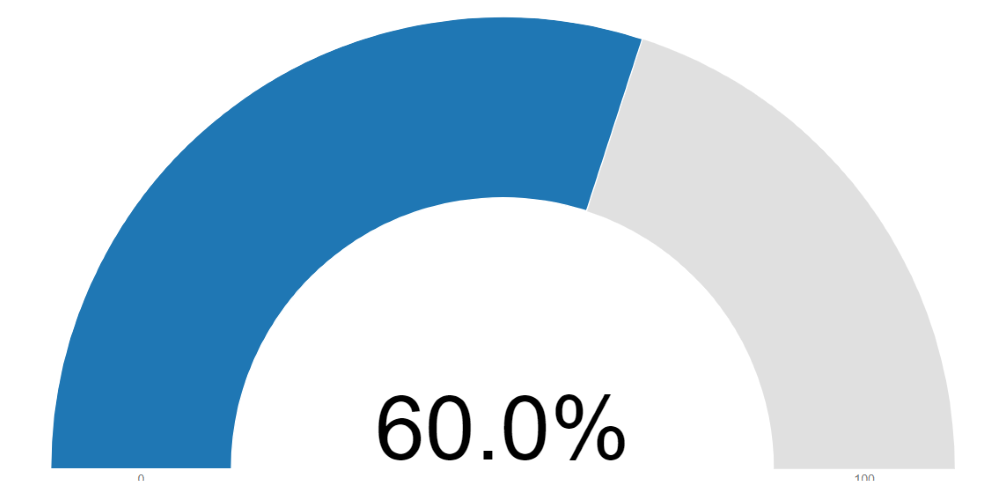
7. Gauge (with easy to set threshold colors)
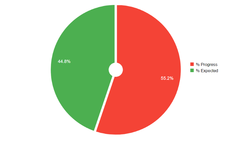
8. Pie
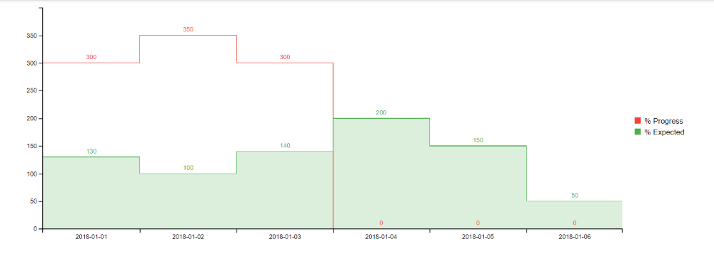
9. Step
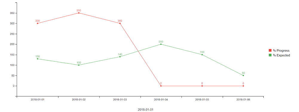
10. Line
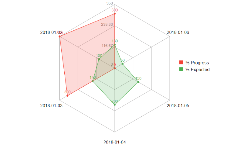
11. Radar
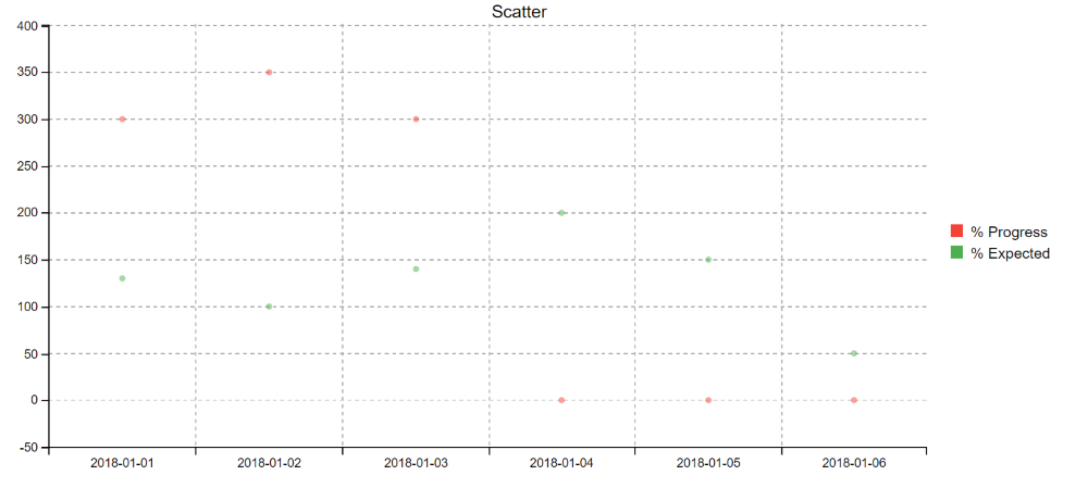
12. Scatter
Enjoy..
Here is the class for learning...
I had had some challenges with my charts for a while, though the other potent charts I found.
- Morris Charts don't have legends: here is my post
- Frappe Charts can have legends but if you have many items these get cut off and you cant rotate the x axis, here is my findings and my client wasn't impressed.
- JQPlot is just not the eye candy level I want, here is my version, though they are also my fav.
- My favourate rather is Syncfusion, but the js files are heavy, 3MB or so. here is my implementation.
So my dashboard based page, as much as awesome as it looked, when many x-axis items were loaded, the legends got cut off. So today I spent some time exploring billboard and wrapping it up for ABM. Here are my explorations, 12 chart types with animations. The most important issue has been ease of implementation, speed and presentation and responsiveness.
NB: Please note that all data points passed to billboard cannot be null. So if reading records directly from the database, any of the Y values should NOT BE NULL.
1. Horizontal Chart
You can turn the grid on and off, turn the legends on or off, and the x and y labels on and off. You can show the label values / hide them. Also zoom functionality is available and these can be exported to png too.
B4X:
Dim mbill0 As MashBillboard
    mbill0.Initialize(page,"mbill0","Horizontal Chart",400)
    mbill0.charttype = mbill0.EnumChartType.horizontalbar
    mbill0.AddSeries("data1","% Progress",MashPlugIns.EnumColors.red)
    mbill0.AddSeries("data2","% Expected", MashPlugIns.EnumColors.green)
    mbill0.SetXAxis("date",0,0,True)
    mbill0.AddData(CreateMap("data1":300,"data2":130,"date":"2018-01-01"))
    mbill0.AddData(CreateMap("data1":350,"data2":100,"date":"2018-01-02"))
    mbill0.AddData(CreateMap("data1":300,"data2":140,"date":"2018-01-03"))
    mbill0.AddData(CreateMap("data1":0,"data2":200,"date":"2018-01-04"))
    mbill0.AddData(CreateMap("data1":0,"data2":150,"date":"2018-01-05"))
    mbill0.AddData(CreateMap("data1":0,"data2":50,"date":"2018-01-06"))
    mbill0.YLabel = "Percentage"
    mbill0.XLabel = "Period"
    mbill0.showgrid = True
    Log(mbill0.GetScript)
    page.Cell(4,1).AddComponent(mbill0.ABMComp)
2. Area and Area-spline
Besides being able to set the height of the x-axis, the angle of the x axis is an added nicety.
B4X:
Dim mbill1 As MashBillboard
    mbill1.Initialize(page,"mbill1","Area & Area-Spline",400)
    mbill1.AddSeries("data1","% Progress",MashPlugIns.EnumColors.red)
    mbill1.AddSeries("data2","% Expected", MashPlugIns.EnumColors.green)
    mbill1.SetSeriesChartType("data1",mbill1.EnumChartType.area)
    mbill1.SetSeriesChartType("data2",mbill1.enumcharttype.areaspline)
    mbill1.SetXAxis("date",90,100,True)
    mbill1.AddData(CreateMap("data1":300,"data2":130,"date":"2018-01-01"))
    mbill1.AddData(CreateMap("data1":350,"data2":100,"date":"2018-01-02"))
    mbill1.AddData(CreateMap("data1":300,"data2":140,"date":"2018-01-03"))
    mbill1.AddData(CreateMap("data1":0,"data2":200,"date":"2018-01-04"))
    mbill1.AddData(CreateMap("data1":0,"data2":150,"date":"2018-01-05"))
    mbill1.AddData(CreateMap("data1":0,"data2":50,"date":"2018-01-06"))
    mbill1.YLabel = "Percentage"
    mbill1.XLabel = "Period"
    mbill1.BillBoardLegend.Show = False
    page.Cell(4,1).AddComponent(mbill1.ABMComp)
3. Bar Chart
By default, one creates a bar chart and is able to set it up or change series as they want.
B4X:
Dim mbill2 As MashBillboard
    mbill2.Initialize(page,"mbill2","Bar Charts",400)
    mbill2.AddSeries("data1","% Progress",MashPlugIns.EnumColors.red)
    mbill2.AddSeries("data2","% Expected", MashPlugIns.EnumColors.green)
    mbill2.SetXAxis("date",0,0,True)
    mbill2.AddData(CreateMap("data1":300,"data2":130,"date":"2018-01-01"))
    mbill2.AddData(CreateMap("data1":350,"data2":100,"date":"2018-01-02"))
    mbill2.AddData(CreateMap("data1":300,"data2":140,"date":"2018-01-03"))
    mbill2.AddData(CreateMap("data1":0,"data2":200,"date":"2018-01-04"))
    mbill2.AddData(CreateMap("data1":0,"data2":150,"date":"2018-01-05"))
    mbill2.AddData(CreateMap("data1":0,"data2":50,"date":"2018-01-06"))
    mbill2.YLabel = "Percentage"
    mbill2.XLabel = "Period"
    page.Cell(4,1).AddComponent(mbill2.ABMComp)
4. Stacked Bar Chart
B4X:
Dim mbill3 As MashBillboard
    mbill3.Initialize(page,"mbill3","Stacked Charts",400)
    mbill3.charttype = mbill3.enumcharttype.stackedbar
    mbill3.AddSeries("data1","% Progress",MashPlugIns.EnumColors.red)
    mbill3.AddSeries("data2","% Expected", MashPlugIns.EnumColors.green)
    mbill3.SetXAxis("date",0,0,True)
    mbill3.AddData(CreateMap("data1":300,"data2":130,"date":"2018-01-01"))
    mbill3.AddData(CreateMap("data1":350,"data2":100,"date":"2018-01-02"))
    mbill3.AddData(CreateMap("data1":300,"data2":140,"date":"2018-01-03"))
    mbill3.AddData(CreateMap("data1":0,"data2":200,"date":"2018-01-04"))
    mbill3.AddData(CreateMap("data1":0,"data2":150,"date":"2018-01-05"))
    mbill3.AddData(CreateMap("data1":0,"data2":50,"date":"2018-01-06"))
    mbill3.YLabel = "Percentage"
    mbill3.XLabel = "Period"
    Log(mbill3.GetScript)
    page.Cell(4,1).AddComponent(mbill3.ABMComp)
5. Combination Chart (this was shown above with an area chart, this one is bar + spline)
B4X:
Dim mbill As MashBillboard
    mbill.Initialize(page,"mbill","Combination Chart",400)
    mbill.AddSeries("data1","% Progress",MashPlugIns.EnumColors.red)
    mbill.AddSeries("data2","% Expected", MashPlugIns.EnumColors.green)
    mbill.SetXAxis("date",0,0,True)
    mbill.AddData(CreateMap("data1":300,"data2":130,"date":"2018-01-01"))
    mbill.AddData(CreateMap("data1":350,"data2":100,"date":"2018-01-02"))
    mbill.AddData(CreateMap("data1":300,"data2":140,"date":"2018-01-03"))
    mbill.AddData(CreateMap("data1":0,"data2":200,"date":"2018-01-04"))
    mbill.AddData(CreateMap("data1":0,"data2":150,"date":"2018-01-05"))
    mbill.AddData(CreateMap("data1":0,"data2":50,"date":"2018-01-06"))
    'mixed chart
    mbill.SetSeriesChartType("data1",mbill.EnumChartType.bar)
    mbill.SetSeriesChartType("data2",mbill.enumcharttype.spline)
    page.Cell(4,1).AddComponent(mbill.ABMComp)
6. Donut
B4X:
Dim mbilld As MashBillboard
    mbilld.Initialize(page,"mbilld","Donut",400)
    'set after initialize statement 'IMPORTANT
    mbilld.ChartType = mbilld.EnumChartType.donut
    mbilld.AddSeries("data1","% Progress",MashPlugIns.EnumColors.red)
    mbilld.AddSeries("data2","% Expected", MashPlugIns.EnumColors.green)
    mbill.SetXAxis("date",0,0,True)
    mbilld.AddData(CreateMap("data1":300,"data2":130,"date":"2018-01-01"))
    mbilld.AddData(CreateMap("data1":350,"data2":100,"date":"2018-01-02"))
    mbilld.AddData(CreateMap("data1":300,"data2":140,"date":"2018-01-03"))
    mbilld.AddData(CreateMap("data1":0,"data2":200,"date":"2018-01-04"))
    mbilld.AddData(CreateMap("data1":0,"data2":150,"date":"2018-01-05"))
    mbilld.AddData(CreateMap("data1":0,"data2":50,"date":"2018-01-06"))
    mbilld.BillBoardDonut.Title = "Donut"
    mbilld.BillBoardDonut.padAngle = 0.1
    page.Cell(4,1).AddComponent(mbilld.ABMComp)
7. Gauge (with easy to set threshold colors)
B4X:
'gauge up until 100

    Dim mbillg As MashBillboard
    mbillg.Initialize(page,"mbillg","Gauge",400)
    'set after initialize statement 'IMPORTANT
    mbillg.ChartType = mbilld.EnumChartType.gauge
    mbillg.AddSeries("data1","% Progress",MashPlugIns.EnumColors.red)
    mbill.SetXAxis("date",0,0,True)
    mbillg.AddData(CreateMap("data1":60))
    mbillg.GaugeAddThreshold(30,MashPlugIns.enumcolors.red)
    mbillg.GaugeAddThreshold(60,MashPlugIns.enumcolors.blue)
    mbillg.GaugeAddThreshold(90,MashPlugIns.enumcolors.orange)
    mbillg.GaugeAddThreshold(100,MashPlugIns.enumcolors.green)
    page.Cell(4,1).AddComponent(mbillg.ABMComp)
8. Pie
B4X:
Dim mbillp As MashBillboard
    mbillp.Initialize(page,"mbillp","Pie",400)
    'set after initialize statement 'IMPORTANT
    mbillp.ChartType = mbilld.EnumChartType.pie
    mbillp.AddSeries("data1","% Progress",MashPlugIns.EnumColors.red)
    mbillp.AddSeries("data2","% Expected", MashPlugIns.EnumColors.green)
    mbillp.BillBoardPie.InnerRadius = 20
    mbillp.BillBoardPie.Padding = 3
    mbillp.BillBoardPie.PadAngle = 0.1
    mbillp.AddData(CreateMap("data1":300,"data2":130,"date":"2018-01-01"))
    mbillp.AddData(CreateMap("data1":350,"data2":100,"date":"2018-01-02"))
    mbillp.AddData(CreateMap("data1":300,"data2":140,"date":"2018-01-03"))
    mbillp.AddData(CreateMap("data1":0,"data2":200,"date":"2018-01-04"))
    mbillp.AddData(CreateMap("data1":0,"data2":150,"date":"2018-01-05"))
    mbillp.AddData(CreateMap("data1":0,"data2":50,"date":"2018-01-06"))
    page.Cell(4,1).AddComponent(mbillp.ABMComp)
9. Step
B4X:
Dim mbillstep As MashBillboard
    mbillstep.Initialize(page,"mbillstep","Step",400)
    'set after initialize statement 'IMPORTANT
    mbillstep.ChartType = mbilld.EnumChartType.stepchart
    mbillstep.AddSeries("data1","% Progress",MashPlugIns.EnumColors.red)
    mbillstep.AddSeries("data2","% Expected", MashPlugIns.EnumColors.green)
    mbillstep.SetXAxis("date",0,0,True)
    mbillstep.AddData(CreateMap("data1":300,"data2":130,"date":"2018-01-01"))
    mbillstep.AddData(CreateMap("data1":350,"data2":100,"date":"2018-01-02"))
    mbillstep.AddData(CreateMap("data1":300,"data2":140,"date":"2018-01-03"))
    mbillstep.AddData(CreateMap("data1":0,"data2":200,"date":"2018-01-04"))
    mbillstep.AddData(CreateMap("data1":0,"data2":150,"date":"2018-01-05"))
    mbillstep.AddData(CreateMap("data1":0,"data2":50,"date":"2018-01-06"))
    mbillstep.SetSeriesChartType("data2",mbillstep.EnumChartType.areastep)
    page.Cell(4,1).AddComponent(mbillstep.ABMComp)
10. Line
B4X:
Dim mbillL As MashBillboard
    mbillL.Initialize(page,"mbillL","Line",400)
    'set after initialize statement 'IMPORTANT
    mbillL.ChartType = mbilld.EnumChartType.line
    mbillL.AddSeries("data1","% Progress",MashPlugIns.EnumColors.red)
    mbillL.AddSeries("data2","% Expected", MashPlugIns.EnumColors.green)
    mbillL.SetXAxis("date",0,0,True)
    mbillL.AddData(CreateMap("data1":300,"data2":130,"date":"2018-01-01"))
    mbillL.AddData(CreateMap("data1":350,"data2":100,"date":"2018-01-02"))
    mbillL.AddData(CreateMap("data1":300,"data2":140,"date":"2018-01-03"))
    mbillL.AddData(CreateMap("data1":0,"data2":200,"date":"2018-01-04"))
    mbillL.AddData(CreateMap("data1":0,"data2":150,"date":"2018-01-05"))
    mbillL.AddData(CreateMap("data1":0,"data2":50,"date":"2018-01-06"))
    page.Cell(4,1).AddComponent(mbillL.ABMComp)
11. Radar
B4X:
Dim radar1 As MashBillboard

    radar1.Initialize(page,"radar1","Radar1",400)
    'set after initialize statement 'IMPORTANT
    radar1.ChartType = mbilld.EnumChartType.radar
    radar1.AddSeries("data1","% Progress",MashPlugIns.EnumColors.red)
    radar1.AddSeries("data2","% Expected", MashPlugIns.EnumColors.green)
    radar1.SetXAxis("date",0,0,True)
    radar1.AddData(CreateMap("data1":300,"data2":130,"date":"2018-01-01"))
    radar1.AddData(CreateMap("data1":350,"data2":100,"date":"2018-01-02"))
    radar1.AddData(CreateMap("data1":300,"data2":140,"date":"2018-01-03"))
    radar1.AddData(CreateMap("data1":0,"data2":200,"date":"2018-01-04"))
    radar1.AddData(CreateMap("data1":0,"data2":150,"date":"2018-01-05"))
    radar1.AddData(CreateMap("data1":0,"data2":50,"date":"2018-01-06"))
    radar1.BillBoardRadar.ShowLevelText = True
    radar1.BillBoardRadar.ShowLine = True
    radar1.BillBoardRadar.ShowText = True
    page.Cell(4,1).AddComponent(radar1.ABMComp)
12. Scatter
B4X:
Dim radar2 As MashBillboard
    radar2.Initialize(page,"scatter","Scatter",400)
    'set after initialize statement 'IMPORTANT
    radar2.ChartType = mbilld.EnumChartType.scatter
    radar2.AddSeries("data1","% Progress",MashPlugIns.EnumColors.red)
    radar2.AddSeries("data2","% Expected", MashPlugIns.EnumColors.green)
    radar2.SetXAxis("date",0,0,True)
    radar2.AddData(CreateMap("data1":300,"data2":130,"date":"2018-01-01"))
    radar2.AddData(CreateMap("data1":350,"data2":100,"date":"2018-01-02"))
    radar2.AddData(CreateMap("data1":300,"data2":140,"date":"2018-01-03"))
    radar2.AddData(CreateMap("data1":0,"data2":200,"date":"2018-01-04"))
    radar2.AddData(CreateMap("data1":0,"data2":150,"date":"2018-01-05"))
    radar2.AddData(CreateMap("data1":0,"data2":50,"date":"2018-01-06"))
    radar2.ShowGrid = True
    page.Cell(4,1).AddComponent(radar2.ABMComp)
Enjoy..
Here is the class for learning...
Attachments
Last edited:
