Hi all,
I've wrote and used this minimalistic slider library in many of my projects, so because I've updated it for a long time and I added all custom functionalities I wanted, now I've decided to release it as library.
Attached there is a library .jar and .xml, (copy these to your Additional Libraries folder) and 2 demo projects to test it, the first is a base project that show the slider horizzontally and vertically, the second test optional animations with interpolators.
This library was completely developed on B4A and because it is a relatively simple class (simpler than others I wrote) I've decided to release the full source code as most of libraries I've developed. This is the first of a long series of libraries I will release that I've developed in last 10 years with B4X, almost all my B4A libraries have a desktop B4J counterpart, some others I only developed for a specific platform.
You can find the library source code inline in the demo 1, if you like, you can make modifications and recompile it to a library (depends on AnimationPlus library).
This and other free libraries will soon be available next on my github repository here https://github.com/maxmeli123
I've developed the same library for B4J and I will release it next.
Features:
- Fully OpenSource library, .jar and .xml provided, demo projects to test it provided, full B4A library source code provided here and on github.
- Fully resizable sliders by setting the layout in the constructor line that create it, eg. you can use small sliders or put a full screen single slider with a big bar
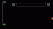
- Minimalistic control, only show a colored bar with borders, a Tag label that is a slider/progress name and can be used to identify any slider and a value label that show the current value
- Any slider/progress have it's parameters that can be customized separately from others
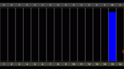
- Full multi touch, any istance of it has separate touch events, this mean that you can move five sliders the same time with five fingers (even more using two hands) and track the moved/released sliders by index in the event callback sub
- Acts as minimal (generic non customized) slider, it has a label to show the slider name and a label that show it's value
- Acts as minimal (generic non customized) progress bar, it has a label to show the progress bar name and a label that show it's value. Touch control can be disabled
- Bar color and borders can be customized
- Click on labels it set a value 0 or MaxValue
- Fully customizable, the class returns the slider panel and both labels, so they can be customized at runtime, eg you can change labels background color or make it transparent and other things
- Support horizzontal and vertical orientations, it is auto detected by the library depending on controls size. If Width > Height then it is horizontal, otherwise vertical
- Support custom max value, it can be set to an integer number, eg from 0 to 100, from 0 to 5000, from 0 to 100000 etc.
- Moved event will be raised when value change
- Release event will be raised when finger move up
- Support animations with interpolators. Note that I've developed the jAnimationPlus library that is a B4J desktop counterpart of good AnimationPlus by @Informatix, and I will release it next on this Forum. I've used it and embedded inside this library and many other control libraries I release.
This B4A library use internally AnimationPlus and counterpart B4J library use jAnimationPlus.
- One line of code can create a slider/progress
- One line of code can create a block of sliders/progress (you can access any single slider by index and by tag)
- Touch event can be enabled/disabled when control is created and after creation multiple times trasforming a slider to a progress bar or viceversa
- Events return UserChanged property that specifies if value was changed by user (touch) or by code at runtime
- Main visiblily and/or (indipendent) labels visiblility can be set by code
As I said I've used it on many of my projects and sometime I customized it for a specific project.
I've used it to do some sophysticated things like control a drone and a RC car machine controlled by ESP8266/ESP32 over WiFi from my phone, control some domotics like lights intensity, thermostat temperature etc. I've used it to remotely control my 3D printer over internet and move 5 sliders (at same time) of my motorized midi mixer (I'm musician) and other things.
Note that if you do not need animations, you can completely ignore this part and just use a few methods to creare and manage one or a lots of sliders in a simple way, just by index or Tag.
Changelog
-------------------------------------------------------------------------------------------------------------------------------------------------------------------
CustomMinimalSlider
I've wrote and used this minimalistic slider library in many of my projects, so because I've updated it for a long time and I added all custom functionalities I wanted, now I've decided to release it as library.
Attached there is a library .jar and .xml, (copy these to your Additional Libraries folder) and 2 demo projects to test it, the first is a base project that show the slider horizzontally and vertically, the second test optional animations with interpolators.
This library was completely developed on B4A and because it is a relatively simple class (simpler than others I wrote) I've decided to release the full source code as most of libraries I've developed. This is the first of a long series of libraries I will release that I've developed in last 10 years with B4X, almost all my B4A libraries have a desktop B4J counterpart, some others I only developed for a specific platform.
You can find the library source code inline in the demo 1, if you like, you can make modifications and recompile it to a library (depends on AnimationPlus library).
This and other free libraries will soon be available next on my github repository here https://github.com/maxmeli123
I've developed the same library for B4J and I will release it next.
Features:
- Fully OpenSource library, .jar and .xml provided, demo projects to test it provided, full B4A library source code provided here and on github.
- Fully resizable sliders by setting the layout in the constructor line that create it, eg. you can use small sliders or put a full screen single slider with a big bar
- Minimalistic control, only show a colored bar with borders, a Tag label that is a slider/progress name and can be used to identify any slider and a value label that show the current value
- Any slider/progress have it's parameters that can be customized separately from others
- Full multi touch, any istance of it has separate touch events, this mean that you can move five sliders the same time with five fingers (even more using two hands) and track the moved/released sliders by index in the event callback sub
- Acts as minimal (generic non customized) slider, it has a label to show the slider name and a label that show it's value
- Acts as minimal (generic non customized) progress bar, it has a label to show the progress bar name and a label that show it's value. Touch control can be disabled
- Bar color and borders can be customized
- Click on labels it set a value 0 or MaxValue
- Fully customizable, the class returns the slider panel and both labels, so they can be customized at runtime, eg you can change labels background color or make it transparent and other things
- Support horizzontal and vertical orientations, it is auto detected by the library depending on controls size. If Width > Height then it is horizontal, otherwise vertical
- Support custom max value, it can be set to an integer number, eg from 0 to 100, from 0 to 5000, from 0 to 100000 etc.
- Moved event will be raised when value change
- Release event will be raised when finger move up
- Support animations with interpolators. Note that I've developed the jAnimationPlus library that is a B4J desktop counterpart of good AnimationPlus by @Informatix, and I will release it next on this Forum. I've used it and embedded inside this library and many other control libraries I release.
This B4A library use internally AnimationPlus and counterpart B4J library use jAnimationPlus.
- One line of code can create a slider/progress
- One line of code can create a block of sliders/progress (you can access any single slider by index and by tag)
- Touch event can be enabled/disabled when control is created and after creation multiple times trasforming a slider to a progress bar or viceversa
- Events return UserChanged property that specifies if value was changed by user (touch) or by code at runtime
- Main visiblily and/or (indipendent) labels visiblility can be set by code
As I said I've used it on many of my projects and sometime I customized it for a specific project.
I've used it to do some sophysticated things like control a drone and a RC car machine controlled by ESP8266/ESP32 over WiFi from my phone, control some domotics like lights intensity, thermostat temperature etc. I've used it to remotely control my 3D printer over internet and move 5 sliders (at same time) of my motorized midi mixer (I'm musician) and other things.
Note that if you do not need animations, you can completely ignore this part and just use a few methods to creare and manage one or a lots of sliders in a simple way, just by index or Tag.
Changelog
- 1.15 First release. Works well but there are touch conflicts when placed on top of AHViewPager due to touch event conflicts on horizontal sliders
- 1.16 - Fixed touch conflict issue on horizontal sliders when placed on top of AHViewPager. The library now internally disable/enable paging when required, no user intervention, just put this after AHViewPager initialization:
- Now all controls have _Moved and _Released events. Sometime the slider value require just to be retrieved only when slider is released, this is a case eg. if you want send a value over socket, the _Moved event in this case send a lots of data because fires every time the slider change value. With _Release event you can send data once the slider is released. Eventually you can disable these two events separately if you do not need to fire it, this can be done just by comment the event sub you do not need (or not add at all to your project), or by code this way:B4X:
CustomMinimalSlider1.UseViewPager(Pager) ' Pager is an initialized instance of AHViewPager. With slider blocks you can iterate by index in a for loop to set it. Note that this only required for horizontal sliders, for verticals you can set it but it do nothing.- Added new demo that show use on top of AHViewPagerB4X:CMS1.FireEventMove(False) ' We can disable _Move event, and then reenable it multiple times if needed. (By default True) CMS1.FireEventRelease(False) ' We can disable _Release event, and then reenable it multiple times if needed. (By default True)
-------------------------------------------------------------------------------------------------------------------------------------------------------------------
CustomMinimalSlider
- Create (Parent As Panel, Module As Object, EventName As String, Left As Int, Top As Int, Width As Int, Height As ) As Panel
Create a CustomMinimalSlider object.
After Initialize, this is a first step to create a CustomMinimalSlider. Other methods can be used after this method.
NOTE: Slider have automatic orientation, if With > Height, it is placed horizontally, otherwise vertically.
Parent: the parent in witch to initialize the CustomMinimalSlider control, can be Activity or Panel or View
Module: the module that receive events
EventName: the name of Sub that receive events
Left: the Left property of the slider
Top: the Top property of the slider
Width: the Width of the slider
Height: the Height of the slider
ColorClear: the internal background color of the control
ColorFill: the bar color
ColorBorder: the border color
StrokeWidth: the border width
ShowValue: set label Value visibility
TouchControl: if True can be used a MultiTouch control to set the slider value and event _Moved is raised
Visible: set the initial visible state
Example: -
B4X:
Dim CMS1 As CustomMinimalSlider CMS1.Initialize CMS1.Create(Panel1, Me, "CMS1", 10,50,500,300, Colors.Black, Colors.Green, Colors.White, 1, True, True, True) - CreateBlock (Parent As Panel, Module As Object, EventName As String, SliderArray() As CustomMinimalSlider, Left As Int, Top As Int, Width As Int, Height As ) As Panel
Create a block of CustomMinimalSliders.
NOTE: Sliders have automatic orientation, if each slider With > Height, it is placed horizontally, otherwise vertically.
IMPORTANT: If this method is used, no need to initialize a Class for each CustomMinimalSlider, just Initialize first element
in the block and Class is automatically initialized for all CMSs in the block.
After Initialize first element in the block, this is a first step to create a CustomMinimalSlider block. Other methods can be used after this method.
Parent: the parent in witch to initialize the CustomMinimalSlider controls, can be Activity or Panel or View
Module: the module that receive events
EventName: the name of Sub that receive events
SliderArray(): the slider array
Left: the Left property of the slider
Top: the Top property of the slider
Width: the Width of the slider
Height: the Height of the slider
ColorClear: the internal background color of the control
ColorFill: the bar color
ColorBorder: the border color
StrokeWidth: the border width
ShowValue: set label Value visibility
TouchControl: if True can be used a MultiTouch control to set the slider value and event Moved is returned
Visible: set the initial visible state
Example: -
B4X:
Dim CMS(10) As CustomMinimalSlider CMS(0).Initialize CMS(0).CreateBlock(Panel1, Me, "CMS", CMS, 10,50,500,300, Colors.Black, Colors.Green, Colors.White, 1, True, True, True) - getTouchControl As Boolean
Gets or Sets the control touch property. - getLeft As Int
Gets the control Left. - getTop As Int
Gets the control Top. - getRight As Int
Gets the control Right. - getBottom As Int
Gets the control Bottom. - getWidth As Int
Gets the control Width. - getHeight As Int
Gets the control Height. - getUserChanged As Boolean
Gets if Moved Action depends from user action, changed with touch (true) or changed at runtime code (false). - setAlpha (Alpha As Double)
Gets or Sets the control alpha: 0 is tranparent, 1 (default) is fully. - setVisible (Visible As Boolean)
Gets or Sets whether the control is visible. - setEnabled (Enabled As Boolean)
Gets or Sets whether the control is enabled. - setTouchOffset (Offset As Int)
Gets or Sets the touch offset
For example:
by set it to 0.5 when the touch is 50% MaxValue will be reached
by set it to 0.25 when the touch is 25% MaxValue will be reached
by set it to 2.0 when the touch is 100% the 50% will be reached - getMaxValue As Int
Get or Set the Slider MaxValue.
Default MaxValue if no chanded is 100 - getTag As String
Get or Set the Slider Tag. - getValue As Int
Get or Set the Slider value.
Call this after Initialize or CreateBlock
Default range if MaxValue no chanded is (0-100) - getPanel As Panel
Get the Slider Panel. - getCanvas As Canvas
Get the Slider Canvas. - Remove
Remove this control and free ram from it's resource. - AnimatePosition (Duration As Int, Left As Double, Top As Double)
Changes the control Left and Top properties with an animation effect.
Duration: animation duration in milliseconds
Left: new left position after animation
Top: new top position after animation - AnimateLayout (Duration As Int, Left As Double, Top As Double, Width As Double, Height As Double)
Changes the control layout with an animation effect.
Duration: animation duration measured in milliseconds
Left: new left position after animation
Top: new top position after animation
Width: new width size after animation
Height: new height size after animation - AnimateColor (Duration As Int, FromColor As Int, ToColor As Int)
Changes the background color with a transition animation between the FromColor and the ToColor colors.
Note that the animation will only be applied when running on Android 3+ devices.
Duration: animation duration measured in milliseconds - PlayAnimationSet (Duration As Int, StartOffset As Long, ShareInterpolator As Boolean, Interpolator As Int, Param As Float)
Plays an AnimationSet that contain all previously added animations.
Duration: the animations duration (milliseconds). This overwrite all single animation durations
StartOffset sets when the animation should begin after this method was called (milliseconds)
ShareInterpolator: pass True if all the animations in this set should use the interpolator associated with this AnimationSet, pass False if each animation should use its own interpolator
Interpolator: the AnimationSet Interpolator, pass INTERPOLATOR constants.
NOTE: this is relevant only if ShareInterpolator is True and all the animations in this set should use the same interpolator associated with this AnimationSet
Param : Interpolator parameter if needed, Factor, Tension or Cycles
INTERPOLATOR_LINEAR, INTERPOLATOR_ACCELERATE_DECELERATE, INTERPOLATOR_BOUNCE have no parameters.
NOTE: this is relevant only if ShareInterpolator is True, if not or if parameter is not required just pass -1
Parameters:
INTERPOLATOR_ACCELERATE : Float Factor - The acceleration rate (default is 1.0)
INTERPOLATOR_ANTICIPATE: Float Tension - The amount of tension to apply (default is 2.0)
INTERPOLATOR_ANTICIPATE_OVERSHOOT: Float Tension - The amount of tension to apply (default is 2.0)
INTERPOLATOR_CYCLE: Integer Cycles - The number of cycles (default is 1)
INTERPOLATOR_DECELERATE: Float Factor - The deceleration rate (default is 1.0)
INTERPOLATOR_OVERSHOOT: Float Tension - The amount of tension to apply (default is 2.0)
Raise event AnimationSet_Finished - AddFadeTransition (Duration As Int, FromAlpha As Float, ToAlpha As Float, RepeatCount As Int, RepeatMode As Int, Interpolator As Int, Param As Float)
Creates an alpha animation. This animation affects the view's transparency (fading effect).
The alpha values are between 0 to 1 where 0 is fully transparent and 1 is fully opaque.
NOTE: this animation is automatically added to AnimationSet and can be started from
PlayAlphaTransition for a single animation or PlayAnimationSet for multiple and complex animations.
Duration: the animation duration in milliseconds.
FromAlpha: the first frame value
ToAlpha the last frame value
RepeatCount: the number of times the animation will repeat. A value of 0 means that it will play once. Set to -1 or COUNT_INFINITE for a non stopping animation.
RepeatMode: the repeat mode. Relevant when RepeatCount is larger than 0 (or -1).
default is REPEAT_RESTART which means that the animation will restart each time. REPEAT_REVERSE causes the animation to repeat in reverse each time.
Interpolator: the acceleration curve for this animation. Defaults to a linear interpolation. Use one of the INTERPOLATOR constants or number (0-8)
Param : Interpolator parameter if needed, Factor, Tension or Cycles. If parameter is not required just pass -1
INTERPOLATOR_LINEAR, INTERPOLATOR_ACCELERATE_DECELERATE, INTERPOLATOR_BOUNCE have no parameters.
Parameters:
INTERPOLATOR_ACCELERATE : Float Factor - The acceleration rate (default is 1.0)
INTERPOLATOR_ANTICIPATE: Float Tension - The amount of tension to apply (default is 2.0)
INTERPOLATOR_ANTICIPATE_OVERSHOOT: Float Tension - The amount of tension to apply (default is 2.0)
INTERPOLATOR_CYCLE: Integer Cycles - The number of cycles (default is 1)
INTERPOLATOR_DECELERATE: Float Factor - The deceleration rate (default is 1.0)
INTERPOLATOR_OVERSHOOT: Float Tension - The amount of tension to apply (default is 2.0)
Raise event Alpha_Finished - PlayFadeTransition (StartOffset As Long, Delay As Int)
Plays an Alpha animation previously added with AddFadeTransition method .
StartOffset: add a delay before animation should begin after this method is called (milliseconds)
Delay: delay this animation (milliseconds). This is offset for this single element in the FadeTransition - AddRotateTransition (Duration As Long, FromDegrees As Float, ToDegrees As Float, RepeatCount As Int, RepeatMode As Int, Interpolator As Int, Param As Float)
Creates a rotation animation. The view will rotate between the given values.
Rotation pivot is set to the top left corner.
NOTE: this animation is automatically added to AnimationSet and can be started from
PlayRotateTransition for a single animation or PlayAnimationSet for multiple and complex animations.
Duration: the animation duration in milliseconds
FromDegrees: the first frame rotation value
ToDegrees: the last frame rotation value
RepeatCount: the number of times the animation will repeat. A value of 0 means that it will play once. Set to -1 or COUNT_INFINITE for a non stopping animation
RepeatMode: the repeat mode. Relevant when RepeatCount is larger than 0 (or -1)
default is REPEAT_RESTART which means that the animation will restart each time. REPEAT_REVERSE causes the animation to repeat in reverse each time
Interpolator: the acceleration curve for this animation. Defaults to a linear interpolation. Use one of the INTERPOLATOR constants or number (0-8)
Param : Interpolator parameter if needed, Factor, Tension or Cycles. If parameter is not required just pass -1
INTERPOLATOR_LINEAR, INTERPOLATOR_ACCELERATE_DECELERATE, INTERPOLATOR_BOUNCE have no parameters.
Parameters:
INTERPOLATOR_ACCELERATE : Float Factor - The acceleration rate (default is 1.0)
INTERPOLATOR_ANTICIPATE: Float Tension - The amount of tension to apply (default is 2.0)
INTERPOLATOR_ANTICIPATE_OVERSHOOT: Float Tension - The amount of tension to apply (default is 2.0)
INTERPOLATOR_CYCLE: Integer Cycles - The number of cycles (default is 1)
INTERPOLATOR_DECELERATE: Float Factor - The deceleration rate (default is 1.0)
INTERPOLATOR_OVERSHOOT: Float Tension - The amount of tension to apply (default is 2.0)
Raise event Rotate_Finished - PlayRotateTransition (StartOffset As Long, Delay As Int)
Plays a Rotate animation previously added with AddRotateTransition method.
NOTE: this method supports only one animation at time . To use more animations simultaneously use the method PlayAnimationSet instead.
StartOffset: add a delay before animation should begin after this method was called (milliseconds)
Delay: delay this animation (milliseconds). This is offset for this single element in the RotateTransition - AddRotateCenterTransition (Duration As Int, FromDegrees As Float, ToDegrees As Float, RepeatCount As Int, RepeatMode As Int, Interpolator As Int, Param As Float)
Similar to AddRotateTransition, but with the pivot set to the given view center.
NOTE: this animation is automatically added to AnimationSet and can be started from
PlayRotateCenterTransition for a single animation or PlayAnimationSet for multiple and complex animations.
Duration: the animation duration in milliseconds
FromDegrees: the first frame rotation value
ToDegrees: the last frame rotation value
View: set pivot to the given view center
RepeatCount: the number of times the animation will repeat. A value of 0 means that it will play once. Set to -1 or COUNT_INFINITE for a non stopping animation
RepeatMode: the repeat mode. Relevant when RepeatCount is larger than 0 (or -1)
default is REPEAT_RESTART which means that the animation will restart each time. REPEAT_REVERSE causes the animation to repeat in reverse each time
Interpolator: the acceleration curve for this animation. Defaults to a linear interpolation. Use one of the INTERPOLATOR constants or number (0-8)
Param : Interpolator parameter if needed, Factor, Tension or Cycles. If parameter is not required just pass -1
INTERPOLATOR_LINEAR, INTERPOLATOR_ACCELERATE_DECELERATE, INTERPOLATOR_BOUNCE have no parameters.
Parameters:
INTERPOLATOR_ACCELERATE : Float Factor - The acceleration rate (default is 1.0)
INTERPOLATOR_ANTICIPATE: Float Tension - The amount of tension to apply (default is 2.0)
INTERPOLATOR_ANTICIPATE_OVERSHOOT: Float Tension - The amount of tension to apply (default is 2.0)
INTERPOLATOR_CYCLE: Integer Cycles - The number of cycles (default is 1)
INTERPOLATOR_DECELERATE: Float Factor - The deceleration rate (default is 1.0)
INTERPOLATOR_OVERSHOOT: Float Tension - The amount of tension to apply (default is 2.0)
Raise event RotateCenter_Finished - PlayRotateCenterTransition (StartOffset As Long, Delay As Int)
Plays a RotateCenter animation previously added with AddRotateCenterTransition method.
NOTE: this method supports only one animation at a time . To use more animations simultaneously use the method PlayAnimationSet instead.
StartOffset: add a delay before animation should begin after this method was called (milliseconds)
Delay: delay this animation (milliseconds). This is offset for this single element in the RotateCenterTransition - AddScaleTransition (Duration As Int, FromX As Float, ToX As Float, FromY As Float, ToY As Float, RepeatCount As Int, RepeatMode As Int, Interpolator As Int, Param As Float)
Creates a scale animation. The view will be scaled during the animation.
The scaling pivot will be set to the top left corner.
NOTE: this animation is automatically added to AnimationSet and can be started from
PlayScaleTransition for a single animation or PlayAnimationSet for multiple and complex animations.
Duration: the animation duration in milliseconds
FromX: the first frame horizontal scale
ToX: the last frame horizontal scale
FromY: the first frame vertical scale
ToY: the last frame vertical scale
RepeatCount: the number of times the animation will repeat. A value of 0 means that it will play once. Set to -1 or COUNT_INFINITE for a non stopping animation
RepeatMode: the repeat mode. Relevant when RepeatCount is larger than 0 (or -1)
default is REPEAT_RESTART which means that the animation will restart each time. REPEAT_REVERSE causes the animation to repeat in reverse each time
Interpolator: the acceleration curve for this animation. Defaults to a linear interpolation. Use one of the INTERPOLATOR constants or number (0-8)
Param : Interpolator parameter if needed, Factor, Tension or Cycles. If parameter is not required just pass -1
INTERPOLATOR_LINEAR, INTERPOLATOR_ACCELERATE_DECELERATE, INTERPOLATOR_BOUNCE have no parameters.
Parameters:
INTERPOLATOR_ACCELERATE : Float Factor - The acceleration rate (default is 1.0)
INTERPOLATOR_ANTICIPATE: Float Tension - The amount of tension to apply (default is 2.0)
INTERPOLATOR_ANTICIPATE_OVERSHOOT: Float Tension - The amount of tension to apply (default is 2.0)
INTERPOLATOR_CYCLE: Integer Cycles - The number of cycles (default is 1)
INTERPOLATOR_DECELERATE: Float Factor - The deceleration rate (default is 1.0)
INTERPOLATOR_OVERSHOOT: Float Tension - The amount of tension to apply (default is 2.0)
Raise event Scale_Finished - PlayScaleTransition (StartOffset As Long, Delay As Int)
Plays a Scale animation previously added with AddScaleTransition method.
NOTE: this method supports only one animation at a time . To use more animations simultaneously use the method PlayAnimationSet instead.
StartOffset: add a delay before animation should begin after this method is called (milliseconds)
Delay: delay this animation (milliseconds). This is offset for this single element in the ScaleTransition - AddScaleCenterTransition (Duration As Int, FromX As Float, ToX As Float, FromY As Float, ToY As Float, RepeatCount As Int, RepeatMode As Int, Interpolator As Int, Param As Float)
Similar to AddScaleTransition with a pivot set to the given view center.
NOTE: this animation is automatically added to AnimationSet and can be started from
PlayScaleCenterTransition for a single animation or PlayAnimationSet for multiple and complex animations.
Duration: the animation duration in milliseconds
FromX: the first frame horizontal scale
ToX: the last frame horizontal scale
FromY: the first frame vertical scale
ToY: the last frame vertical scale
View: set pivot to the given view center
RepeatCount: the number of times the animation will repeat. A value of 0 means that it will play once. Set to -1 or COUNT_INFINITE for a non stopping animation
RepeatMode: the repeat mode. Relevant when RepeatCount is larger than 0 (or -1)
default is REPEAT_RESTART which means that the animation will restart each time. REPEAT_REVERSE causes the animation to repeat in reverse each time
Interpolator: the acceleration curve for this animation. Defaults to a linear interpolation. Use one of the INTERPOLATOR constants or number (0-8)
Param : Interpolator parameter if needed, Factor, Tension or Cycles. If parameter is not required just pass -1
INTERPOLATOR_LINEAR, INTERPOLATOR_ACCELERATE_DECELERATE, INTERPOLATOR_BOUNCE have no parameters.
Parameters:
INTERPOLATOR_ACCELERATE : Float Factor - The acceleration rate (default is 1.0)
INTERPOLATOR_ANTICIPATE: Float Tension - The amount of tension to apply (default is 2.0)
INTERPOLATOR_ANTICIPATE_OVERSHOOT: Float Tension - The amount of tension to apply (default is 2.0)
INTERPOLATOR_CYCLE: Integer Cycles - The number of cycles (default is 1)
INTERPOLATOR_DECELERATE: Float Factor - The deceleration rate (default is 1.0)
INTERPOLATOR_OVERSHOOT: Float Tension - The amount of tension to apply (default is 2.0)
Raise event ScaleCenter_Finished - PlayScaleCenterTransition (StartOffset As Long, Delay As Int)
Plays a ScaleCenter animation previously added with AddScaleCenterTransition method.
NOTE: this method supports only one animation at time . To use more animations simultaneously use the method PlayAnimationSet instead.
StartOffset: add a delay before animation should begin after this method is called (milliseconds)
Delay: delay this animation (milliseconds). This is offset for this single element in the ScaleCenterTransition - AddTranslateTransition (Duration As Int, FromX As Float, ToX As Float, FromY As Float, ToY As Float, RepeatCount As Int, RepeatMode As Int, Interpolator As Int, Param As Float)
Creates a translation animation. The view will move according to the given values.
NOTE: this animation is automatically added to AnimationSet and can be started from
PlayTranslateTransition a for single animation or PlayAnimationSet for multiple and complex animations.
Duration: the animation duration in milliseconds
FromX: the first frame horizontal scale
ToX: the last frame horizontal scale
FromY: the first frame vertical scale
ToY: the last frame vertical scale
RepeatCount: the number of times the animation will repeat. A value of 0 means that it will play once. Set to -1 or COUNT_INFINITE for a non stopping animation
RepeatMode: the repeat mode. Relevant when RepeatCount is larger than 0 (or -1)
default is REPEAT_RESTART which means that the animation will restart each time. REPEAT_REVERSE causes the animation to repeat in reverse each time
Interpolator: the acceleration curve for this animation. Defaults to a linear interpolation. Use one of the INTERPOLATOR constants or number (0-8)
Param : Interpolator parameter if needed, Factor, Tension or Cycles. If parameter is not required just pass -1
INTERPOLATOR_LINEAR, INTERPOLATOR_ACCELERATE_DECELERATE, INTERPOLATOR_BOUNCE have no parameters.
Parameters:
INTERPOLATOR_ACCELERATE : Float Factor - The acceleration rate (default is 1.0)
INTERPOLATOR_ANTICIPATE: Float Tension - The amount of tension to apply (default is 2.0)
INTERPOLATOR_ANTICIPATE_OVERSHOOT: Float Tension - The amount of tension to apply (default is 2.0)
INTERPOLATOR_CYCLE: Integer Cycles - The number of cycles (default is 1)
INTERPOLATOR_DECELERATE: Float Factor - The deceleration rate (default is 1.0)
INTERPOLATOR_OVERSHOOT: Float Tension - The amount of tension to apply (default is 2.0)
Raise event Translate_Finished - PlayTranslateTransition (StartOffset As Long, Delay As Int)
Plays a TranslateTransition previously added with AddTranslateTransition method.
NOTE: this method supports only one animation at time . To use more animations simultaneously use the method PlayAnimationSet instead.
StartOffset: add a delay before animation should begin after this method is called (milliseconds)
Delay: delay this animation (milliseconds). This is offset for this single element in the TranslateTransition
Attachments
Last edited: