B4J Question Cannot set button border through CSS

yo3ggx

Active Member
Licensed User
Longtime User
Hello,

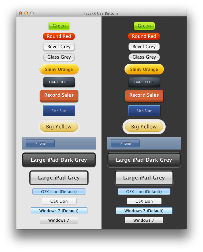
I'm using the following css file:


B4X:
.button {
    -fx-background-color: linear-gradient(#707070, #101010);
    -fx-border-radius: 10;
    -fx-background-radius: 10;
    -fx-text-fill: cyan;
    -fx-border-width: 2;
    -fx-faint-focus-color: cyan;
    -fx-focus-color: cyan;
}
.button:hover {
    -fx-background-color: linear-gradient(#808080, #101010);
    -fx-border-radius: 10;
    -fx-background-radius: 10;
    -fx-text-fill: yellow;
    -fx-border-width: 2;
    -fx-faint-focus-color: yellow;
    -fx-focus-color: yellow;
}
.button:pressed {
    -fx-background-color: linear-gradient(#505050, #0C0C0C);
    -fx-border-radius: 10;
    -fx-background-radius: 10;
    -fx-text-fill: yellow;
    -fx-border-width: 2;
    -fx-focus-color: yellow;
    -fx-faint-focus-color: yellow;
}

When I hover over the button or I press it, only the background gradient, corner and text color are changed according to the file. Border width and color is not set at all.
Is this possible through the css file?

Thank you.
 

behnam_tr

Active Member
Licensed User
Longtime User
B4X:
 -fx-border-color: rgb(49, 89, 23);

chek this for more properties
 
Upvote 0

yo3ggx

Active Member
Licensed User
Longtime User
Same. Nothing related to border works from CSS. I can only set the border through the designer, but I need to be able to change it for hoover and pressed events.
 
Upvote 0

stevel05

Expert
Licensed User
Longtime User
A bit late to the party as I've just seen this post, if the button was created with the designer, you need to remove the default style added to the button as a border is added even with 0 width and css attached to a node has precedence.

B4X:
'For a button
Button.Style = ""

'For A B4xView
Button.As(Button).Style = ""
 
Upvote 0

yo3ggx

Active Member
Licensed User
Longtime User
In the mean time I've solve it without removing default style with the following css code.
css:
.button {
 -fx-background-color:
       cyan,
       cyan,
       cyan,
       linear-gradient(#707070, #101010);
  -fx-background-insets: -2 -2 -2 -2, 0, 0, 0;
  -fx-background-radius: 10, 10, 10, 10;
  -fx-text-fill: cyan;
}
.button:disabled {
 -fx-background-color:
       cyan,
       cyan,
       cyan,
       linear-gradient(#707070, #101010);
  -fx-background-insets: -2 -2 -2 -2, 0, 0, 0;
  -fx-background-radius: 10, 10, 10, 10;
  -fx-text-fill: #303030;
}

.button:hover {
  -fx-background-color:
       white,
       white,
       white,
       linear-gradient(#909090, #303030);
  -fx-background-insets: -2 -2 -2 -2, 0, 0, 0;
  -fx-background-radius: 10, 10, 10, 10;
  -fx-text-fill: white;
}
.button:pressed {
  -fx-background-color:
       darkgray,
       darkgray,
       darkgray,
       linear-gradient(#808080, #202020);
  -fx-background-insets: -2 -2 -2 -2, 0, 0, 0;
  -fx-background-radius: 10, 10, 10, 10;
  -fx-text-fill: yellow;
}
 
Upvote 0

stevel05

Expert
Licensed User
Longtime User
I thought you might have found another way, but just for completeness. :)
 
Upvote 0

yo3ggx

Active Member
Licensed User
Longtime User
The information is very useful and I will definitely take into account this much simpler solution in future projects. I was not aware about this precedence.
 
Upvote 0
Top