Device vs Emulator with variants

jschuchert

Active Member
Licensed User
Longtime User
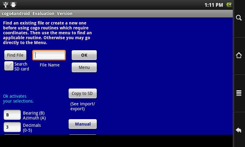
I designed my app for portrait and landscape using the 320x480 and 480x320 variants only. In each activity, I moved views around to accommodate each variant. When I changed the orientation on the emulator (ctrl+F11) and on my 7" tablet everything displayed as it should. With the additional variants in 1.6, I am now finding some of the activities' views are hidden in landscape on the emulator for both the 7" and 10" variants.

For example:
I load an existing activity. It comes in with the default 320x480.
I select 'new variant' 7" portrait 480x800
Looks the same on the emulator as the 320x480
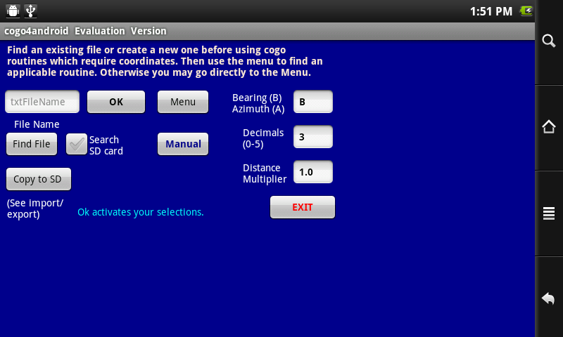
Change orientation ctrl+F11
Select new variant 7" 800x480
Some views are hidden
Same for 10"

All is ok in portrait for all sizes. I don't have access to an actual 10" device but since my 7" device displays properly in both orientations, should I be concerned? Why the difference now? It's probably a simple explanation.

Thanks. Jim
 

derez

Expert
Licensed User
Longtime User
and check the densities of the displays, resolution is not the only thing that affects the size.
 
Upvote 0

jschuchert

Active Member
Licensed User
Longtime User
Thanks Erel, nfordbscndrd and derez,
@erel
The top and left never exceed 320x480
@nfordbscndrd
Well written documentation and very helpful


From the wiki documentation:
"When a New Variant is created, it inherits all the views of the original layout. However, each layout variant holds a different set of values for the position and size of the views If you change the text of any view it will be changed in all variants automatically. However if you change the position or size of a view it will only affect the current variant."

Regardless of which variant I select, the position of a particular view is the same relative to its top and left coordinates. Apparently, in my case, everything remains based upon 320x480 on the emulator. I expected the views to be smaller for the 10" variant but they are not changed from the phone size. Obviously there is something I don't understand...yet.

Although I did not make separate layouts for my tablet, the phone size (320x480) works perfectly on it including orientation changes. Here, again, I expected smaller views. Android OS must be at work making the adjustments. Therefore, I hope the same holds true for the 10" tablet. Just to be sure, if anyone has a 10" tablet, I would greatly appreciate their installing my application and telling me how it fits. Same for a phone ( I only have a 7" tablet and will be happy to reciprocate). Just email me and I will send a link. I haven't found anyone local yet...or is there another way?

Thanks for your awesome expertise.
 
Upvote 0

nfordbscndrd

Well-Known Member
Licensed User
Longtime User
I've looked at your app on a 7" tablet (800x480) and a 10.1" tablet (1280x800). I see that you have a couple of dozen layouts, one for each type of calculation with a portrait and landscape variant for each, which brings you up to about 50 layouts.

You said: "on my 7" tablet everything displayed as it should." What is the resolution of your 7" tablet? Your layouts are done at 480x320x160. If your tablet is the common 800x480x160, then your layout should take less than half the screen, which is how it appears on my 7" tablet of 800x480x160.

On my 10" tablet, it only covers about an 8th of the screen. This makes the text, EditBoxes and Buttons correspondingly tiny.

As noted under Common Device Sizes in the Wiki under Layout Variants:

Notice that both the Xoom, at 10.1" [1280x800], and the Archos A70, at 7" [800x480], have a scale of 1. This means that Android will not change the size of the views despite the increase in number of pixels, which means that the same layout on the Xoom will look much smaller than on the A70. (See the screen shots in the Introduction, above.) One way to adjust for this is to do a separate layout for 1280x800x160 devices in which you manually enlarge all the views, the text sizes, etc.

This means having a different layout for each of your current (couple of dozen) layouts, each with two variants, which will result in about 150 total layouts. (Ouch!)

Also note that to solve the size problem, you must do new layouts for the different sizes apart from the original layout files. If you did new variants inside the existing layouts, changing the text sizes on one size variant would also change the text size on the other variants, which you don't want.

Another (much smaller) problem is that when I get past the splash screen and "evaluation version" notice box to the input boxes and start entering data then rotate the screen (perhaps accidentally), I lose the data I've entered and have to go through the splash screen and "evalutation" notice again. To avoid this, see Saving An App's State in the Wiki and the following section on using Activity_Create, Pause, and Resume.
 
Upvote 0

jschuchert

Active Member
Licensed User
Longtime User
Thank you so much for your time. Looks like I have some work to do.

You said: "on my 7" tablet everything displayed as it should." What is the resolution of your 7" tablet? Your layouts are done at 480x320x160. If your tablet is the common 800x480x160, then your layout should take less than half the screen, which is how it appears on my 7" tablet of 800x480x160
My tablet is a Coby Kyros 7015a with a 800x480 resolution 16:9 aspect ratio. Early on I did some testing on a Galaxy Tab (7") and it displayed the same as my current tablet. What you are finding with your devices makes sense and is what I more or less originally expected before I saw good results on my own tablet. Are the numbers in my app still readable with your Archos 7"? How about the Toshiba 10"? For some reason, I thought android made some adjustments for the various devices. Otherwise, I will have to make 2 more versions. Thank goodness the code remains the same.

This means having a different layout for each of your current (couple of dozen) layouts, each with two variants, which will result in about 150 total layouts. (Ouch!)
Let's see...I'll be 77 in October...wondering if there's still enough time:) I'm willing to tackle it if there's no other way but as mentioned in my original post, I can't see a variant that I can use. All of the views still reflect 320x480. I would have something to work with if my layouts appeared differently in the other variants. Where do I go from here?
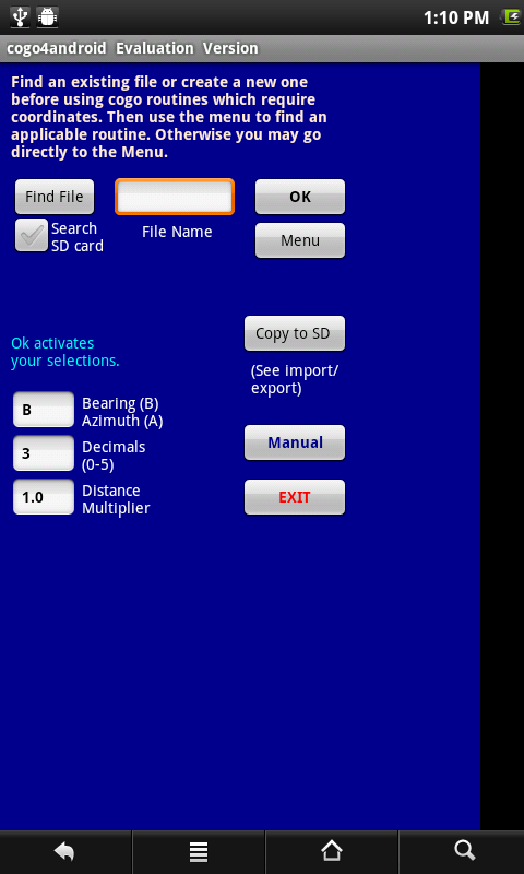
Another (much smaller) problem is that when I get past the splash screen and "evaluation version" notice box to the input boxes and start entering data then rotate the screen (perhaps accidentally), I lose the data I've entered and have to go through the splash screen and "evalutation" notice again. To avoid this, see Saving An App's State in the Wiki and the following section on using Activity_Create, Pause, and Resume.
That's strange since I have allowed for this in my code. Maybe I missed one. I am aware of the 'going back to splash screen' issue but in most, if not all, of the various routines, I utilized Pause and Resume with code to accommodate the orientation change.

I have had the evaluation version posted on my website for a couple of months now but no feedback concerning what you are finding. There have been many lookers but very few takers, probably due to the issues you pointed out so I want to make sure it is done right.

Yours and others' advice will be invaluable. Thanks again.

Jim
 
Upvote 0

jschuchert

Active Member
Licensed User
Longtime User
Here is what I have now done:
1. Created a new virtual device with the AVD manager and named it 480x800
2. Set a 7" screen size
3. Set 160 for density
4. Launched it

Installed one of my layouts.
It probably looks like what you are seeing on your archos 7" (about half the screen used).
Connected my tablet with the bridge and installed the same app
It fills the screen as it did before (not same as the emulator)

Did you also install the apk for comparison?
My tablet has 3 UI resolution settings...800x480, 1280x720 and 720x576.
The views look the same in all.

:sign0137::BangHead:
 
Upvote 0

nfordbscndrd

Well-Known Member
Licensed User
Longtime User
Here are some screen shots:

7" tablet, portrait mode. It doesn't fill the screen, but doesn't look too bad.
Test1.png


7" tablet, rotated to landscape. The first issue is that from the above screen, when rotated, the splash came up again. This is to be expected because when rotated, the OS starts the app over in Activity_Create where your first line is to load the spash. At the very least, you should say to load the splash only "If FirstTime". The next problem is that it doesn't look like a typical splash screen because it only takes up part of the left half of the screen.
Test2.png


App screen in 7" landscape mode. Here the problem is that part of your input area has gone off the bottom of the screen. This is not the 480x320 layout shown below; it is still your portrait layout.
Test3.png


480x320x160 layout in Designer. This is the landscape layout, but only takes part of the screen. It's not that you MUST fill up the screen, but if you choose not to, then you may as well use the portrait orientation for landscape. However, this screen NEVER comes up when running the app.
Test6.png


I have some screenshots from my 10" tablet, but they just duplicate the problems above, except that the layouts are smaller and in the upper left 1/8th of the screen.

Even when I *start* in the landscape mode, I still don't get the landscape layout, but I get one that does fit the screen vertically (on the left half of the screen). But if I then rotate it to portrait and the rotate it back, I get the one as shown before which does not fit.
 
Last edited:
Upvote 0

nfordbscndrd

Well-Known Member
Licensed User
Longtime User
Did you also install the apk for comparison?

I install to the 10" via B4A-Bridge, which installs the apk. To the 7", I use USB. I get similar results on both.

My tablet has 3 UI resolution settings...800x480, 1280x720 and 720x576.

What??? Really??? How does that happen? I would like to say "No way!", but, who knows...

I guess if the native resolution were 1280x720, it might scale it down to the lesser resolutions somehow, but what would be the point? Android scales up and down for different densities automatically.

But even if your tablet has 3 different resolutions, if what I understand is correct, it would be impossible for the layout to look the same at all three resolutions because they are all standard density (1), so Android would not resize them to fit the different resolutions, and I don't see where your code is manually adjusting them.

Did you read the link that I gave you on the Wiki page which explains all of this? If that info is wrong, nobody has said so yet.
 
Upvote 0

jschuchert

Active Member
Licensed User
Longtime User
You have really gone above and beyond. Thank you, thank you.

7" tablet, rotated to landscape. The first issue is that from the above screen, when rotated, the splash came up again. This is to be expected because when rotated, the OS starts the app over in Activity_Create where your first line is to load the spash. At the very least, you should say to load the splash only "If FirstTime". The next problem is that it doesn't look like a typical splash screen because it only takes up part of the left half of the screen.
Thanks for pointing this out. I will correct it.

480x320x160 layout in Designer. This is the landscape layout, but only takes part of the screen. It's not that you MUST fill up the screen, but if you choose not to, then you may as well use the portrait orientation for landscape. However, this screen NEVER comes up when running the app.
I have to use crtl+F11 and then select the landscape variant to see how it is going to look. That corrects the cut off views.

If you will indulge me one more time, I am going to experiment a little with one of the layouts and the avd previously mentioned. Then I would appreciate your installing the revision on both 7" and 10" devices and reporting if that has made a difference. This will help me decide what to do.

Yes, I have read the wiki docs you referred. They are well written and easy to understand and that is why I can't get it through my head why the variants won't work as I expected. And the other issue is why our 2 tablets behave differently.

Jim
 
Upvote 0

jschuchert

Active Member
Licensed User
Longtime User
Thanks again for your help. The apk sent via pm was not intended to address the splash or orientation, only to see if the portrait fit your archos. I am much relieved to know that it did. As stated before, my kyros 7015 does not accommodate the revised layout. Not sure if it is because of something I did or not. I am waiting to hear back from their gurus about this issue. In the meantime my plan is to make a separate version for 7" tablets. I would:

Create an AVD with a 7" screen size,480x800 resolution and scale= 1

Adjust the 30 layouts to fit the 7" screen size like I did for the one I sent you

Since I will change text size on labels and buttons, I don't think it would be a good idea to do it as a variant since the text affects the other variants, one of which is for phones

Include both apk files for users. The 7" version could also be used for a 10" device (still thinking about this one).

An awful lot of work but I am so glad you picked up on the size difference. Those who downloaded the evaluation (another version to consider) may have been turned off by the results you helped find. If anyone who has followed this thread has other ideas or advice, I would be happy to hear from you. What do others with multiple activities do???

Jim
 
Upvote 0
Top