Android Tutorial Android Charts Framework

Status
Not open for further replies.
The purpose of this framework is to allow you to easily add different types of charts to your projects.
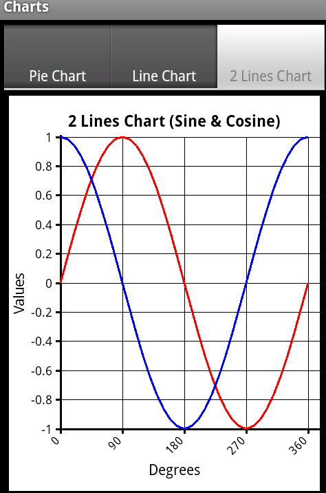
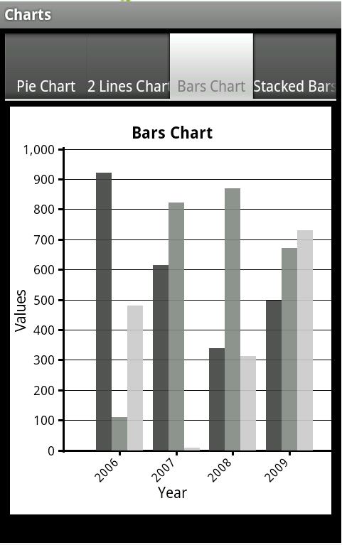
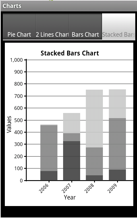
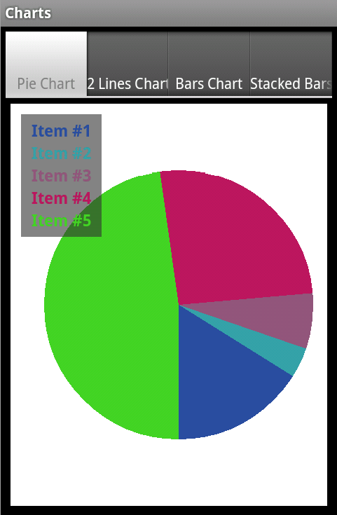
The current version supports pie charts, line charts and bar charts.

The framework is implemented as code modules. You are free to customize the code as needed.

I also recommend you to go over the code. It demonstrates several concepts including: usage of custom types, drawings, string measurements and region clipping.


charts_2.png

charts_bars.png

charts_stackedbars.png


charts_pie.png


The code module is attached as part of the example project.
Questions, comments and suggestions are welcomed.

Klaus has posted a version that includes automatic scaling: http://www.b4x.com/android/forum/threads/android-charts-framework.8260/page-7#post-240181
 

Attachments

  • Charts.zip
    9.6 KB · Views: 7,622
Last edited:

GMan

Well-Known Member
Licensed User
Longtime User
thx Klaus, i feared that i have to take this way :(
So, nice looking charts is mostly the 1/3 of all work :cool:
 

Lykaion

Member
Licensed User
Longtime User
i developed that function modifying the line chart, if somebody need it...

B4X:
Sub DrawAreaChart(G As Graph, LD As LineData, BackColor As Int)
    Dim aree As Map
    If Not(aree.IsInitialized) Then
        aree.Initialize
        aree.Clear
    End If
   
    If LD.Points.Size = 0 Then
        ToastMessageShow("Missing line points.", True)
        Return
    End If
    LD.Canvas.Initialize(LD.Target)
    LD.Canvas.DrawColor(BackColor)

    If LD.AutomaticScale = True Then
        GetLineMinMaxValues(LD)
        CalcScale(G, LD)
    End If

    drawGraph(G, LD.Canvas, LD.Target, LD.Points, False, 0)
    'Draw data lines
    Dim point As LinePoint
    point = LD.Points.Get(0)
   
    'multiple lines
    Dim py2(point.YArray.Length) As Double
    'initialize first point
    For i = 0 To py2.Length - 1
        py2(i) = point.YArray(i)
    Next
    'draw all points
    For i = 1 To LD.Points.Size - 1
        point = LD.Points.Get(i)
        For a = 0 To py2.Length - 1
            If aree.ContainsKey(LD.LinesColors.Get(a)) Then
                Dim linee As Path
                linee = aree.Get(LD.LinesColors.Get(a))
                linee.LineTo(G.GI.originX + G.GI.intervalX * i, calcPointToPixel(point.YArray(a), G))
                If i = LD.Points.Size-1 Then
                    linee.LineTo(G.GI.originX + G.GI.intervalX * i, G.GI.originY)
                End If
                aree.Put(LD.LinesColors.Get(a), linee)
            Else
                Dim linee As Path
                linee.Initialize(G.GI.originX + G.GI.intervalX * (i - 1), G.GI.originY)
                linee.LineTo(G.GI.originX + G.GI.intervalX * (i - 1), calcPointToPixel(py2(a), G))
                linee.LineTo(G.GI.originX + G.GI.intervalX * i, calcPointToPixel(point.YArray(a), G))
                aree.Put(LD.LinesColors.Get(a), linee)
            End If
            py2(a) = point.YArray(a)
        Next
    Next

    For i=0 To aree.Size-1
        LD.Canvas.DrawPath(aree.GetValueAt(i), Colors.Transparent, True, 2dip)
        LD.Canvas.DrawPath(aree.GetValueAt(i), aree.GetKeyAt(i), True, 2dip)
    Next
    drawGraph(G, LD.Canvas, LD.Target, LD.Points, False, 0)

    LD.Target.Invalidate
End Sub
 

Lykaion

Member
Licensed User
Longtime User
Yes, I'm sorry, I apologize for the rush, you may put that function in the library and using that similarly to DrawLineChart function, the only difference is that not put only a line but it draw a filled path.
The paths are drawn two times: one in transparent fill for delete the previous path intersections, the second for putting on the data.
The next step, I hope to take a few of time to do that in next week, is to put the data in a transparent canvas and in a second time put that on the grid.
 

Reids

Member
Licensed User
Longtime User
Cool!!! , really helping for people who not expert in coding like me, here is the result :

Screenshot_2014-12-03-00-14-58.png

I hope u can add floating marker on the chart too :)
smiliar like this

hope.png
 

iamfanghan

Member
Licensed User
Longtime User
Hi there, would like to know is there anyway to make the Line graph a smooth curve line based on the data? for example y = 2 , y = 2.4 , y=2. a smooth curve line joining from first point to the last point
 

iamfanghan

Member
Licensed User
Longtime User
Not without implementing the curve yourself. This implementation just draws straight lines between the points.
Is there any link that I can read up on how to implement the curves? Sorry for being a nuisance as I'm new to this.
 

iamfanghan

Member
Licensed User
Longtime User
Btw, in java coding, there is the function of "context.quadraticCurveTo();" is there similar function in B4A?
 

iamfanghan

Member
Licensed User
Longtime User
Hi there, wanna ask is there any method to draw this type of graph?
I tried in Line but the x-axis is predetermined by the column value and thus even if i put (4,-23) (4,23) it would not produce a straight vertical line
 

Attachments

  • Capture.PNG
    Capture.PNG
    10.9 KB · Views: 383

PhilipK

Member
Licensed User
Longtime User
Hi Erel,

Your charts framework is ideal for off-line charting.

I have a data set consisting of six sets of data points to plot. The charts framework plots fine but adds lines between the points of the series.

If you imagine the data streams are not necessarily continuous over time and there are periods where there may be no data.... I have arranged that the chart shows the data against time on the x axis with gaps in the chart's linedata array (where there is no data point set at that time).

Unfortunately the lines created between the points corrupt the chart by suggesting changes in data value where none occur. For example, at the beginning or end of a set of data points, a line appears, connecting the data to or from zero.

QUESTION: Is it possible for the charts framework to plot the points only, without lines, working for multiple coloured series? Scatter Plot.

Thanks
 
Last edited:

PhilipK

Member
Licensed User
Longtime User
SCATTER PLOT

Surprisingly easy! Many thanks. Only changed Drawline to DrawCircle with updated parameters, in Charts.bas, 'Sub DrawLineChart':

B4X:
Sub DrawLineChart(G As Graph, LD As LineData, BackColor As Int)
    If LD.Points.Size = 0 Then
        ToastMessageShow("Missing line points.", True)
        Return
    End If
    LD.Canvas.Initialize(LD.Target)
    LD.Canvas.DrawColor(BackColor)
    drawGraph(G, LD.Canvas, LD.Target, LD.Points, False, 0)
    'Draw data lines
    Dim point As LinePoint
    point = LD.Points.Get(0)
    If point.YArray.Length > 0 Then
        'multiple lines
        Dim py2(point.YArray.Length) As Float
        'initialize first point
        For i = 0 To py2.Length - 1
            py2(i) = point.YArray(i)
        Next
        'draw all points
        For i = 1 To LD.Points.Size - 1
            point = LD.Points.Get(i)
            For a = 0 To py2.Length - 1
'>>>>>>> Scatter graph - NOTE: requires setting unused array/data points to values that will be outside your max/min X/Y
                LD.Canvas.DrawCircle(G.GI.originX + G.GI.intervalX * (i - 1), calcPointToPixel(py2(a), G),2dip,LD.LinesColors.Get(a),False, 1dip)
                py2(a) = point.YArray(a)
            Next
        Next
    Else
        'Single line
        Dim py As Float
        py = point.Y
        For i = 1 To LD.Points.Size - 1
            point = LD.Points.Get(i)
            LD.Canvas.DrawLine(G.GI.originX + G.GI.intervalX * (i - 1), calcPointToPixel(py, G) _
                , G.GI.originX + G.GI.intervalX * i, calcPointToPixel(point.Y, G), LD.LinesColors.Get(0), 2dip)
            py = point.Y
        Next
    End If
    LD.Target.Invalidate
End Sub
 
Status
Not open for further replies.
Top