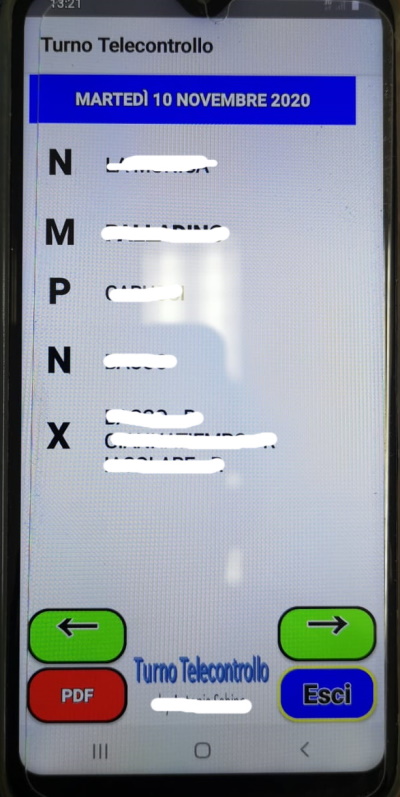
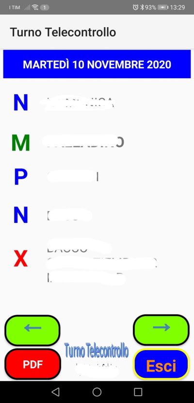
Can anyone explain to me why (on some smartphones), the text colors of some labels appear black?
The colors of the text of the labels are set directly in the designer and I have deliberately chosen standard colors, for example Blue (# FF0000FF), Red (# FFFF0000)
The strange thing is that the same red color (# FFFF0000) applied to the Color property of a button (hence the background color) is displayed well I am attaching photos (just to make it clear but I think it's clear what I mean) The 5 labels (N - M - P - N - X) are all black, while the background of the PDF button is red (same color as the X label)
I haven't found any particular settings or styles in devices that don't show the right colors
I have tried on various smartphones with these results:
- Huawey P8 lite - android 8.0.0: Ok colors
- Huawey P20 PRo - android 10: Ok colors
- Samsung S4 -Android 5.0.1 - Colors OK
- Samsung Note 8 - Android 9 - Colors NO OK
- Another Samsung (which now I do not have on hand to read the model and version) Colors NO OK
