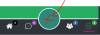
A better menu, can you find here

A complete New and better Version of this View is available now. (V2)
I'm very happy to share my first customview with the community.
I develop Cross Platform Apps, it was too much code and too much effort to assemble my own bottom menu from many views. So I decided to build a class that I just need to add one view in the designer with less work.")
-You have many options to customize the menu.
-easy to use
-compatible with B4A,B4I and B4J
-you can hide the middle Button
-4 Tabs or 2 Tabs
It is optimized for B4A and B4I, on B4J it is still a little buggy, but i dont need it for B4J.
Android, B4J ,2Tabs


since Version 1.2 it is possible to replace the big middle button with further page (page5) more information about it, in #13

IOS Android


Since Version 1.6 it is possible to add Text:

AS Bottom Menu
Author: Alexander Stolte
Version: 1.6
Notes:
-in B4I use the "iXUI" lib.
-BitmapCreator Class is needed
I Plan a second Bottom Menu with Text instead of icons.
Have Fun.
Change log:
- V1.1
A complete New and better Version of this View is available now. (V2)
I'm very happy to share my first customview with the community.
I develop Cross Platform Apps, it was too much code and too much effort to assemble my own bottom menu from many views. So I decided to build a class that I just need to add one view in the designer with less work.
-You have many options to customize the menu.
-easy to use
-compatible with B4A,B4I and B4J
-you can hide the middle Button
-4 Tabs or 2 Tabs
It is optimized for B4A and B4I, on B4J it is still a little buggy, but i dont need it for B4J.
Android, B4J ,2Tabs
since Version 1.2 it is possible to replace the big middle button with further page (page5) more information about it, in #13
IOS Android
Since Version 1.6 it is possible to add Text:
AS Bottom Menu
Author: Alexander Stolte
Version: 1.6
- ASBottomMenu
- Events:
- MiddleButtonClick
- MiddleButtonLongClick
- Page1Click
- Page2Click
- Page3Click
- Page4Click
- Page5Click
- Functions:
- ChangeMiddleButtonSize (size As Double, BorderWidth As Double) As String
Standard Value are the height of the view/1.2. Standard BorderWidth are 3dip. - Class_Globals As String
- DesignerCreateView (Base As Object, Lbl As Label, Props As Map) As String
- EnableBadget1 (Enable As Boolean) As String
If True, the Badget is Visible, if not, the Badget is hidden. - EnableBadget2 (Enable As Boolean) As String
If True, the Badget is Visible, if not, the Badget is hidden. - EnableBadget3 (Enable As Boolean) As String
If True, the Badget is Visible, if not, the Badget is hidden. - EnableBadget4 (Enable As Boolean) As String
If True, the Badget is Visible, if not, the Badget is hidden. - EnableBadget5 (Enable As Boolean) As String
If True, the Badget is Visible, if not, the Badget is hidden. - EnableSelectedPageColor (enable As Boolean) As String
If True then the Icon will change the Color on the current Page. - EnableText (Enable As Boolean) As String
- GetBase As B4XView
- HideBadgetValue (badget As Int, Hide As Boolean) As String
If True only the badget color is display without value inside. badget as int = 1-4 allowed. - Initialize (CallBack As Object, EventName As String) As String
- IsInitialized As Boolean
Tests whether the object has been initialized. - SetBadgetColor1 (color As Int) As String
Set the Background Color of the 1. Badget - SetBadgetColor2 (color As Int) As String
Set the Background Color of the 2. Badget - SetBadgetColor3 (color As Int) As String
Set the Background Color of the 3. Badget - SetBadgetColor4 (color As Int) As String
Set the Background Color of the 4. Badget - SetBadgetColor5 (color As Int) As String
Set the Background Color of the 5. Badget - SetBadgetValue1 (value As Int) As String
Set on the 1. Badge the Value. Bigger then 9, a "9+" is Displayed - SetBadgetValue2 (value As Int) As String
Set on the 2. Badge the Value. Bigger then 9, a "9+" is Displayed - SetBadgetValue3 (value As Int) As String
Set on the 3. Badge the Value. Bigger then 9, a "9+" is Displayed - SetBadgetValue4 (value As Int) As String
Set on the 4. Badge the Value. Bigger then 9, a "9+" is Displayed - SetBadgetValue5 (value As Int) As String
Set on the 5. Badge the Value. Bigger then 9, a "9+" is Displayed - SetCurrentPage (page As Int) As String
Set the current Page 1-4 - SetIcon1 (icon As B4XBitmap) As String
- SetIcon2 (icon As B4XBitmap) As String
- SetIcon3 (icon As B4XBitmap) As String
- SetIcon4 (icon As B4XBitmap) As String
- SetIcon5 (icon As B4XBitmap) As String
- SetMenuBackgroundColor (color As Int) As String
Set the Background color behind the Buttons. - SetMiddleButtonBackgroundColor (color As Int) As String
Set the Middle Button Background Color - SetMiddleButtonIcon (icon As B4XBitmap) As String
Set the Icon of the Middle Button - SetMiddleButtonVisible (Visble As Boolean) As String
- SetPageClickColor (color As Int) As String
The Color of Halo Effect during Page Click. - SetPartingLineColor (color As Int) As String
Set the Color of the Line over the Buttons. - SetPartingLinesColor (Color As Int) As String
Change The Parting Lines Color - SetSelectedPageColor (color As Int) As String
Set the color of the icon which is selected - SetSlider1Color (color As Int) As String
Set the slider Color, if the slider slides to the 1. button. - SetSlider2Color (color As Int) As String
Set the slider Color, if the slider slides to the 2. button. - SetSlider3Color (color As Int) As String
Set the slider Color, if the slider slides to the 3. button. - SetSlider4Color (color As Int) As String
Set the slider Color, if the slider slides to the 4. button. - SetSlider5Color (color As Int) As String
Set the slider Color, if the slider slides to the 4. button. - SetTabPartingLinesVisible (Visible As Boolean) As String
Set the Tab Parting Lines Visible. This lines are right or left on the tab vertical. - SetText1 (text As String) As String
- SetText2 (text As String) As String
- SetText3 (text As String) As String
- SetText4 (text As String) As String
- SetText5 (text As String) As String
- SetTextColor (Color As Int) As String
- ChangeMiddleButtonSize (size As Double, BorderWidth As Double) As String
- Events:
Notes:
-in B4I use the "iXUI" lib.
-BitmapCreator Class is needed
I Plan a second Bottom Menu with Text instead of icons.
Have Fun.
Change log:
- V1.1
- Badget Value Fits automatic Text Size
- View Resize Bug Fixed
- Added Change Middle Button Size
- Added Hide badget value
- Fixed Resize Bug on Android
- Fixed Badget Value Size Bug on Android and IOS
- Added a 5. Tab, Hides automatically the Middle Button, if this option is true in the designer
- Slider have now more distance from the icons
- Add SetTabPartingLinesVisible, shows PartingLines Between the Pages
- Add SetPartingLinesColor, change the Color of the Parting Lines
- Add Parting Lines Color in the Designer
- Important Bug Fixes
- Add SetMiddleButtonVisible Hide or Show the Middle Button during runtime, pages resize automatically
- Fix Bug that the pages are not transparent and the background color therefore was not changeable
- Add Text under the icons (can be activated or deactivated during the runtime)
- Adds 7 Designer properties and Functions (Text Color, Enable Text and 1-5 Text)
Attachments
Last edited: