PropertyEditor is available for IOS and Android and can be used to present object properties to the user for review and editing.
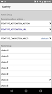
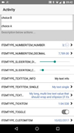
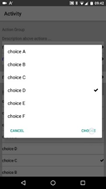
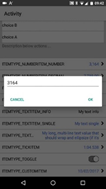
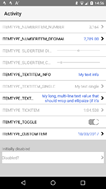
It is modelled on the IOS Settings App (see https://www.b4x.com/android/forum/t...gs-to-the-default-settings-app.48778/#content) and is designed to be used in the following (and similar) scenarios:
It displays property values as a list where each entry is the name of the property and its current value. By using a list format, there is no need to adjust field layout/positioning to handle portrait and landscape orientations - the view works just as well in either orientation.
Installing PropertyEditor
Copy the library files into your additional libraries folder. Copy the layout file (propertyeditorresources.bal/ propertyeditorresources.bil) into the Files folder within your project then "sync" the files tab in your project - PropertyEditor needs access to FontAwesome and Material fonts and the layout file makes this possible (PropertyEditor loads the layout into an internal panel to access the fonts).
PropertyEditor contains two classes:
PropertyEditorView
To get started, add a PropertyEditorView to a designer layout and load the layout. Alternatively, create a control programatically then use .Initialize and .AddToParent to add to an Activity/Panel (the attached example contains a Programmatic_A activity demonstrating how to do this).
PropertyEditorView implements a number of designer properties that control the way the view displays. Each is briefly documented in the designer and is also implemented as a property for programmatic updates. In addition, PropertyEditorView uses TextColor and TextSize information from the designer label properties.
Each property is also implemented using an andXX format that allows property updates to be "chained" together (see the attached example for how this works).
PropertyEditorView implements the following additional properties and methods:
Each AddXX method expects a unique ItemKey and for items that have more than one variant an ITEMTYPE constant, as well as minimum properties required to create an item of that type. Additional properties can be set before the item is displayed using the DelayAdd and AddToList methods described above.
The following events are generated and should be used to capture the user edits and reflect changes into the data source:
PropertyEditorItem
PropertyEditorItems are not created directly - they are created via the AddXX methods in PropertyEditorView.
Each PropertyEditorItem has a unique key and a display name, and optionally a display value, a Detail/Edit indicator (>) and additional properties specific to the Item Type.
The following properties apply to all PropertyEditorItem types:
Other properties are specific to a PropertyEditorItem type, indicated by the name of the property (e.g. GroupDescription and GroupDescriptionIsHeader are for Group Items). Each property is also implemented using an andXX format that allows property updates to be "chained" together (see the attached example for how this works).
NOTE: Many properties are changeable until the PropertyEditorItem is added to the list - attempting to change them once added to the list will cause an Exception. To change properties before a PropertyEditorItem is added to the list, use DelayAdd/AddToList as described above. Only the following properties can be changed once a PropertyEditorItem is added to the list:
Latest Changes
Further development
This is my first attempt at a fully-featured custom view and it's already at the stage where I can use it in my own Apps (avoiding the need to design portrait/landscape versions of edit pages).
If you find PropertyEditor useful, please like this post. If you find a bug, please post details.
And if you'd like improvements/enhancements, please respond to the poll at the top of this thread, or post a reply and I'll add new items to the poll.
It is modelled on the IOS Settings App (see https://www.b4x.com/android/forum/t...gs-to-the-default-settings-app.48778/#content) and is designed to be used in the following (and similar) scenarios:
- To implement a settings page in an App
- To show field values from a database record for new record creation or existing record update
- To allow class properties to be updated by an end user.
- To collect inputs from an end user.
It displays property values as a list where each entry is the name of the property and its current value. By using a list format, there is no need to adjust field layout/positioning to handle portrait and landscape orientations - the view works just as well in either orientation.
Installing PropertyEditor
Copy the library files into your additional libraries folder. Copy the layout file (propertyeditorresources.bal/ propertyeditorresources.bil) into the Files folder within your project then "sync" the files tab in your project - PropertyEditor needs access to FontAwesome and Material fonts and the layout file makes this possible (PropertyEditor loads the layout into an internal panel to access the fonts).
PropertyEditor contains two classes:
- PropertyEditorView - a custom view that displays the list of properties
- PropertyEditorItem - a class that manages display/editing of a single property within the list
PropertyEditorView
To get started, add a PropertyEditorView to a designer layout and load the layout. Alternatively, create a control programatically then use .Initialize and .AddToParent to add to an Activity/Panel (the attached example contains a Programmatic_A activity demonstrating how to do this).
PropertyEditorView implements a number of designer properties that control the way the view displays. Each is briefly documented in the designer and is also implemented as a property for programmatic updates. In addition, PropertyEditorView uses TextColor and TextSize information from the designer label properties.
Each property is also implemented using an andXX format that allows property updates to be "chained" together (see the attached example for how this works).
PropertyEditorView implements the following additional properties and methods:
- Clear - Removes all items from the PropertyEditorView.
- AddGroup - Adds a group and makes it the current group. Subsequent items will be added to the current group until EndGroup is called or until the next AddGroup.
- EndGroup - Finishes a group and resets the current group. Subsequent items will not be added to a group.
- AddActionItem - Adds an item that when clicked generates an event that can be used to initiate an App action or to open a URL (using other classes available in the B4X forums).
- AddChoiceItem - Adds a multi-choice or radio-choice item. The user can choose from a list of items shown in a pop-up dialog (multi-choice) or shown as multiple rows in the PropertyEditorView (radio-choice). The sort order of the displayed items can be set using the ChoiceSortByKey and ChoiceSortType properties of PropertyEditorItem.
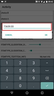
- AddNumberItem - Adds a number or decimal number item. The user can edit the item using a pop-up dialog.
- AddNumberItemMinMax - Adds a number or decimal number item, specifying the valid range for the number. User edits outside of the valid range will be red-highlighted in the pop-up dialog.
- AddSliderItem - Adds a Slider (IOS) or SeekBar (Android) item which returns whole (discrete) numbers or fractional (continuous) numbers. The slider is adjusted directly in the PropertyEditorView.
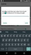
- AddTextItem - Adds a read-only (informational) item, a single-line text item or a multi-line text item. The user can edit the single-line or multi-line items using a pop-up dialog.
- AddToggleItem - Adds a toggle item that can store binary (yes/no, true/false) values. The toggle is edited directly in the PropertyEditorView.
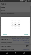
- AddTickItem - Adds an item that can be used to store/edit DateTime Tick values (displaying the result using h:mm:ss.SSS formatting codes). The user can edit the item using a pop-up dialog that displays the ticks using and IOS picker / an Android version of an IOS picker. Tick values can be used to store times.
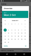
- AddCustomItem - Adds a custom item that can be used to extend the item types and/or validation. The custom item shows a name and a display value and generates an event when clicked. The attached example demonstrates how to implement a date property using a CustomItem.
- DelayAdd - Some items implement additional properties that are not available via the AddXX methods. DelayAdd should be called before AddXX to delay adding the Item to the view until the additional properties are set. The attached example demonstrates the use of DelayAdd/AddToList.
- AddToList - Adds an item to the view once additional properties have been set. The attached example demonstrates the use of DelayAdd/AddToList.
- GetItemByKey - Gets a PropertyEditorItem using the unique key that was provided via the AddXX method.
- GetItemByIndex - Gets a PropertyEditorItem based on its position in the View (which depends on the sequence in which items were added).
- SetUIString - Sets a localized value for the button text on a pop-up dialog. UIKeys can be obtained by calling GetUIKeys - Key names should be quite understandable.
- GetUIKeys - Returns a list of UIKeys that can be used with SetUIString to localize dialog button labels.
Each AddXX method expects a unique ItemKey and for items that have more than one variant an ITEMTYPE constant, as well as minimum properties required to create an item of that type. Additional properties can be set before the item is displayed using the DelayAdd and AddToList methods described above.
The following events are generated and should be used to capture the user edits and reflect changes into the data source:
- ActionItem_Clicked - the user clicked an action item - the App should execute the action or display the URL (using other classes available in the B4X forums).
- ChoiceItem_Changed - the user chose a different item from the multi-choice or radio-choice list.
- CustomItem_Clicked - the user clicked a custom item - the App should execute a custom action or should present a pop-up dialog allowing the custom value to be edited.
- NumberItem_Changed - the user changed a number or decimal item. Note that this event is only generated if the new value is within the allowed Min/Max limits (the pop-up shows invalid values with a red border).
- SliderItem_Changed - the user adjusted a slider.
- TextItem_Changed - the user updated a single-line or multi-line text item.
- TickItem_Changed - the user updated a tick value.
- ToggleItem_Changed - the user toggled an item.
PropertyEditorItem
PropertyEditorItems are not created directly - they are created via the AddXX methods in PropertyEditorView.
Each PropertyEditorItem has a unique key and a display name, and optionally a display value, a Detail/Edit indicator (>) and additional properties specific to the Item Type.
The following properties apply to all PropertyEditorItem types:
- RowHeight - gets/sets the RowHeight for the specific PropertyEditorItem.
- ItemType - returns an ITEMTYPE constant giving the type of the PropertyEditorItem.
- ItemKey - returns the unique ID that was provided via the AddXX method.
- DisplayName - gets/sets the DisplayName for the PropertyEditorItem.
- Enabled - Enables/Disables the item. For a group item, items being added to the group take on the Enabled status of the group; if the group is already complete, enabling/disabling the group enables/disables all items in the group - individual items can then be further adjusted.
- Tag - can be used to store/retrieve developer-specific data
Other properties are specific to a PropertyEditorItem type, indicated by the name of the property (e.g. GroupDescription and GroupDescriptionIsHeader are for Group Items). Each property is also implemented using an andXX format that allows property updates to be "chained" together (see the attached example for how this works).
NOTE: Many properties are changeable until the PropertyEditorItem is added to the list - attempting to change them once added to the list will cause an Exception. To change properties before a PropertyEditorItem is added to the list, use DelayAdd/AddToList as described above. Only the following properties can be changed once a PropertyEditorItem is added to the list:
- DisplayName
- Enabled
- Tag
- ChoiceSelectedKey
- CustomValue
- CustomDisplay
- NumberValue
- SliderValue
- TextValue
- TickValue
- ToggleValue
- URLTarget
Latest Changes
- v1.03 added the back ActionItem, the URLTarget and Tag properties and fixed a few bugs.
- v1.02 adds the ability to add a PropertyEditorView programatically, as well as adding additional "standard view" properties and fixing a few bugs.
- v1.01 adds the ability to enable/disable individual PropertyEditorItems, supporting dependencies between properties (e.g. properties A, B and C are disabled unless property A is more than 10). The dependencies must be coded by the developer - see the attached example for how to do this. Added DisabledColor to the custom view - please delete then re-add the view to designer layouts.
Further development
This is my first attempt at a fully-featured custom view and it's already at the stage where I can use it in my own Apps (avoiding the need to design portrait/landscape versions of edit pages).
If you find PropertyEditor useful, please like this post. If you find a bug, please post details.
And if you'd like improvements/enhancements, please respond to the poll at the top of this thread, or post a reply and I'll add new items to the poll.
Attachments
Last edited:
