I seem to remember that it has already been asked, but I can't trust my memory so much (also because I read - and write - too much), so I write this post-request anyway.

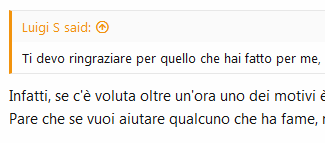
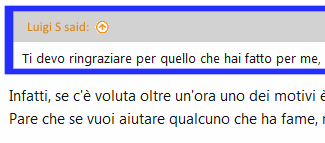
By writing a reply to a post, the original message and the reply text are not visually very well distinct, in my opinion (and also in the opinion of my poor tired eyes ? ?).
?).
So if possible, I would like to ask you to change the "reply to" style.
--------------------------------------------------------------------------
The best thing would be to increase the thickness of the separation line (and maybe even its color) and also the background color of the title (the one with the nick to which you're replying to), which is too light.

By writing a reply to a post, the original message and the reply text are not visually very well distinct, in my opinion (and also in the opinion of my poor tired eyes ?
So if possible, I would like to ask you to change the "reply to" style.
--------------------------------------------------------------------------
The best thing would be to increase the thickness of the separation line (and maybe even its color) and also the background color of the title (the one with the nick to which you're replying to), which is too light.
Last edited:
