Other Designer Anchors - new feature preview

Erel

B4X founder
Staff member
Licensed User
Longtime User
The next version will include a new designer feature that will make it easier to build flexible interfaces that adapt to the endless range of screen sizes.

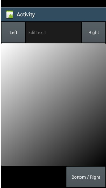
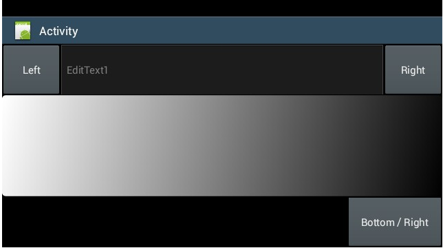
Anchors allow you to define a constant distance between the view and one or more of the parent bounds.

For example:
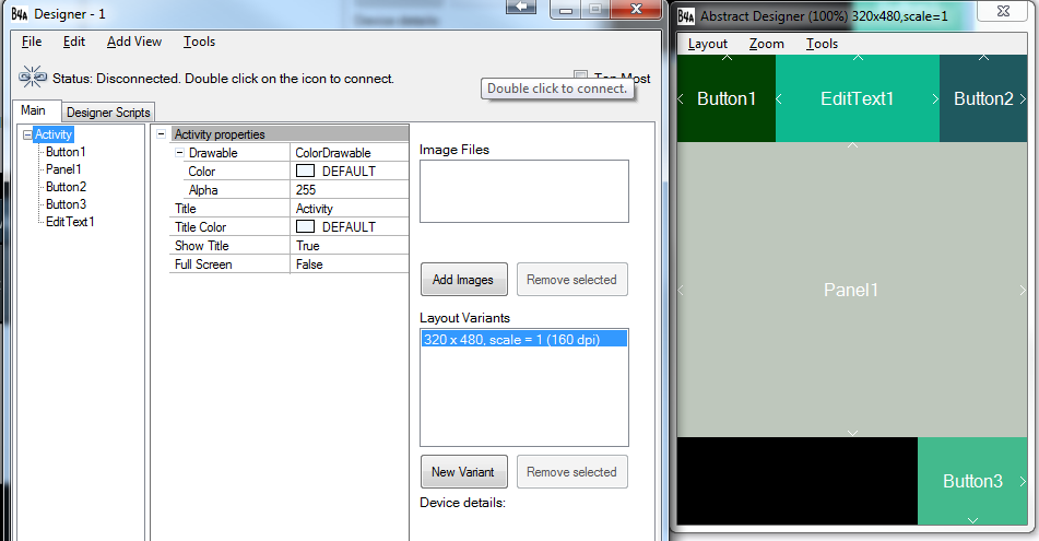
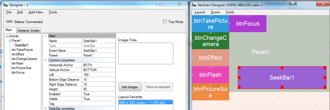
SS-2014-01-14_12.53.44.png


The small arrows in the abstract designer show the set anchors.

SS-2013-12-30_11.10.10.png


SS-2013-12-30_11.09.44.png


As you can see in the above screenshots the set distances are kept.

You can of course create the same layout with the help of a designer script. However anchors make it simpler, especially when there are nested views.

Notes

- Setting the anchors to BOTH will cause the view to change its size, similar to the script SetLeftAndRight / SetTopAndBottom methods.
- Anchors is a designer only feature. This means that changes at runtime (or in the script) will not respect the original anchors. The only exception is AutoScaleAll that does scale the views based on their anchors.
 
Last edited:

qsrtech

Active Member
Licensed User
Longtime User
Anchors will be great. It would also be nice to see an "align" property which aligns the view to specific edges of it's parent. For example an alignclient would make the view fill the parent or remaining screen space if other views are aligned within the parent. For example if you have a view set to alignTop and one to alignclient the first one will fill the parents width and whatever height you set. The latter one will fill the remaining client area below the top view. Note this "align" feature could work in combination with anchoring.
 
Upvote 0

Erel

B4X founder
Staff member
Licensed User
Longtime User
Anchors will be great. It would also be nice to see an "align" property which aligns the view to specific edges of it's parent. For example an alignclient would make the view fill the parent or remaining screen space if other views are aligned within the parent. For example if you have a view set to alignTop and one to alignclient the first one will fill the parents width and whatever height you set. The latter one will fill the remaining client area below the top view. Note this "align" feature could work in combination with anchoring.
Setting the horizontal anchor to BOTH will make the view fill its parent width (based on the left and right distances).

Also remember that you can always use the designer script to change the layout as needed. Personally I prefer the straightforward approach of the designer script compared to "fighting" with splitters and dockings.

Great, when is new version released?
I believe that the beta version will be released this week.
 
Upvote 0

qsrtech

Active Member
Licensed User
Longtime User
Additional new features:

- Copy & Paste Both in the same layout and between other layouts Very useful.
- Undo / Redo
- Views tree:

SS-2013-12-31_17.46.46.png


- AutoScaleAll can now be used with any variant, not just the "standard" variant.
- The grid is saved in the layout file.
- Landscape / Portrait keywords (in designer script)
- Designer script search / replacorm
- And other improvements and fixes...

With respect the the "view list", i trust "selection" will be coridinated between the designer and the view list such that when items are selected their corresponding designer/list will be selected. Also i hope you'll be able to move views to different parents in the "list", as well as right click on a list item and have the same menu as in the designer.

As mentioned before, I hope the two designer windows will be merged, also I think the code and designer windows should be merged, I.e. MDI. Perhaps offer an option (SDI or MDI).

finally, not sure if i mentioned this feature before, but it would be nice to have ide tooltips of a variables declaration and a subs code/declaration. Again this could be turned on or off.

oh yea i'd like to ask again for a default local "result" variable for any subs that return a value
 
Upvote 0

Jim Brown

Active Member
Licensed User
Longtime User
Hi Erel,
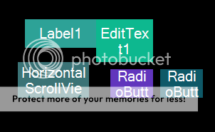
Please consider reducing the text size for the designer boxes. I often cannot read the full text due to the very large size of the font.
To illustrate the point:
b4a_designer_text_zps52794301.png
 
Upvote 0

canalrun

Well-Known Member
Licensed User
Longtime User
Currently the available anchors are: LEFT, RIGHT and BOTH. BOTH is a bit similar to what you are describing.

Sounds neat. Will there be a choice for "No Anchor"?

I currently just do one layout per app: 320x480, scale=1.0.

The views (buttons, text edits, …) seem to be automatically scaled so they become proportionately the same size on higher resolution devices as they were in my layout. I don't do anything to achieve this scaling.

I dynamically re-position everything in code so that it is placed appropriately on different resolution devices - sounds like a nightmare, but it really is not that difficult.

I am sure you have anticipated this, but I hope this "manual mode" of screen layout will be supported.

Barry.
 
Upvote 0

Erel

B4X founder
Staff member
Licensed User
Longtime User
Sounds neat. Will there be a choice for "No Anchor"?
LEFT, TOP = No anchors.
If you set the view's position to (100, 200) you are actually anchoring it 100 pixels from the left and 200 pixels from the top.

The designer dimensions were always based on 'dip' units. This hasn't changed.

Please consider reducing the text size for the designer boxes.
Done.
 
Upvote 0

macsboost

Member
Licensed User
Longtime User
could you add a scrollbar to the side and bottom of the designer. On small pc screens it can be difficult to select certain elements at 50% zoom, so you need 100%zoom. However at 100% you cant see all the views. Hence the need for scrollbars to edit .
 
Upvote 0

klaus

Expert
Licensed User
Longtime User
Hi Erel,
I am testing deeper the new Anchor function.
I noticed that it doesn't work as I would expect it for the two following views:
- the Height property of the ScrollView is not anchored.
- the Width property of the HorizontalScrollView is not anchored.

A same layout where the two scrollviews are replaced by panels works as expected.
It seems that they get the height or width of the internal panel instead of anchoring the view.

Attached two pictures and the test project.
 

Attachments

  • Panels.jpg
    Panels.jpg
    20.5 KB · Views: 425
  • ScrollViews.jpg
    ScrollViews.jpg
    20.4 KB · Views: 419
  • DesignerAnchor.zip
    8.6 KB · Views: 455
Upvote 0
U

unba1300

Guest
I don't know why my layout looks so different in the UI Cloud compared to what I was doing with the standard variant. The four buttons and labels are children of the panel. Are these new anchors not relative to panels? And why would the top-right label become so different? Sorry I'm still struggling with layouts. Thanks.
 

Attachments

  • Capture2.JPG
    Capture2.JPG
    30.1 KB · Views: 437
  • Capture.JPG
    Capture.JPG
    12.2 KB · Views: 390
Upvote 0

klaus

Expert
Licensed User
Longtime User
The anchors don't work as you think they do.
In your case you have scvCats Horizontal Anchor set to BOTH and the same for lblCats.
When you set the Horizontal Anchor of a view to BOTH it sets the views left edge with a distance to the parent views left edge and the views right edge with a distance to the parent views right edge.
In the example below the left view has its left edge set to 0 and the right edge at the blue distance from the parent views right edge.
The right view has its left edge set at the red distance from the parent views left screen edge and the right edge on the parent views right edge.
On a device with a wider screen.
For the left view, the distance of its right edge to the parent views right edge remains the same !
And, for the right view, the distance of its left edge to the parent views left edge remains the same !
And the result is an overlapping of both views !
upload_2014-1-22_22-17-16.png

In your case you should use %x and %y values in the Designer Scripts.
The same for the vertical scaling.
 
Upvote 0
U

unba1300

Guest
Thanks. I used percentages for nearly everything in that layout, but have also experienced the power of anchors in a different layout.
 
Upvote 0
Top