UPDATE!
LibVersion: Alpha2.2 > Alpha2.4 - 2020/11/03 - Status: Field Test in progress.
Notice: up to now we have some trouble with the compiled lib version. Until having a solution please use the class (import bas file) instead it works fine.
The Problem is solved!
Please use the attached FoldableMenu.b4xlib file and copy it to your additional libraries folder.
Do not forget to set the lib referencies as shown next.
If you like to work with the the FoldableMenu Class than import the attached .bas file in your project.
The Solution:
 special Developer Manual from Dropbox: Download here - sorry to big to attach.
------------------------------------
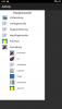
FoldableMenu is a customview lib being used with the designer. It shows a menu tree with branches and leafs (see appended screenshot).
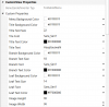
The menu is customizable in deep with Backgroundcolors, Textfont, Textcolor and Textsize by setting the appropriated properties in designers customview (see appended screenshot).
The main difference to other libs with same topic is the possibility of deep customization via the designer properties.
To use the FoldableTreeMenu you need to implement libs in your project as followes:
The layout of the branches and the leafs is defined in the activity or page creation event.
Notice:
Find next the code for the Custom Class. This may help you for ideas of optimization of this class or solutions for your projects. In your project please acivate the FoldableMenu lib an not the Custom Class,
Find attached to the article: lib file of compiled customview class
?This customview is Royalty Free to use for private and commercial purpose only for the members of the B4X Forum.
Comments , suggestion of improvment are welcome.
Nov. 2020 Thank you of the many likes I received during the last days. ?
Best regards from Germany
stay well
?Guenter
LibVersion: Alpha2.2 > Alpha2.4 - 2020/11/03 - Status: Field Test in progress.
- Implemented automatic measurement of the height of the title label
now depends on titles textsize - Implemented ScrollView to scroll big menus
- Implemented DIP consideration for image scale in pixels
to scale correct depending on device screen resolution - attached lib files changed.
- Article Sourcecode updated
- lib file deleted and bas file attached
The Problem is solved!
Please use the attached FoldableMenu.b4xlib file and copy it to your additional libraries folder.
Do not forget to set the lib referencies as shown next.
If you like to work with the the FoldableMenu Class than import the attached .bas file in your project.
The Solution:
- Do not compile by using 'compile to library'! This raises duplicated lib referencing and raises errors.
- Look into the b4x customview help booklet and follow the way to create a zip file with a b4xlib extension.
special Developer Manual from Dropbox: Download here - sorry to big to attach.------------------------------------
FoldableMenu is a customview lib being used with the designer. It shows a menu tree with branches and leafs (see appended screenshot).
The menu is customizable in deep with Backgroundcolors, Textfont, Textcolor and Textsize by setting the appropriated properties in designers customview (see appended screenshot).
- A Menu item (branch or leaf) may have a leading bitmap/icon and a label.
- The indent for the leafs under the branch is done automatic.
- The height of a row of the menu tree depends on the height of the leading bitmap. This height and width may be predefined by custom designerproperty.
- You can open one ore more branches as you like by setting Designer Property 'Only One'. True=one Branch can be opend False=Multiple Branches can be opened.
- Each Branch may have leafes (childs) or not.
- Clicking on a branch with leafs leads to show or hide the leafs (collaps or not).
- If the menu does not fit the screen height it is possible to scroll up and down.
The main difference to other libs with same topic is the possibility of deep customization via the designer properties.
To use the FoldableTreeMenu you need to implement libs in your project as followes:
- core
- B4XCollections
- StringUtils
- XUI
The layout of the branches and the leafs is defined in the activity or page creation event.
Example Definition of the Menu Tree:
' Parameter:  ID, ParentID, isBranch, HasLeafes, Bitmap,Text
Sub Activity_Create(FirstTime As Boolean)
    'Do not forget to load the layout file created with the visual designer. For example:
     Activity.LoadLayout("test")

   ' build menu tree
   FoldableMenu1.buildItem("A","0",True,True,LoadBitmap(File.DirAssets,"preflight.png"),"Vorbereitung")
   FoldableMenu1.buildItem("A1","A",False,False,LoadBitmap(File.DirAssets,"calculator-48x48.png"),"Luftfahrtrechner")
   FoldableMenu1.buildItem("A2","A",False,False,LoadBitmap(File.DirAssets,"check.png"),"Flugstatusprüfung")
   FoldableMenu1.buildItem("B","0",True,True,LoadBitmap(File.DirAssets,"checklist.png"),"Vorflugkontrolle")
   FoldableMenu1.buildItem("B1","B",False,False,LoadBitmap(File.DirAssets,"checklist.png"),"Aussenkontrolle")
   FoldableMenu1.buildItem("B2","B",False,False,LoadBitmap(File.DirAssets,"checklist.png"),"Innenkontrolle")
   FoldableMenu1.buildItem("B3","B",False,False,LoadBitmap(File.DirAssets,"flighthours.png"),"Einheitenerfassung")
   FoldableMenu1.buildItem("B4","B",False,False,LoadBitmap(File.DirAssets,"clock.png"),"Block Off Erfassung")
   ' build the menu tree
  FoldableMenu1.buildMenu
end Sub
Notice:
- 1st Parameter 'ID' must be unique.
- 2nd Parameter 'ParentID' must be always '0' (Zero) if it is a branch otherwise if its a leaf put the branch ID as 2nd parameter.
- The used image/bitmap should be 48x48 Pixels other shapes are possible.
- All leafs have value 'False' for the 3rd ('Its a Branch') and 4th parameter ('Has Leafs'). Because leafs can be no branches and leafs cannot have leafs.
Only one Sublevel is possible. - A branch with 4th Parameter ('Has Leafs') = False do not have leafs it acts like button.
- All leafs are acting like a button.
- Clicking on a branch or leaf is manged by the control itself. If it acts like a button the control calls a click Sub in the parent Activity/B4XPage as shown next.
This event can be generated by Designer. To the rvent the ID of the clcked branch or leaf is transfered. Use this rvent to do further action like starting activity or page.
CustomView click event:
Sub FoldableMenu1_click (ID As String)
    ' do your Actions
    Select ID
        Case "A1"
            ' StartActivity("???")
            ' B4XPages.ShowPageAndRemovePreviousPages("????")
    End Select
End Sub
Find next the code for the Custom Class. This may help you for ideas of optimization of this class or solutions for your projects. In your project please acivate the FoldableMenu lib an not the Custom Class,
Customview Class Version Alpha2.4:
' ###############################################
' (C) TechDoc G. Becker - http://gbecker.de
' ###############################################
' Custom View:    FoldableMenu
' Language:        B4A
' Designer:        Yes with custom props
' Version:        Alpha 2.4/2020
' Used Libs:    B4XCollections, Core, XUI, StringUtils
' ###############################################
' Usage is Roayalty free for Private and commercial
' use only for B4X-Anywhere Board Members.
' ###############################################

#Event: click (ID as string)

#DesignerProperty: Key: OnlyOne, DisplayName: Open only One, FieldType: boolean,DefaultValue: true, Description: Opens one (true) or mor (false) Branches and Leafs.

#DesignerProperty: Key: MenuBackColor, DisplayName: Menu Background Color, FieldType: Color,DefaultValue: 0xFFFFFFFF, Description: Background color of the menu item.

#DesignerProperty: Key: TitleBackColor, DisplayName: Title Background Color, FieldType: Color,DefaultValue: 0xFFD3D3D3, Description: Background color of the Title
#DesignerProperty: Key: TitleTxtSize, DisplayName: Title Text Size, FieldType: int,DefaultValue: 22, Description: Textsize of the Title.
#DesignerProperty: Key: TitleFont, DisplayName: Tile Font, FieldType: String, DefaultValue: Sans_Serif, List: Sans_Serif|Serif|Monospace|FontAwesome|Material Icons
#DesignerProperty: Key: TitleTxtColor, DisplayName: Title Text Color, FieldType: Color,DefaultValue: 0xFF000000, Description: Color of the Title text.
#DesignerProperty: Key: TitleTxt, DisplayName: Title Text, FieldType: string,DefaultValue: Main Menu, Description: Text of the Title.

#DesignerProperty: Key: BranchBackColor, DisplayName: Branch Background Color, FieldType: Color,DefaultValue: 0xFFFFFFFF, Description: Background color of the Branch.
#DesignerProperty: Key: BranchTxtSize, DisplayName: Branch Text Size, FieldType: int,DefaultValue: 18, Description: Textsize of the Branch menu item text.
#DesignerProperty: Key: BranchTxtFont, DisplayName: Branch Font, FieldType: String, DefaultValue: Sans_Serif, List: Sans_Serif|Serif|Monospace|FontAwesome|Material Icons
#DesignerProperty: Key: BranchTxtColor, DisplayName: Branch Text Color, FieldType: Color,DefaultValue: 0xFF000000, Description: Color of the branch item text.

#DesignerProperty: Key: LeafBackColor, DisplayName: Leaf Background Color, FieldType: Color,DefaultValue: 0xFFFFFFFF, Description: Background color of the Leaf.
#DesignerProperty: Key: LeafTxtSize, DisplayName: Leaf Text Size, FieldType: int,DefaultValue: 14, Description: Textsize of the Leaf menu item text.
#DesignerProperty: Key: LeafTxtFont, DisplayName: Leaf Font, FieldType: String, DefaultValue: Sans_Serif, List: Sans_Serif|Serif|Monospace|FontAwesome|Material Icons
#DesignerProperty: Key: LeafTxtColor, DisplayName: Leaf Text Color, FieldType: Color,DefaultValue: 0xFF000000, Description: Color of the leaf item text.

#DesignerProperty: Key: ImgHeight, DisplayName: Image Height, FieldType: int,DefaultValue: 36, Description: Height of the leading bitmap.
#DesignerProperty: Key: ImgWidth, DisplayName: Image Width, FieldType: int,DefaultValue: 36, Description: Width of the leading bitmap.

Sub Class_Globals
    Private mEventName As String 'ignore
    Private mCallBack As Object 'ignore
    Public mBase As B4XView
    Private xui As XUI 'ignore
    Public Tag As Object

    Private pnl As Panel
    Private ItemPnl As Panel
    Private iProps As Map
    Private iv As ImageView
    Private labl As Label
    Private onlyOneFlag As String
    Private su As StringUtils
    Private scv As ScrollView

    Public MenuItems As B4XOrderedMap

    Type MenuItem ( _
        Branch As Boolean, _
        HasLeafs As Boolean, _
        img As Bitmap, _
        Txt As String, _
        Tg As String, _
        ParentID As String, _
        Show As Boolean)

End Sub

Public Sub Initialize (Callback As Object, EventName As String)
    mEventName = EventName
    mCallBack = Callback

    pnl.Initialize("pnl")
    ItemPnl.Initialize("item")
    iProps.Initialize
    MenuItems.Initialize
    MenuItems.Keys.Sort(True)
End Sub

'Base type must be Object
' ## Vers. 2.4 added scrollview and put pnl as child view
Public Sub DesignerCreateView (Base As Object, lbl As Label, props As Map)
    mBase = Base
    Tag = mBase.Tag
    mBase.Tag = Me

    ' save props map for further usage
    iProps = props

    ' mainpanel setup
    pnl.Color=props.Get("MenuBackColor")
    pnl.Width =mBase.Width : pnl.height=2*mBase.height

    ' add mscrollview to layout (2.4)
    scv.Initialize(mBase.height)
    scv.Width = mBase.width
    scv.Panel.Height=pnl.height
    scv.Panel.AddView(pnl,0,0,pnl.Width,pnl.Height)
    mBase.AddView(scv,0,0,mBase.Width,mBase.height)

End Sub

Private Sub Base_Resize (Width As Double, Height As Double)

End Sub

' ## build one menu branch or leaf and poulate MenuItems Map
Public Sub buildItem( _
    Id As String, _
    ParentId As String, _
    Branch As Boolean, _
    HasLeafs As Boolean, _
    Img As Bitmap, _
    Text As String)

    Dim item As MenuItem
    item.Branch=Branch
    item.HasLeafs=HasLeafs
    item.img = Img
    item.Txt = Text
    item.ParentID = ParentId

    Try
        MenuItems.put(Id,item)
    Catch
        xui.MsgboxAsync(LastException,"Build Menu Item")
    End Try
End Sub

' ## build the menu
' ## Vers. 2.2 iv.Gravity=Fill implemented
' ## Vers. 2.3 auto label height, dip in iv
Public Sub buildMenu()
    Try
        Dim row As Int =0
        Dim parentID As String =""

        ' build the menu tree
        If MenuItems.Size > 0 Then

            ' sort map ascending
            MenuItems.Keys.Sort(True)

            ' clear main panel
            pnl.RemoveAllViews

            ' set title parameter
            Dim lb As Label
            lb.Initialize("lb")
            lb.TextSize = iProps.Get("TitleTxtSize")
            lb.Width = pnl.Width
            ' find best possible labelheight depending on textsize
            ' add 20dip foe bottom padding
            lb.height=su.MeasureMultilineTextHeight(lb, lb.Text) + 20dip
            lb.Color = iProps.Get("TitleBackColor")
            lb.TextColor = iProps.Get("TitleTxtColor")
            Select iProps.Get("TitleFont")
                Case "Sans_Serif"
                    lb.Typeface = Typeface.SANS_SERIF
                Case "Serif"
                    lb.Typeface = Typeface.SERIF
                Case "Monospace"
                    lb.Typeface = Typeface.MONOSPACE
                Case "FontAwesome"
                    lb.Typeface = Typeface.FONTAWESOME
                Case "Material Icons"
                    lb.Typeface = Typeface.MATERIALICONS
            End Select
            lb.Text = iProps.Get("TitleTxt")
            lb.Gravity = Typeface.STYLE_BOLD
            lb.Gravity= Bit.Or(Gravity.CENTER_VERTICAL, Gravity.CENTER_HORIZONTAL)
            ' add title
            pnl.AddView(lb,0,0,pnl.Width,lb.height)
            row = row + lb.height  + 20' next menu row, padding bottom 20

            For  each k In MenuItems.keys
                ' get menu item defintion from map
                Dim mItem As MenuItem
                mItem.Initialize
                mItem = MenuItems.Get(k)
                ' save parent id
                parentID = mItem.ParentID
                ' set item pamel parameters
                ItemPnl.Initialize("item")
                ItemPnl.tag =  k 'used for click Event
                ItemPnl.RemoveAllViews
                ItemPnl.Height = DipToCurrent(iProps.get("ImgHeight")) ' 2.3
                ItemPnl.Width = pnl.width
                ' if item is a branch build the item panel
                If mItem.Branch = True Then
                    ' ITEMPANEL ---------------
                    ' set item panel parameter
                    ItemPnl.Color = iProps.Get("BranchBackColor")

                    ' BITMAP  ---------------
                    ' bitmap has left padding 20dip
                    ' set image view parameter
                    iv.Initialize("item") ' click event
                    iv.Height = DipToCurrent(iProps.get("ImgHeight")) ' 2.3
                    iv.Width=DipToCurrent(iProps.get("ImgWidth")) ' 2.3
                    iv.Gravity = Gravity.FILL
                    If mItem.img.IsInitialized Then
                        iv.Bitmap=mItem.img
                    End If
                    iv.Tag = k  'used for click Event
                    ' LABEL  ---------------
                    ' label has left padding 20dip
                    ' set label parameter
                    labl.Initialize("item") ' click event
                    labl.Height = iv.Height
                    labl.Width = ItemPnl.Width - 20 -iv.Width -20
                    labl.TextColor = iProps.Get("BranchTxtColor")
                    labl.Gravity = Typeface.STYLE_BOLD
                    labl.Gravity= Bit.Or(Gravity.CENTER_VERTICAL, Gravity.LEFT)
                    labl.Tag= k 'used for click Event
                    labl.Text = mItem.Txt
                    labl.TextSize=iProps.Get("BranchTxtSize")
                    Select iProps.Get("BranchTxtFont")
                    Case "Sans_Serif"
                        labl.Typeface = Typeface.SANS_SERIF
                    Case "Serif"
                            labl.Typeface = Typeface.SERIF
                    Case "Monospace"
                            labl.Typeface = Typeface.MONOSPACE
                    Case "FontAwesome"
                            labl.Typeface = Typeface.FONTAWESOME
                    Case "Material Icons"
                            labl.Typeface = Typeface.MATERIALICONS
                    End Select

                    ' add bitmap and label to item panel
                    ItemPnl.AddView(iv,20,0,iv.Width,iv.Height)
                    ItemPnl.addview(labl,20+iv.Width+20,0,labl.width,iv.Height)

                    ' add item panel to main panel
                    pnl.AddView(ItemPnl,0,row,mBase.Width,ItemPnl.height)
                    row = row +ItemPnl.Height +10 ' next menu row

                Else 'ist a leaf

                    If mItem.Show = True Then
                        ' ITEMPANEL ---------------
                        ' set item panel parameter
                        ItemPnl.Color = iProps.Get("LeafBackColor")

                        ' BITMAP  ---------------
                        ' bitmap has left padding 20dip
                        ' set image view parameter
                        iv.Initialize("item") ' click event
                        iv.Height = DipToCurrent(iProps.get("ImgHeight"))' 2.3
                        iv.Width=DipToCurrent(iProps.get("ImgWidth"))' 2.3
                        iv.Gravity = Gravity.FILL
                        If mItem.img.IsInitialized Then
                            iv.Bitmap=mItem.img
                        End If
                        iv.Tag = k  'used for click Event
                        ' LABEL  ---------------
                        ' label has left padding 20dip
                        ' set label parameter
                        labl.Initialize("item") ' click event
                        labl.Height = iv.Height
                        labl.Width = ItemPnl.Width - 20 -iv.Width - 20 - iv.Width - 20
                        labl.TextColor = iProps.Get("LeafTxtColor")
                        'labl.Gravity = Typeface.STYLE_BOLD
                        labl.Gravity= Bit.Or(Gravity.CENTER_VERTICAL, Gravity.LEFT)
                        labl.Tag= k 'used for click Event
                        labl.Text = mItem.Txt
                        labl.TextSize=iProps.Get("LeafTxtSize")
                        Select iProps.Get("LeafTxtFont")
                            Case "Sans_Serif"
                                labl.Typeface = Typeface.SANS_SERIF
                            Case "Serif"
                                labl.Typeface = Typeface.SERIF
                            Case "Monospace"
                                labl.Typeface = Typeface.MONOSPACE
                            Case "FontAwesome"
                                labl.Typeface = Typeface.FONTAWESOME
                            Case "Material Icons"
                                labl.Typeface = Typeface.MATERIALICONS
                        End Select
                        ' add bitmap and label to item panel
                        ItemPnl.AddView(iv,20 + iv.Width + 20,0,iv.Width,iv.Height)
                        ItemPnl.addview(labl,20 + iv.Width + 20 + iv.width+20,0,labl.width,iv.Height)

                        ' add item panel to main panel
                        pnl.AddView(ItemPnl,0,row,mBase.Width,ItemPnl.height)
                        row = row +ItemPnl.Height +10 ' next menu row
                    End If
                End If
            Next
            scv.Invalidate 'redraw scv content - 2.4
        End If
    Catch
        xui.MsgboxAsync(LastException,"Build Menu")
    End Try
End Sub

' ## Item click event for all branche and all leaf items
' ## Vers. Alpha 2.1 implement OnlyOne
private Sub item_click
    Try
        Dim cItem As B4XView=Sender
        Dim item As MenuItem
        Dim ID As String
        Dim ParentID As String = "0"

        ' get menu item
        ID = cItem.tag
        item = MenuItems.Get(ID)
        ' if a branch is clicked
        If item.Branch = True Then
            ParentID = ID
            ' if branch has no leafs/children
            ' then do action
            If item.HasLeafs = False Then
                ' do action for branches without leafs
                ' other activity/page selected call activity/page event
                ' to load new activity/page
                If SubExists(mCallBack,"FoldableMenu1_click") Then
                    CallSub2(mCallBack,"FoldableMenu1_Click",ID)
                End If
            Else ' toggle leafs visibility
                If (onlyOneFlag = "" Or onlyOneFlag = ID) And iProps.Get("OnlyOne") = True Then ' 2.1
                    For Each k As String In MenuItems.Keys
                        item = MenuItems.Get(k)
                        If item.ParentID = ID Then
                            item.Show=Not(item.show)
                            If item.Show = True Then
                                onlyOneFlag=item.parentid
                            Else
                                onlyOneFlag=""
                            End If
                        End If
                    Next
                    ' rebuild menu
                    buildMenu
                Else if (onlyOneFlag = "" Or onlyOneFlag = ID) And iProps.Get("OnlyOne") = False Then ' 2.1
                    item = MenuItems.Get(k)
                    For Each k As String In MenuItems.Keys
                        item = MenuItems.Get(k)
                        If item.ParentID = ID Then
                            item.Show=Not(item.show)
                            onlyOneFlag=""
                        End If
                    Next
                    ' rebuild menu
                    buildMenu
                End If
            End If
        Else' a leaf is clicked
            ' other activity/page selected call activity/page event
            ' to load new activity/page
            If SubExists(mCallBack,"FoldableMenu1_click") Then
                CallSub2(mCallBack,"FoldableMenu1_Click",ID)
            End If
        End If
    Catch
        xui.MsgboxAsync(LastException,"Menu Item clicked")
    End Try
End Sub

' ###############################################
' (C) TechDoc G. Becker - http://gbecker.de
' ###############################################
Find attached to the article: lib file of compiled customview class
?This customview is Royalty Free to use for private and commercial purpose only for the members of the B4X Forum.
Comments , suggestion of improvment are welcome.
Nov. 2020 Thank you of the many likes I received during the last days. ?
Best regards from Germany
stay well
?Guenter
Attachments
Last edited: