Hello,
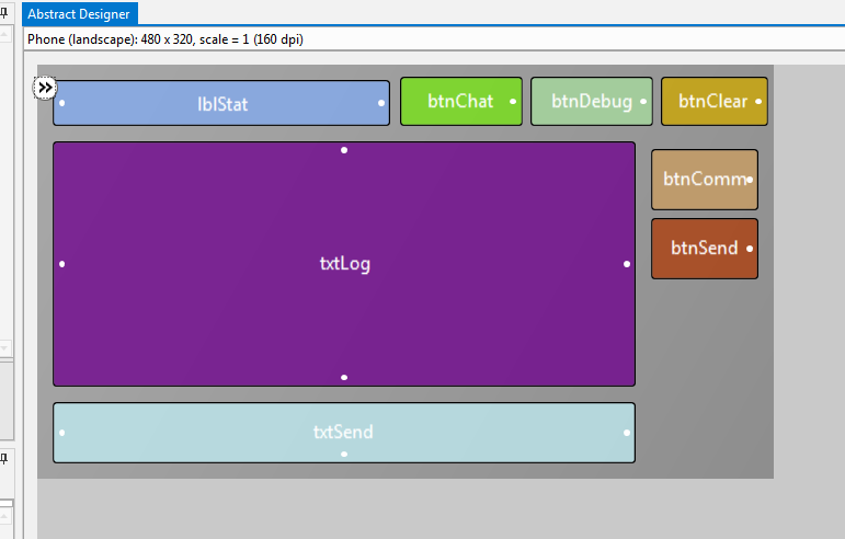
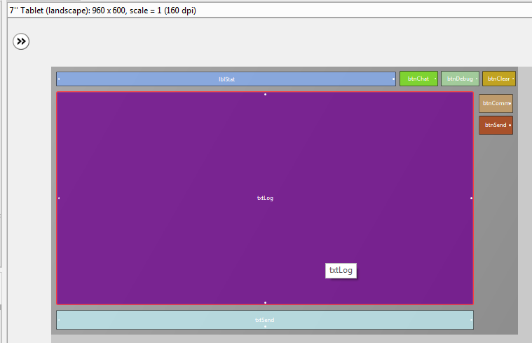
I want to make my layout responsive.
First I'd make my design to fit perfectly to my tablet screen.
Then I want to make it responsive by setting how much % it should have for example if editbox should have width 300px and my screen width is 600 - I will setup in designer scripts myeditbox.width = 50%x
etc. so I had written to the paper following proporties of each of my elements:
Left Top Width Height
And calcute % values. Then I make my designer script like:
firstelement.left = somenumber%x
firstelement.top = somenumber%y
firstelement.width = somenumber%x
firstelement.height = somenumber%y
secondelement.left = somenumber%x
........ etc.
When I comment my designer scripts and there will be only AutoScaleAll - In normal mode my layout width is only maybe 70% of tablet screen but if I switch into the designer script mode (there's only AutoScaleAll option) and run it layout width is equal to my tablet width - as it should be.
So why in normal (not designer) mode layout width is only about 70% of my tablet screen width ? (There's a same problem with height too).
And when I try to run my responsive designer script (as shown up) in the designer mode will layout have again only about 70% of real tablet screen width & height.
When I run my final app, the app will also consume only 70% of tablet real width & height.
Where's the problem ?
Thank's you very much for help, hope you understand me. My app zipped in attachment.