Android Question Auto scale issue

DannyMarom

New Member
Hi All

Regrets, i looks like the AutoScale issue was discussed and should work.

However, I got a simple app where the AutoScale is nor working properly on all other devices:

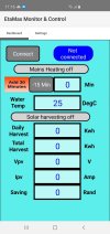
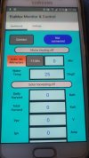
1, The design is done using the Samsung A22 5G with screen resolution of 1080 x 2408 pixels.
2. All the views are standard that come with the basic package, the "AutoScaleAll" directive is present on all pages.
3. When installing the App to other devices, we sometime get cut screen and/or not proportional text size.
4. See attached pics of the original design and of the App installed on S6 and S23 handsets.
5. Also attached are the project files clear of the logic.

What are we doing wrong?

Thanks in advance
 

Attachments

  • B4aEtaMax.zip
    97.9 KB · Views: 37
  • On Original Handset.zip
    59.5 KB · Views: 30
  • On Samsung S6 ans S23 Handsets.zip
    92 KB · Views: 37

DannyMarom

New Member
Hi Erel

Thank you for the reply.

See pics, magic or no magic, I have this issue.

What I am doing wrong?

Regards
Danny
 

Attachments

  • On Original Handset.jpg
    On Original Handset.jpg
    103 KB · Views: 35
  • On Samsung S6 ans S23 Handsets.jpg
    On Samsung S6 ans S23 Handsets.jpg
    107.8 KB · Views: 41
Upvote 0

Erel

B4X founder
Staff member
Licensed User
Longtime User
Don't put views outside of the visible area. Change the variant height and make it taller.

But, don't assume that AutoScaleAll will make your layout magically fit all devices. In this case you have several options:
1. Use B4XPreferencesDialog for all these fields.
2. Load the layout into a ScrollView that fills the screen. The content height should be: 530dip (based on the lower view in Page1 layout.
 
Upvote 0

emexes

Expert
Licensed User
From memory what I found is that AutoScale scales by the relative diagonal size,
which means that if the source (layout) and destination (screen) aspect ratios are different,
then one of the dimensions will be scaled a fraction not enough (thus leaving some "bonus" unused space on the right or bottom of the screen)
and the other a fraction too much (thus potentially overshooting the right or bottom of the other screen dimension).

(dimension aka axis)
 
Last edited:
Upvote 0

emexes

Expert
Licensed User
On a completely unrelated note, and you've probably fixed it already, but just in case:

power unit is kW (little k for kilo, big W for name James Watt) not Kw (big K is degrees Kelvin, little w I don't know offhand).

You're in good company, though šŸ» the local news here during droughts often state the city's daily water usage as ml (millilitres) rather than Ml (megalitres) which is only out by a factor of one billion.
 
Upvote 0

udg

Expert
Licensed User
Longtime User
Sometimes you could read " inversion of 360 degrees:" when they wanted to say someone changed his mind to embrace the opposite idea. Same when driving/walking in the opposite versus where they misuse the word direction.
They pay great attention when they define a unit, then common language comes in and you can read anything .. :D
 
Upvote 0

emexes

Expert
Licensed User
magic or no magic

My solution in 2018 was to add a bottom-layer panel that was the full size of the layout,
and then, after loading the layout, compare the post-AutoScale size of that panel to the screen dimensions,
work out a rescaling factor to fit the bottom full-size panel to within the screen,
(so that it would be either the screen height but less width, or the screen width but less height),
work out X and Y offsets to split the excess width or height equally (with at least one of X and Y being zero),
then GetViewsRecursive and adjust all views accordingly

It worked surprisingly well, provided that the layout aspect ratio is middle-of-the-range (or multiple layouts are spread equally across the range).
 
Last edited:
Upvote 0
Top