Other [new feature] Recent places list in the title bar

Erel

B4X founder
Staff member
Licensed User
Longtime User
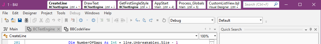
In many cases we find ourselves switching back and forth between several places. There are all kinds of ways to navigate between these places. You can use bookmarks, split the code editor, use Alt + Left / Right arrows as well as a few other methods.

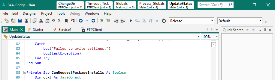
Now there is another one:

B4A_DwOweEi0tI.png


The 5 recent places appear automatically in the title bar and can be clicked to jump to the recent place.

Note that the quick search field also moved to the title bar to make it more accessible.

Edit: Screenshot updated with some design changes.
 
Last edited:

Erel

B4X founder
Staff member
Licensed User
Longtime User
Is there a way to turn this off if I dont want to see a bunch of stuff in the UI title bar?
With the exception of the lost shortcut which 99% most probably never used, there are no downsides to this feature. So it will probably won't be optional in the next version. It might become optional in future versions.
 
Upvote 0

techknight

Well-Known Member
Licensed User
Longtime User
So if I am reading it correctly, your imposing it onto us, basically forcing it like an ugly banshee that it is.

Edit: I'll just be patient. see what happens. I will either like it and get used to it, Or I will hate it and have to hack it out somehow. Maybe tape over the screen... Yes, I am that anal about the look and feel of something I use on a daily basis.
 
Last edited:
Upvote 0

j_o_h_n

Active Member
Licensed User
I agree 100%, that would also make the top of the screen look less cluttered too. An option to turn off/disable the recent places list in the title bar would be nice though...

The more information you have without doing anything the better, in my opinion.
A drop down is good but takes one more step and you can't be certain that what you are seeking is even there until you've made it drop down.
Each to their own but for me the title bar is big piece of real estate that's always visible and is currently doing nothing.
 
Upvote 0

Peter Simpson

Expert
Licensed User
Longtime User
The more information you have without doing anything the better, in my opinion.
A drop down is good but takes one more step and you can't be certain that what you are seeking is even there until you've made it drop down.
Each to their own but for me the title bar is big piece of real estate that's always visible and is currently doing nothing.

Well I prefer the one extra step than a cluttered screen, and the top looks cluttered IMO, and I mean IMHO, each to their own. Anyway Erel has added it already so it will not be change. Recent places history is a great addition but I would have prefer a drop down.

Goodnight...
 
Upvote 0

alwaysbusy

Expert
Licensed User
Longtime User
I mostly agree with Erel on the IDE design (I pick functionality over aesthetics every day!) but on this one I can't say I'm a fan. I love the functionality, just not the position where it is placed.

I work mostly in VMWare environments (so wherever I work, I work under the same conditions). However, the window bar is often occupied by a lot of other stuff. e.g. in VMWare, moving your mouse to the top of the screen will show the VMWare toolbar, covering the new functionality:

upload_2019-5-21_11-44-52.png


If it where in the toolbar, just below the window bar, I would've been very happy with this as it looks like another huge productivity asset. Implementation now, not that much. (sorry Erel, just my thoughts...)
 
Upvote 0

RWK

Member
Licensed User
Why not put it at the bottom of the Protocol window?
when developing there is much room to show the last used subs.
when compiling it could be hidden so that protocol window can rise vertically.

when hidden a ctrl+ 1 to 5 will show it again.
and maybe one can pin some of the subs. so that they show always on top of that list.


also 2c :)

Greetings
Rainer
 
Upvote 0

MarkusR

Well-Known Member
Licensed User
Longtime User
Why not put it at the bottom of the Protocol window?
thats why tool bar parts customizable / movable or optional.
 
Upvote 0

techknight

Well-Known Member
Licensed User
Longtime User
Now that's a great call AB, and it wold look more natural there too...

Thats what I had mentioned too. if it was inside a toolbar/ribbon, it could sit in the dock along with the Open/Save/etc toolbar that is pre-existing. Then it can be re-arranged top/bottom, stacked, etc...

Heck, it could even be in the same toolbar, Just after the two Debug/Release-Default dropdowns.
 
Upvote 0

Alaa Alawi

Member
Licensed User
Late to commenting here!

May I suggest left, right or bottom tabs. It will be more (arguably) closer to the central editing (focus) point.

Regards,
 
Upvote 0

Erel

B4X founder
Staff member
Licensed User
Longtime User
This has evolved into an "auto bookmarks tabs" feature:

B4J_qZV9vx8c4I.png


1. The IDE will list up to 6 code locations and designer files based on the developer behavior. It considers several parameters such as recency, code modifications and explicit navigation.
2. The navigation stack will be saved in the meta file and loaded when the project loads.
3. The window can be dragged directly from these tabs.
4. This feature could be disabled from the ini file.

I find it to be an excellent feature especially when you need to modify several subs and go back and forth between the various places.
 
Upvote 0

Erel

B4X founder
Staff member
Licensed User
Longtime User
what is the difference, only that you can jump directly to the N position of 6? Or...
1. The IDE will list up to 6 code locations and designer files based on the developer behavior. It considers several parameters such as recency, code modifications and explicit navigation.
2. The navigation stack will be saved in the meta file and loaded when the project loads.

Manually? Why not by an item menu or icon?
There are many many features in the IDE. Most of them cannot be disabled at all. At this point I don't see a reason to add a menu option for this feature.
 
Upvote 0

j_o_h_n

Active Member
Licensed User
Not the case here I'd say, but I find sometimes that the code and design that allows the user to set/unset something can take as much time as coding the feature itself does.
So adjusting settings, particularly ones that are a once-off, by tweaking the ini file is fine by me.
 
Upvote 0

LucaMs

Expert
Licensed User
Longtime User
Not the case here I'd say, but I find sometimes that the code and design that allows the user to set/unset something can take as much time as coding the feature itself does.
So adjusting settings, particularly ones that are a once-off, by tweaking the ini file is fine by me.
The ini file, in my opinion, is antediluvian stuff; furthermore, asking the user to change it manually is not a good thing.

Someone told me a little while ago that a list (combobox) would be better; as in some software there is a list of the last commands that allows you to "automate" N "Undo"s; it would probably be better and less graphically invasive.


For the avoidance of doubt, mine are not criticisms but suggestions; improving b4x helps us and even b4x sales itself.
I suppose that among the many "Wish" suggestions there are still very useful suggestions.
 
Upvote 0
Top