This is an old tutorial. I recommend to instead watch the visual designer video tutorial: https://www.b4x.com/etp.html
There are several features in B4A that help you target Android phones and tablets with different screen sizes and resolutions. The purpose of this page is to collect tips and best practices that will help you create flexible layouts.
If you are not familiar with the designer script feature then please start with this tutorial: Designer Scripts Tutorial
- 'dip' units
It is very simple. You should always use 'dip' units when specifying the size or position of a view (control). This way the view's physical position and size will be the same on any device.
This is correct for both regular code and designer script.
Note that text size is measured in physical units. So you should not use 'dip' units with text size values.
- Use few layout variants
It is easy to create many variants. However it is very difficult to maintain a layout made of many variants. You should use the designer script feature and the anchoring feature to adjust your layout instead of creating many variants.
- Understand the meaning of scale (dots per inch)
There are many questions starting with "I have a device with 480x800 screen...". There is no meaning to these dimensions without the scale value.
A scale of 1.0 means that there are 160 dots (pixels) per inch.
The scale values can be one of the following values: 0.75, 1.0, 1.33, 1.5 and 2.
Most phones today have a scale of 1.5 (160 * 1.5 = 240 dots per inch) or 2.0.
Most tablets have a scale of 1.0.
- "Normalized" variants
Normalized variants are variants with a scale of 1.0.
The layout you create with the designer is scaled (not stretched or resized) automatically. This means that the layout will look exactly the same on two phones with the same physical size. The scale doesn't matter.
It is highly recommended to work and design your layout with normalized variants only.
For example a variant of 480x800, scale=1.5 matches the normalized variant: 320x533, scale=1.0 (divide each value by the scale value). Now it is easy to see that this device is slightly longer than the "standard" variant: 320x480, scale=1.0.
- Scaling strategy
Use the anchoring feature to anchor the views to their parents.
See this video example: Designer anchors - Video example
And: https://www.b4x.com/android/forum/threads/64112
Decide which views should be anchored and which views should "fill" the available space.
You can also use the designer script to make a view fill the available space:
This is done with SetTopAndBottom and SetLeftAndRight methods.
Starting from v3.20 you can set the vertical or horizontal (or both) anchor to BOTH to achieve the same result.
- How to change the views size and text size?
Larger devices offer a lot more available space. The result is that even if the physical size of a view is the same, it just "feel" smaller.
Some developers use %x and %y to specify the views size. However the result is far from being perfect. The layout will just be stretched.
The solution is to combine the "dock and fill" strategy with a smart algorithm that increases the views size and text size based on the running device physical size.
Basic4android v2.20 introduces three new keywords that help with scaling the views size and text size:
AutoScale - Scales the specified view. The scale size, position and text size will be scaled based on the device physical size compared to the chosen variant size.
Example:
AutoScaleAll - Scales all layout views.
AutoScaleRate - Sets the scale rate. This is a number between 0 to 1. The default value is 0.3.
A value of 0 means no scaling at all.
Value of 1 means that the scale factor is exactly proportional to the device physical size. The result is a "stretched" UI.
The recommended process is to first scale all views and then adjust their positions as required.
If done properly this saves the need to create many variants. Your layout will look good on all devices.
Test your layout
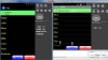
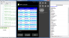
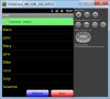
You can test your layout with a real device, an emulator, the abstract designer and the UI Cloud service (Tools - Send to UI Cloud).
There are several features in B4A that help you target Android phones and tablets with different screen sizes and resolutions. The purpose of this page is to collect tips and best practices that will help you create flexible layouts.
If you are not familiar with the designer script feature then please start with this tutorial: Designer Scripts Tutorial
- 'dip' units
It is very simple. You should always use 'dip' units when specifying the size or position of a view (control). This way the view's physical position and size will be the same on any device.
This is correct for both regular code and designer script.
B4X:
Button1.Width = 100 'WRONG!
Button1.Width = 100dip 'Good job!- Use few layout variants
It is easy to create many variants. However it is very difficult to maintain a layout made of many variants. You should use the designer script feature and the anchoring feature to adjust your layout instead of creating many variants.
- Understand the meaning of scale (dots per inch)
There are many questions starting with "I have a device with 480x800 screen...". There is no meaning to these dimensions without the scale value.
A scale of 1.0 means that there are 160 dots (pixels) per inch.
The scale values can be one of the following values: 0.75, 1.0, 1.33, 1.5 and 2.
Most phones today have a scale of 1.5 (160 * 1.5 = 240 dots per inch) or 2.0.
Most tablets have a scale of 1.0.
- "Normalized" variants
Normalized variants are variants with a scale of 1.0.
The layout you create with the designer is scaled (not stretched or resized) automatically. This means that the layout will look exactly the same on two phones with the same physical size. The scale doesn't matter.
It is highly recommended to work and design your layout with normalized variants only.
For example a variant of 480x800, scale=1.5 matches the normalized variant: 320x533, scale=1.0 (divide each value by the scale value). Now it is easy to see that this device is slightly longer than the "standard" variant: 320x480, scale=1.0.
- Scaling strategy
Use the anchoring feature to anchor the views to their parents.
See this video example: Designer anchors - Video example
And: https://www.b4x.com/android/forum/threads/64112
Decide which views should be anchored and which views should "fill" the available space.
You can also use the designer script to make a view fill the available space:
This is done with SetTopAndBottom and SetLeftAndRight methods.
B4X:
'Make an EditText fill the available height between two buttons:
EditText1.SetTopAndBottom(Button1.Bottom, Button2.Top)

'Make a Button fill the entire PARENT panel:
Button1.SetLeftAndRight(0, Parent1.Width)
Button1.SetTopAndBottom(0, Parent1.Height)
Starting from v3.20 you can set the vertical or horizontal (or both) anchor to BOTH to achieve the same result.
- How to change the views size and text size?
Larger devices offer a lot more available space. The result is that even if the physical size of a view is the same, it just "feel" smaller.
Some developers use %x and %y to specify the views size. However the result is far from being perfect. The layout will just be stretched.
The solution is to combine the "dock and fill" strategy with a smart algorithm that increases the views size and text size based on the running device physical size.
Basic4android v2.20 introduces three new keywords that help with scaling the views size and text size:
AutoScale - Scales the specified view. The scale size, position and text size will be scaled based on the device physical size compared to the chosen variant size.
Example:
B4X:
AutoScale(Button1)AutoScaleRate - Sets the scale rate. This is a number between 0 to 1. The default value is 0.3.
A value of 0 means no scaling at all.
Value of 1 means that the scale factor is exactly proportional to the device physical size. The result is a "stretched" UI.
The recommended process is to first scale all views and then adjust their positions as required.
If done properly this saves the need to create many variants. Your layout will look good on all devices.
Test your layout
You can test your layout with a real device, an emulator, the abstract designer and the UI Cloud service (Tools - Send to UI Cloud).
Last edited:
") )
)