The TableView view from iTableView library wraps the native UITableView control. This control is similar to B4A ListView though it is more powerful.
Do not confuse TableView with Table class which is a custom multicolumn table: https://www.b4x.com/android/forum/threads/class-table.46567/
TableView is optimized for very large lists. It only creates internal views for the visible cells and reuses them when the user scrolls the list.
Note that for short / meduim lists that require custom UI you can use CustomListView class.
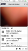
TableView holds one or more sections. Each section holds a list of TableCells.
Currently there are two types of cells: single line cells and two lines cells. Each type of cell can optionally show a bitmap.
Adding cells and sections
Adding sections is done with TableView.AddSection.
Adding cells is done with AddSingleLine or AddTwoLines methods. Note that these methods will create a section automatically if you didn't create one.
These methods return a TableCell object which you can further customize. For example you can add a bitmap or use an AttributedString to change the text colors:

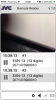
Code example:
Accessory Views
Accessory views are standard views or symbols that are added to the right side of the cells.

The following code is used to create the above screenshot:
If the accessory type is DETAIL_BUTTON or DISCLOSURE_BUTTON then the touch events are tracked and the AccessoryButtonClicked event will fire when the user clicks on this accessory:
Updating the cell content
You can update the content of the cells. The important thing to remember is that you need to call TableCell.Update to apply the changes:
You can get a reference to a cell with:
Table Style
There are two possible styles for the table: grouped or plain. It is determined by the second parameter in the Initialize method.
In the plain style the headers and footers are floating:

Group style:

Adding or removing items
It is possible to add or remove items from a list.
First you retrieve the list of items of a specific section and then you can modify the list of cells.
The last step is to call TableView.ReloadSection to apply the changes. Note that the changes will be animated.
ExpandableTableView class: https://www.b4x.com/android/forum/threads/class-expandabletableview-tree-view.50743/
Do not confuse TableView with Table class which is a custom multicolumn table: https://www.b4x.com/android/forum/threads/class-table.46567/
TableView is optimized for very large lists. It only creates internal views for the visible cells and reuses them when the user scrolls the list.
Note that for short / meduim lists that require custom UI you can use CustomListView class.
TableView holds one or more sections. Each section holds a list of TableCells.
Currently there are two types of cells: single line cells and two lines cells. Each type of cell can optionally show a bitmap.
Adding cells and sections
Adding sections is done with TableView.AddSection.
Adding cells is done with AddSingleLine or AddTwoLines methods. Note that these methods will create a section automatically if you didn't create one.
These methods return a TableCell object which you can further customize. For example you can add a bitmap or use an AttributedString to change the text colors:
Code example:
B4X:
Sub Process_Globals
   Public App As Application
   Public NavControl As NavigationController
   Private Page1 As Page
   Private TableView1 As TableView
End Sub

Private Sub Application_Start (Nav As NavigationController)
   NavControl = Nav
   Page1.Initialize("Page1")
   Page1.Title = "Page 1"
   Page1.RootPanel.Color = Colors.White
   NavControl.ShowPage(Page1)
   TableView1.Initialize("TableView1", False)
   Page1.RootPanel.AddView(TableView1, 0, 0, 100%x, 100%y)
   Dim img As Bitmap = LoadBitmap(File.DirAssets, "smiley.png")
   For i = 1 To 50
     TableView1.AddSingleLine("Item #" & i)

     'create an item and customize it
     Dim tc As TableCell = TableView1.AddTwoLines("First line", "") 'the second line will be soon added
     tc.Bitmap = img
     tc.IndentationLevel = Rnd(0, 5)
     Dim ColoredTitle As AttributedString
     ColoredTitle.Initialize("Second line", Font.CreateNew(19), Rnd(0x80000000, -1))
     tc.DetailText = ColoredTitle
   Next
End Sub

Private Sub Page1_Resize(Width As Int, Height As Int)
   TableView1.SetLayoutAnimated(500, 0.6, 0, 0, 100%x, 100%y)
End Sub

Sub TableView1_SelectedChanged (SectionIndex As Int, Cell As TableCell)
   Page1.Title = Cell.Text.ToString
End Sub
Accessory Views
Accessory views are standard views or symbols that are added to the right side of the cells.
The following code is used to create the above screenshot:
B4X:
For i = 1 To 50
   Dim tc As TableCell = TableView1.AddSingleLine("Item #" & i)
   Select i Mod 5
     Case 0
       tc.AccessoryType = tc.ACCESSORY_NONE
     Case 1
       tc.AccessoryType = tc.ACCESSORY_CHECKMARK
     Case 2
       tc.AccessoryType = tc.ACCESSORY_DETAIL_BUTTON
     Case 3
       tc.AccessoryType = tc.ACCESSORY_DISCLOSURE_BUTTON
     Case 4
       tc.AccessoryType = tc.ACCESSORY_INDICATOR
   End Select
Next
B4X:
Sub TableView1_AccessoryButtonClicked (SectionIndex As Int, Cell As TableCell)
   Log("Accessory view: " & Cell.Text.ToString & " was clicked")
   Dim i As Int = TableView1.GetItems(SectionIndex).IndexOf(Cell)
   Log("Cell index: " & i)
End Sub
Updating the cell content
You can update the content of the cells. The important thing to remember is that you need to call TableCell.Update to apply the changes:
B4X:
Sub TableView1_SelectedChanged (SectionIndex As Int, Cell As TableCell)
   Dim s As AttributedString
   s.Initialize(DateTime.Time(DateTime.Now), Font.DEFAULT_ITALIC, Colors.Black)
   Cell.Text = s
   Cell.Update
End Sub
You can get a reference to a cell with:
B4X:
Dim tc As TableCell = TableView1.GetItems(0).Get(1) 'Get the second item in the first sectionTable Style
There are two possible styles for the table: grouped or plain. It is determined by the second parameter in the Initialize method.
In the plain style the headers and footers are floating:
Group style:
Adding or removing items
It is possible to add or remove items from a list.
First you retrieve the list of items of a specific section and then you can modify the list of cells.
The last step is to call TableView.ReloadSection to apply the changes. Note that the changes will be animated.
B4X:
Dim items As List = TableView1.GetItems(0)
Dim tc As TableCell 'create a new item
tc.InitializeSingleLine("New Item!")
items.InsertAt(0, tc)
TableView1.ReloadSection(0)
ExpandableTableView class: https://www.b4x.com/android/forum/threads/class-expandabletableview-tree-view.50743/
Last edited:
