B4J Tutorial [BANanoWebix] Lesson 7: Charts - Part 1

Ola

Fork it here...

Let me close off today with Lesson 7, that deals with the charts. Depicted here is not everything there is though. We will deal with mutliple type charts on same chart, series charts and setting legends in Part 2.
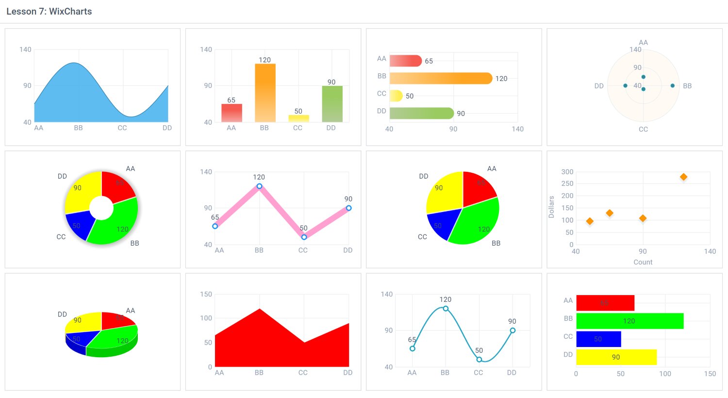
WixCharts.png


As you might have guessed, by just setting the 'type' attribute of the WixElement to the chart you need and setting the 'data' attribute, you have different types of charts.

This is the chart data we are using across all these charts we have specified.

B4X:
Dim chartData As List
    chartData.Initialize
    chartData.Add(CreateMap("count" : 65, "dollars" : 130, "color" : "#ff0000", "type" : "AA"))
    chartData.Add(CreateMap("count" : 120, "dollars" : 280, "color" : "#00ff00", "type" : "BB"))
    chartData.Add(CreateMap("count" : 50, "dollars" : 98, "color" : "#0000ff", "type" : "CC" ))
    chartData.Add(CreateMap("count" : 90, "dollars" : 110, "color" : "#ffff00", "type" : "DD"))

So to draw each chart we use basically .SetValue("#count#").SetColor("#color#").SetLabel("#type"#) and then the chart type e.g. .SetChartTypeSpLine("") or .SetChartBar("")

That is basically all.

Some charts have different properties that you can set for more details see from the webix website.
 
Last edited:

Mashiane

Expert
Licensed User
Longtime User
Charts on R1

B4X:
'area chart
    R1.AddColumns(CreateMap("width":10))
    Dim wchart As WixChart
    wchart.Initialize("").SetTypeSpLineArea("").SetValue("#count#").SetLabel("#count#").SetWidth(300).SetHeight(200).SetData(chartData)
    wchart.SetColor("#36abee").SetAlpha(0.8).SetXAxisTemplate("#type#").SetTooltipTemplate("#count#").SetBorder(True)
    R1.AddColumns(wchart.Item)
    '
    'bar chart
    R1.AddColumns(CreateMap("width":10))
    Dim w1 As WixChart
    w1.Initialize("").SetTypeBar("").SetValue("#count#").SetLabel("#count#").SetWidth(300).SetHeight(200).SetData(chartData)
    w1.SetBarWidth(35).SetRadius(0).SetGradientFalling("").SetXAxisTemplate("#type#")
    '.SetGradient("3d")
    R1.AddColumns(w1.Item)
    '
    'horizontal bar
    R1.AddColumns(CreateMap("width":10))
    Dim w2 As WixChart
    w2.Initialize("").SetTypeBarH("").SetValue("#count#").SetLabel("#count#").SetWidth(300).SetHeight(200).SetData(chartData)
    w2.SetBarWidth(20).SetRadius(10).SetGradient("falling").SetPadding(40).SetYAxisTemplate("#type#")
    R1.AddColumns(w2.Item)
    '
    'radar chart
    R1.AddColumns(CreateMap("width":10))
    Dim wa As WixChart
    wa.Initialize("").SetTypeRadar("").SetValue("#count#").SetWidth(300).SetHeight(200).SetData(chartData)
    wa.SetDisableLines(True).SetXAxisTemplate("#type#").SetYAxisLineShape("arc").SetYAxisBG("#fffbf4")
    wa.SetTooltipTemplate("#count#").SetItemBorderWidth(0).SetItemColor("#3a838e").SetItemRadius(2)
    R1.AddColumns(wa.Item)
    R1.AddColumns(CreateMap())
 

Mashiane

Expert
Licensed User
Longtime User
Charts on R2

B4X:
'donut chart
    R2.AddColumns(CreateMap("width":10))
    Dim w3 As WixChart
    w3.Initialize("").SetTypeDonut("").SetValue("#count#").SetColor("#color#").SetLabel("#type#").SetData(chartData).SetShadow(20)
    w3.SetWidth(300).SetHeight(200).SetPieInnerText("#count#")
    R2.AddColumns(w3.Item)
    '
    'line chart
    R2.AddColumns(CreateMap("width":10))
    Dim w4 As WixChart
    w4.Initialize("").SetTypeLine("").SetValue("#count#").SetLabel("#count#").SetWidth(300).SetHeight(200).SetData(chartData)
    w4.SetLineColor("#ffa0d0").SetLineWidth(10).SetXAxisTemplate("#type#").SetOffSet(0)
    w4.SetItemBorderColor("#1293f8").SetItemColor("#ffffff")
    R2.AddColumns(w4.Item)
    '
    'pie chart
    R2.AddColumns(CreateMap("width":10))
    Dim w5 As WixChart
    w5.Initialize("").SetTypePie("").SetValue("#count#").SetPieInnerText("#count#").SetLabel("#type#").SetColor("#color#").SetWidth(300).SetHeight(200).SetData(chartData)
    'w5.SetShadow(20).SetLegend(90,"right")
    R2.AddColumns(w5.Item)
    '
    'scatter chart
    R2.AddColumns(CreateMap("width":10))
    Dim wb As WixChart
    wb.Initialize("").SetTypeScatter("").SetValue("#dollars#").SetXValue("#count#").SetWidth(300).SetHeight(200).SetData(chartData)
    wb.SetXAxisTitle("Count").SetYAxisTitle("Dollars")
    wb.SetItemBorderColor("#f38f00")
    wb.SetItemBorderWidth(1)
    wb.SetItemRadius(5)
    wb.SetItemTypeDiamond("")
    wb.SetItemColor("#ff9600")
    wb.SetItemShadow(True)
    R2.AddColumns(wb.Item)
    R2.AddColumns(CreateMap())

As noted on the scatter chart, we set the 'item' properties. This is how each item plotted should appear, for example, it should be a diamond, must have a shadow etc etc.
 

Mashiane

Expert
Licensed User
Longtime User
Charts on R3

B4X:
'pie3D chart
    Dim R3 As WixRow
    R3.Initialize("")
    R3.AddColumns(CreateMap("width":10))
    Dim w6 As WixChart
    w6.Initialize("").SetTypePie3D("").SetValue("#count#").SetLabel("#type#").SetColor("#color#").SetWidth(300).SetHeight(200).SetData(chartData)
    w6.SetPieInnerText("#count#")
    R3.AddColumns(w6.Item)
    '
    'stacked area
    R3.AddColumns(CreateMap("width":10))
    Dim w7 As WixChart
    w7.Initialize("").SetTypeStackedArea("").SetValue("#count#").SetLabel("#count#").SetColor("#color#").SetWidth(300).SetHeight(200).SetData(chartData)
    w7.SetXAxisTemplate("#type#")
    R3.AddColumns(w7.Item)
    '
    'spline chart
    R3.AddColumns(CreateMap("width":10))
    Dim w8 As WixChart
    w8.Initialize("").SetTypeSpline("").SetValue("#count#").SetLabel("#count#").SetColor("#color#").SetWidth(300).SetHeight(200).SetData(chartData)
    w8.SetXAxisTemplate("#type#")
    R3.AddColumns(w8.Item)
    '
    '
    'stacked horizontal bar
    R3.AddColumns(CreateMap("width":10))
    Dim w9 As WixChart
    w9.Initialize("").SetStackedBarH("").SetValue("#count#").SetLabel("#count#").SetColor("#color#").SetWidth(300).SetHeight(200).SetData(chartData)
    w9.SetRadius(10).SetShadow("falling").SetYAxisTemplate("#type#")
    R3.AddColumns(w9.Item)
    R3.AddColumns(CreateMap())

As you might have noted, almost the same properties are being set here for the charts. In one example on the previous post, we showed how to set the xaxis and yaxis labels. The charts can also be exported to PNG with online functionality.

#HelpingOthers2Succeed
 
Top